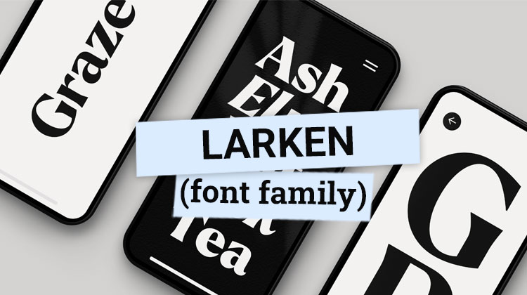
THE LARKEN FONT is a refined, elegant serif typeface created by Ellen Luff. It’s a blend of classic and contemporary minimalist font design elements, making it versatile for print and digital mediums.
You’ll find Larken perfect for editorial work, branding, and varied digital platforms. Its characterful design details, including a slanted ‘g’ and stylistic alternates, add a unique charm.
If you’re excited to explore its potential pairings and applications, there’s a lot more to discover about this stand-out typeface. You can start here:
https://theendearingdesigner.com/review-larken
@xxxx[{::::::::::::::::::::::::::::::::::>
Background of Larken Font
@xxxx[{::::::::::::::::::::::::::::::::::>
What makes the Larken font by Ellen Luff so unique and appealing? It’s the harmonious blend of traditional and modern elements that sets it apart in the world of typography.
This versatile serif typeface boasts a refined, elegant aesthetic, underpinned by dynamic letter shapes that speak to its contemporaneity.
Ellen Luff, a reputable type designer, conceived Larken with an eye for sophistication and charm. Rooting its construction in the classic style of engravings, the typeface exudes a timeless feel. Yet, its distinctiveness doesn’t end there.
It’s the balance between classic construction and simplicity that truly elevates Larken. It features subtle serifs and tender curves, a combination that injects the typeface with both grace and approachability.
Further, the sharp wedges and angles, most noticeable in the bolder weights, add a punch of modernity.
These elements give Larken an edge, setting it apart from more conventional serif fonts. The typeface’s italics, too, reveal unique design decisions. The slanted ‘g’ and stylistic alternates, for instance, inject Larken with a character all its own.
In essence, Larken’s uniqueness and appeal hinge on its clever interplay of tradition and contemporaneity, classicism and simplicity. This interplay, masterfully executed by Ellen Luff, results in a versatile typeface that’s as suitable for a sleek, modern brand as it is for a vintage, nostalgic project.
And that’s the magic of Larken. It’s more than just a typeface; it’s a chameleon, ready to adapt and transform to meet your design needs.
@xxxx[{::::::::::::::::::::::::::::::::::>
Usage and Applications of Larken
@xxxx[{::::::::::::::::::::::::::::::::::>
Diving into the practical applications of Larken, you’ll quickly discover its versatility across a range of design contexts, from editorial work to branding initiatives.
As a serif typeface, Larken brings a touch of class and sophistication to any design it graces. Its unique character designs, such as the slanted ‘g’ and stylistic alternates in the italics, make it stand out, injecting a sense of personality and creativity into your work.
- Editorial Work: Larken shines in editorial design, where its elegance and readability make it a perfect choice for both headlines and body text. Whether it’s a high-end fashion magazine or a thought-provoking editorial piece, Larken elevates the content, making it more engaging for the reader.
- Branding Initiatives: In the domain of branding, Larken’s versatility comes to the fore. It can be used to create striking logos, impactful taglines, and effective marketing materials. The typeface’s balance of classic construction and modern simplicity gives brands a timeless yet contemporary look.
- Digital Design: With its clean lines and sharp angles, Larken is a great choice for digital design. It’s easily readable on screens of all sizes, making it ideal for website design, app interfaces, and digital marketing campaigns.
@xxxx[{::::::::::::::::::::::::::::::::::>
Larken Font Pairings and Recommendations
@xxxx[{::::::::::::::::::::::::::::::::::>
Let’s now explore the versatility of the Larken typeface regarding its pairings and recommendations. This robust and elegant typeface can be effectively paired with a variety of other fonts to create striking and harmonious designs.
Consider pairing Larken with a sans serif typeface like Jeko for a balance of classical elegance and modern simplicity.
For body text, this combination works beautifully, with Larken providing the eye-catching headlines and Jeko ensuring readability. It’s a dynamic duo that’s flexible enough for a range of design projects.
Alternatively, you might want to experiment with a bolder, more contemporary typeface like Ruda for your UI text.
The contrast between Larken’s traditional forms and Ruda’s geometric shapes can create a visually intriguing and engaging design.
To identify the best pairings, you can use online tools like Font Matrix. It’s a detailed resource that allows you to compare and contrast different typefaces, helping you make informed decisions about your typographic choices.
In terms of recommendations, Larken is a top pick for expressive typographic statements.
Its blend of classic construction and simplicity, punctuated by sharp wedges and tender curves, makes it a versatile choice for a variety of design applications. From branding to editorial design, Larken is a reliable and stylish addition to your typographic toolkit.
@xxxx[{::::::::::::::::::::::::::::::::::>
Conclusion
@xxxx[{::::::::::::::::::::::::::::::::::>
Now you’ve explored the intricacies of Larken, it’s clear why it’s a typography gem. Its unique mix of tradition and modernity, combined with its flexibility, makes it a go-to for various design applications. With the right combinations, Larken truly shines.
So, whether you’re creating a logo or designing a book cover, don’t underestimate this typeface. Remember, the right font can make all the difference, and Larken could be just what your design needs.