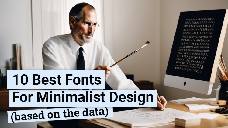
IN THE EARLY 1970s, a young man dropped out of Reed College. He was bored out of his mind. And clueless about what to do next. But since he was already there anyways, he thought to himself that he might as well drop in on random classes that interested him. Classes like a calligraphy course that got his attention.
So dropping in he did, but he wasn’t expecting that those classes on the beauty, elegance, and precision of typography would change his life (and the world) forever.
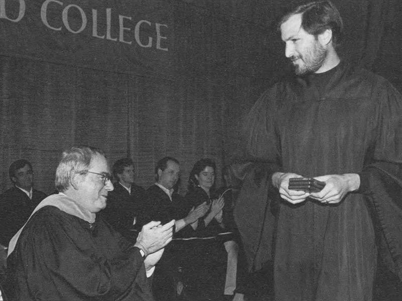
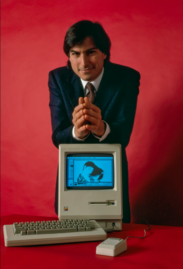
That man was Steve Jobs. And when he founded Apple on April 1st, 1976, with his friend and partner Steve Wozniak, he started applying those minimalist design principles he learned, leaving a long-lasting impression on him, and leading to the creation of the Macintosh in 1984.
The Mac set a new standard in user-friendly design and elegant personal computing. With its minimalistic and proportional font pairings, it turned household computers into an art form that would take the world by storm.
When he returned to a failing Apple in 1997, several years after getting kicked out, he turned the company around by focusing on simplicity and minimalism. While most companies at the time kept adding stuff non-stop on top of their products, he started taking stuff away, keeping only the best and most functional features and products.
The result? The new iMac in 1998 became a roaring success, praised for its sleek design and something anyone could use.
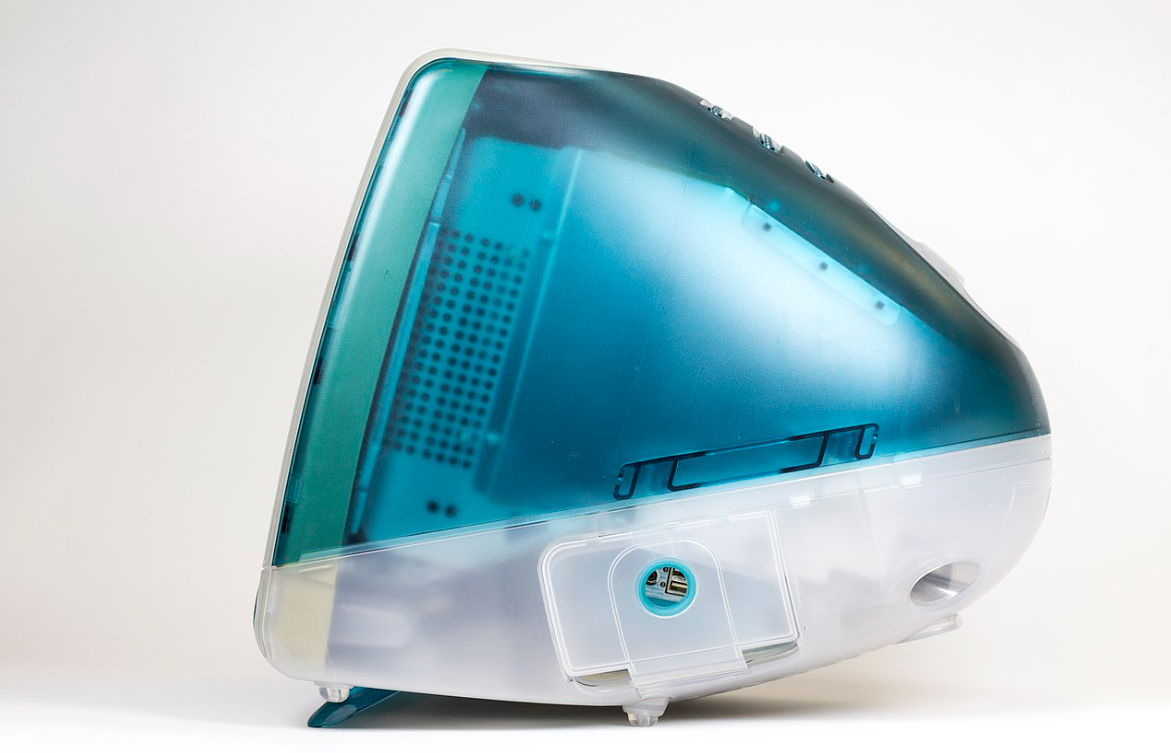
Removing stuff (instead of adding more) and focusing on minimalism and simplicity creates products that are both beautiful, accessible, and easy and fun to use too. But there’s a downside to minimalism that most people never talk about. And that’s the fact that…
The less elements there are in your minimalist design, the more weight every element has to carry. Meaning, every design decision counts. One wrong element is enough to ruin the whole work. And there’s nothing for you to hide behind.
This is especially true for selecting the best font for your minimalist design. How do you do it without overwhelming (or underwhelming) the rest of your design?
@xxxx[{::::::::::::::::::::::::::::::::::>
How To Choose The Best Font For Minimalist Design Projects
@xxxx[{::::::::::::::::::::::::::::::::::>
First, we have to remember the purpose of a minimalist design as opposed to a maximalist design. The core concept of minimalism is to get the maximum impact with the minimum amount of elements. To do that, the font should meet 4 main criteria:
1. High Legibility: Meaning, the font should be super clear and easy to read. Whether you read it from the right. Or from the left. Or squatting on the floor. Whether it’s blown up or shrunk down. You don’t have a lot of background context to help support your text.
So they need to be able to read it and get it quickly at a glance. So it needs to be super legible. As I discussed in my article on the Best YouTube Thumbnail Font styles, if people don’t get your text within a second or two, they’re gonna scroll past and move on to someone else.
2. Clean & Simple Lines and Edges: You want to avoid visual clutter. So you can get the maximum impact in the minimum amount of time. Making sure your fonts have clean, simple, lines and edges helps you achieve this. It helps your design look classier and more sophisticated too. The simplicity forces your focus on the content instead of the font.
3. Geometric Shapes: This ties into the first two. Having fonts with geometric shapes, like circles, squares, triangles, etc. helps improve legibility and keeps things clean and simple.
4. Mass Appeal: There’s a case for creating designs that only appeal to a certain segment of your target market. However, when it comes to the font, it’s a different story. You want your minimalist fonts to be versatile, and broadly appealing. You want them to be highly legible, and quickly and easily “gettable” no matter who’s looking at your design. And…
You’ll want them to be widely appealing, no matter if you’re using as part of your logo fonts, labels, posters, heading, or even body text. So it’s not just about market appeal, it’s also about medium appeal. But this final ‘critical mass’ criteria is probably the hardest to filter for.
Until you start looking at the carefully tabulated data…
@xxxx[{::::::::::::::::::::::::::::::::::>
The Current Top 10 Minimalist Fonts
@xxxx[{::::::::::::::::::::::::::::::::::>
The following ranking of top minimalist fonts is based on worldwide sales data aggregated by MyFonts, the top font marketplace in the world at the moment (read our MyFonts review here). It gives a pretty good indication of how unlikely a font will be hated design-wise. The more sales a font gets every day, the more appealing it is in general.
This list is ranked from bottom to top. From least sales, to most sales. With number 1 being the most sales based on the criteria of “minimalism”. Let’s begin…
@xxxx[{::::::::::::::::::::::::::::::::::>
10. Articulat CF Font
@xxxx[{::::::::::::::::::::::::::::::::::>
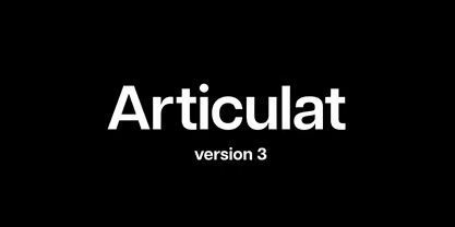
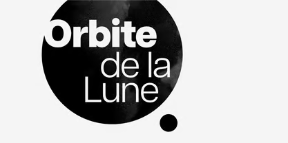
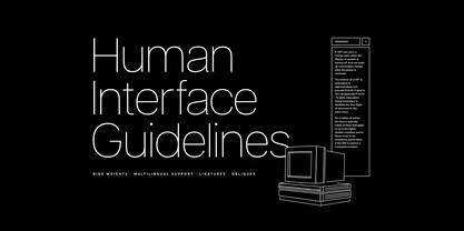
Articulat CF is a geometric minimalist font. It’s also sans-serif, for those who are looking for that in their minimalist designs. Connary Fagen, type designer, created this with traditional Swiss typography in mind. You can tell, based on how clean and sharp the lines and edges are. As well as its strong, straight-forward appearance.
There’s 20 styles available with this font. From thin, to extra-bold, to oblique, and other alternatives. The focus is on versatility, charisma, and legibility. And that makes it a good choice for stuff like logos, headings, body text, and more. Unless you need something a little more playful.
To summarize:
- Clean and Simple Design: Articulat CF uses geometric shapes. It’s made up of clean and simple lines. The modern touch doesn’t hurt either.
- High Legibility: Really clear. And easy to read in different sizes, and across different contexts. If you want easy and effective communication in your minimalist projects, this meets the goal.
- High Versatility: 20 styles. That’s a lot. With different options for different design elements.
- Mid-Century Inspiration: If you want sophistication and elegance in your designs, then the font’s mid-century feel is a stand-out.
@xxxx[{::::::::::::::::::::::::::::::::::>
9. Posterama Font
@xxxx[{::::::::::::::::::::::::::::::::::>
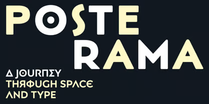
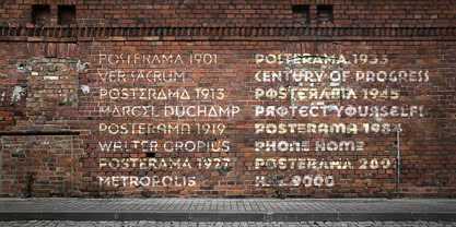
Posterama is a post-modern serif font that takes on a trip through time and space. It was designed by Jim Ford in 2016. And contains 63 different nostalgic font options. You’ll see inspiration from a range of historical periods and styles, bringing your art back to a simpler time.
You’ll notice it includes fonts like Posterama 1901, 1913, 1919, 1927, 1933, 1945, 1984, and 2001. That’s a whole lot of different eras! And wrapped up with the aesthetic appeal of each era, you’ll find the feels from times when the world was much less complex.
Use it for branding. Use it for display typography. Here’s a quick sum up:
- Historical Inspiration: Inspired by key points in design history, this font makes a rather interesting choice if your minimalist projects need to include a feeling of nostalgia. Or you just feel like retro-ing out.
- Very Versatile: 63 fonts. Different styles and weights. Lots of options for every element of your design.
- Evocative Flavor: Imagine encapsulating a whole century’s worth of styles, from disciplines like art, to architecture, to poster design, to science fiction, and more. Perfect if you want to bring your minimalist designs to the next level of timelessness.
- Geometric Shapes: Geometric shapes and clean lines. People back then didn’t have much of a choice.
- Highly Legible: Has a robust character set. Includes upper and lowercase glyphs. And even pan-European language support. All of which helps make the font is readable as possible.
@xxxx[{::::::::::::::::::::::::::::::::::>
8. Note Boster Font
@xxxx[{::::::::::::::::::::::::::::::::::>
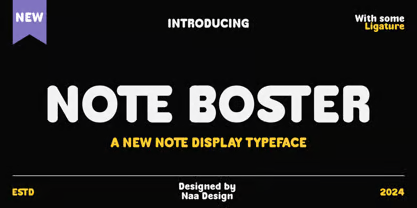
Note Boster is simple, neat, and has that handwritten feel. So while it is humble, it does tend to make your projects stand out.
While it’s playful, the font is still super legible. And the cleanness and simplicity is a plus for a wide variety of different media, from logos, to headlines, business cards, and more.
Here’s a little recap:
- Simple and Neat Design: Note Boster’s handwritten design is clean, simple, and neat. If you want minimalist with a hint of playfulness, this is it.
- Super Legible: Normally. Unless you use a little too much ligature. But other than that, it’s pretty simple and straightforward. And makes for some easy communication, regardless of the size and context.
@xxxx[{::::::::::::::::::::::::::::::::::>
7. Gilmer Font
@xxxx[{::::::::::::::::::::::::::::::::::>
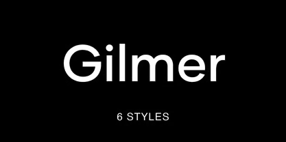
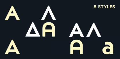
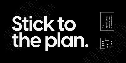
Gilmer is a fresh, geometric, and… yes… sans-serif as most minimalist fonts tend to be. It was designed by Piotr Lapa. And inspired by iconic typefaces like Futura and Avant Garde. It features a large x-height value, geometric letterforms, sharp clean edges, and a small stroke contrast.
Like Posterama, this font family includes 6 fonts. So you can use it for tons of stuff, from magazines, to posters, to branding, and more. Yes, websites too.
A little recap on this minimal font:
- High Versatility: Gilmer has lots of different styles and weights. So your design elements, from headings to body text, won’t be excluded.
- Geometric Shapes: It’s geometric. It has clean lines. And all the sharp edges that are characteristic of minimalist design.
- High Legibility: It’s designed for high legibility and readability. So if you need to make sure your text is clear and easy to read from any angle, this sounds like a safe bet.
- Airy Feel: If you want feelings of lightness, openness, and make your audience feel like they’re walking on air… this font might help.
@xxxx[{::::::::::::::::::::::::::::::::::>
6. Larken Font
@xxxx[{::::::::::::::::::::::::::::::::::>
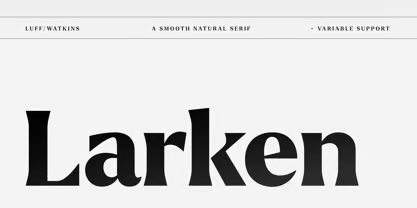
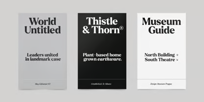
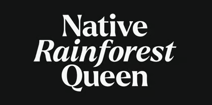
Larken is a serif font. But don’t let that fool you. Ellen Luff designed the serifs in the font to reflect nature. So you’ll notice natural looking curves with simple, gentle repetitions. Overall, it has a soft and minimalist feel.
It includes 14 styles. From thin to black. And you have support for most of the major Latin-based languages. It was designed with boldness and communication in mind. So it gets the message across quite smoothly. Especially if you plan to use it for magazines, flyers, posters, branding, and more.
A quick recap on this natural but simple beauty:
- Natural and Soft Design: Very natural. And very soft. Works well with the clean lines and airy design that just screams minimalist. But it doesn’t lose that sense of unique expression.
- Highly Legible: It’s legible. And readable. And the text looks good from just about any angle.
- Pretty Versatile: Multiple styles. Multiple weights. So, yes, you can use it on various elements of from head to body.
- Open Type Features: The font includes extra symbols, stylistic alternates, unique ligatures, and case-sensitive punctuation. So if you want more control over your typography, this is pretty flexible.
@xxxx[{::::::::::::::::::::::::::::::::::>
5. Visby CF Font
@xxxx[{::::::::::::::::::::::::::::::::::>
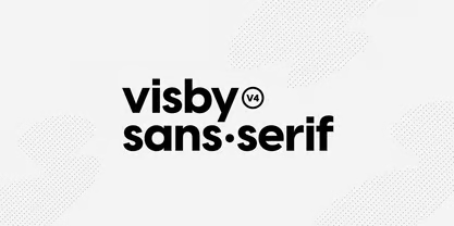
Visby CF is a clean and modern geometric sans-serif font designed by Connary Fagen, who also designed the Articulat CF font that’s ranked #10 (notice the CF is the initials of her name). The inspiration for this font is pretty cool – it was inspired by the “stark beauty and crisp air of the Arctic North”. I’d say that’s a pretty good source of inspiration.
Sharp lines and round geometrical letterforms. Looks like it ticks all the boxes. The font has 16 styles with matching italics. So it’s pretty versatile. 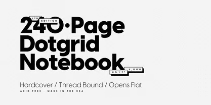
Let’s summarize:
- Clean Modern Design: Visby CF’s has a nice geometric design, clean lines and sharp edges. Basically all the stuff you typically look for in a minimalistic font.
- Super Legible: Super clear. Super easy to read. Gets the point across fast.
- Versatility: It includes multiple weights and styles. So it’s pretty versatile.
@xxxx[{::::::::::::::::::::::::::::::::::>
4. Chesna Grotesk Font
@xxxx[{::::::::::::::::::::::::::::::::::>
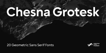
Chesna Grotesk is a geometric form-based sans-serif typeface. It was designed by Ufuk Aracioglu of the Horizon Type Foundry. And features 20 weights, with 10 uprights and 10 italics. So there’s lots of stuff you can use it for.
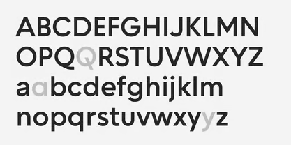
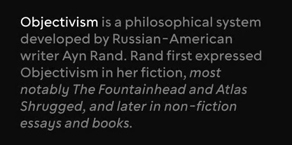
The brings a new approach to the classic grotesque style. And the modern clean design is a plus.
To sum it all up:
- Clean and Modern Design: Geometric designs. Clean and modern. ‘Nuff said.
- Very Legible: Really clear, clean, and easy to read.
- High Versatility: 20 weights and matching italics. Looks like it’s pretty versatile.
@xxxx[{::::::::::::::::::::::::::::::::::>
3. Sofia Pro Font
@xxxx[{::::::::::::::::::::::::::::::::::>
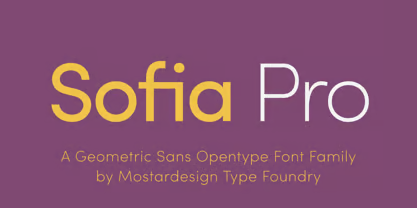
Sofia Pro is a geometric sans-serif Opentype font family. It was first created by Olivier Gourvat of Mostardesign in 2009. But then, we completely redesigned it to its present form in 2012. This font family includes 17 styles, from thin to black, with matching italics.
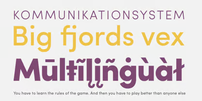
The font boasts clean, modern design. And includes rounded curves and open terminals. So if you’re looking for something elegant, friendly, and contemporary, this might be it. Notice that it has a higher x-height so it’s easier to read in small sizes. Did I mention that it supports over 130 languages, including Western European, Eastern European, Central European, Greek, and Cyrillic?
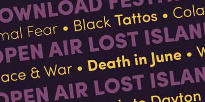
Let’s sum it all up:
- Clean and Modern Design: Clean geometric design. Modern look. Sharp edges. I’d say it works well for minimalist projects.
- High Legibility: Higher x-height so it’s even more legible at smaller sizes. It’s pretty readable from all angles.
- Versatility: It comes in 17 styles and matching italics. So, yeah, it covers pretty much all of the bases.
- Open Type Features: It includes advanced Open Type features. Like case sensitivity, small and true capitals, full ligatures, tabular figures for tables, old style figures, circled numbers, and more. So if you need some extra personality in your type, then you got some.
@xxxx[{::::::::::::::::::::::::::::::::::>
2. Tazugane Gothic Font
@xxxx[{::::::::::::::::::::::::::::::::::>

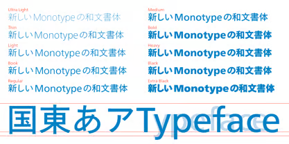
Tazugane Gothic is a pretty interesting modern sans-serif font. It was designed by Akira Kobayashi, Kazuhiro Yamada and Ryota Doi of the Monotype Fonts Studio. And the thing that makes it unique is that it was inspired by traditional Japanese typography. So you’ll note that it was designed with both Japanese and Latin characters in mind.
The font includes 12 styles, thin to black, and comes with matching italics too. Simple. Clean. Readable. And… it works well in a variety of different sizes, and even media. No wonder this is one of the top ranking minimalist fonts.
Here’s a mashup of everything this font has to offer:
- Clean and Elegant Design: The cleanliness extends beyond Latin characters to include Japanese. Very elegant and minimalist design.
- High Legibility: Super clear. Super readable. Looks like it’ll do well on stuff as large as road signs, and as small as hand-held maps.
- Versatility: 10 styles and matching italics. But what makes it stand out is how it allows you to design in both English and Japanese with characters side-by-side.
@xxxx[{::::::::::::::::::::::::::::::::::>
1. Avenir Next Font
@xxxx[{::::::::::::::::::::::::::::::::::>

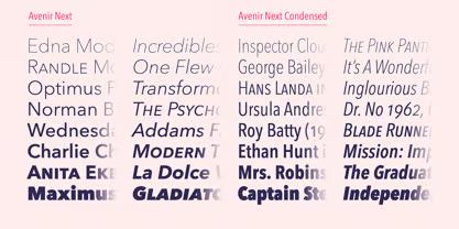
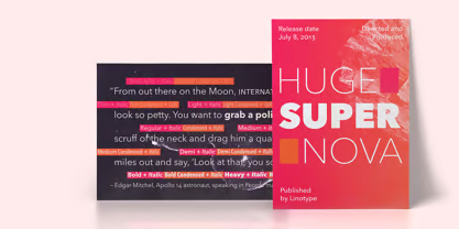
Avenir Next is a geometric sans-serif font that continues the legacy of the original Avenir Font family (1988). It was designed by Adrian Frutiger and Akira Kobayashi and is published by Linotype. And it’s currently ranked as the bestselling minimalist font based on sales worldwide.
The Avenir Next font family includes 32 styles, going from Light to Heavy, and includes those matching italics. It supports Latin languages. So feel free to use it in your magazines, posters, branding, and websites.
Let’s end this round-up right here with this:
- Geometric Design: It definitely hits the spot.
- Clean and Modern Design: Combine its geometry with the clean lines and sharp edges, and you have some pretty fine minimalist design
- High Legibility: Clear and easy to read. I think that’s pretty clear. It’s legible even from far away.
- Versatility: 32 styles and matching italics. It’s pretty versatile.
@xxxx[{::::::::::::::::::::::::::::::::::>
FAQ (Frequently Asked Questions)
@xxxx[{::::::::::::::::::::::::::::::::::>
What is the best font for minimalists?
Based on global sales rankings, the most popular minimalist font right now among professional creatives is the Avenir Next font by Adrian Frutiger and Akira Kobayashi. It comes in 32 different styles, with clean geometric lines, and matching italics.
What font is used for minimalist labels?
When it comes to labels, high legibility is a must. Meaning: the font must be easy to read even at small sizes. Good choices are fonts with good geometric design, simplicity, and clear, clean lines. All the fonts ranked above meet these criteria.
What font is used for minimalist posters?
In contrast to labels, which are typically at smaller font sizes, posters are typically blown up. And you'll see text being printed on a larger scale. At this range, the focus is more on cleanness of the font, so that imperfections don't get blown up along with the size. And also, having clean, crisp lines helps to prevent the font distracting from the main design. All the fonts ranked above make good candidates.
What is minimalism in typography?
It typically refers to picking fonts and typefaces that are simple, clean, and easy to read. Minimalist designers often go with sans serif fonts, to exclude additional unnecessary details like lines or strokes. It can also refer to keeping the number of fonts used to the minimum possible - not more than one or two. The fonts should look good together, of course. The space between them is even more important, because minimalism places heavy emphasis on white space.
@xxxx[{::::::::::::::::::::::::::::::::::>
Conclusion: Picking The Right Fonts
@xxxx[{::::::::::::::::::::::::::::::::::>
There ya go. A list of the top ranking font designs for your next minimalistic project. And it’s all based on historical data, not just the “feels” and “hunches” (though those are important too). But when you use the right minimalist font in your designs, you can see the difference in elegance and sophistication. It just complements the aesthetic and brings the polish and professionalism to a whole ‘nother level.
When you choose the font that resonates best with the emotional feel you’re trying to create, it just elevates the viewer’s connection with your designs. Keeping it easy on the eyes, enjoyable to interact with, and even more so in today’s world where digital interfaces are overwhelmed with clutter.
Keep it clean, and watch how viewers spend longer engaging with your work. When it’s easy and fun to go through, you can be sure your viewers are going to spend more time on it. All’s well…
