IF YOU’RE DESPERATELY SEARCHING for the top logo fonts for your next project, then this may be the most important article you ever read. Here’s why:
Why Choosing The Wrong Logo Font Could Kill Your Branding

A font is more than letters on a page; it’s the voice of your brand. Meaning – get it wrong, and your brand is DEAD in the water before you even start! Your font is the first thing people notice about your logo, and… it sets the tone for how they think of you… for the rest of their life. First impressions count. And they last too.
The Hardships Of Choosing A Great Font
But choosing the right font can be tough. The countless options are overwhelming. With more coming out each day. Yet, you need not fear. Because I’m here. And I’ve curated a list of 100 top fonts for logos that will guide you to enlightenment. Or at least… inspire you to make less destructive choices…
How I Chose The Best Logo Fonts Ever

Let’s face it: We can talk about font versatility, readability, aesthetics, and mass appeal until we’re blue in the face. But the only real way to tell whether a font will work well for your branding is… to… put it out there, wait a hundred years… and if your business is still around, congrats! You hit the branding jackpot!
But most people don’t have a hundred years to see whether their font helped or killed their branding. So… we’re doing the next best thing. We’re looking at companies that have been around the block. They’ve dominated their industries, become the most beloved brands in history, and took over the world.
Let’s see what logo fonts they’ve used, fonts that have been proven to do well in the marketplace, and let’s just use the same fonts. Or maybe… just something similar at least. It’s way easier than waiting a century!
This isn’t just design or typography. It’s historical science.
So whether you’re planning to create a classic, modern, or playful brand to take over the world, there’s no doubt that you’ll find the perfect font you’re looking for on this list…
How I Made This List Easier To Navigate
Other than that, I’ve also included examples of ‘Logos in the Wild‘, so you can see how the logos were used in the real world. Let’s explore…
26 TOP CLASSIC FONTS
These are timeless and elegant options. Great if you’re planning to build a more traditional brand.
#C1. American Pop Font (Coca-Cola)
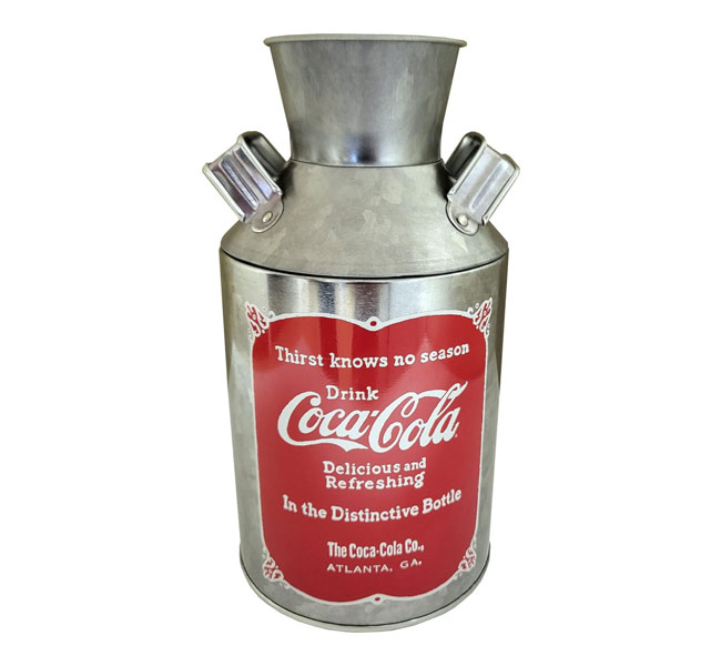
The Coca-Cola logo was originally drawn in a style of classic script handwriting called Spencerian Script. It was taught to children in schools in the 19th century.
While there are a lot of different Spencerian Script fonts, the American Pop font by FontMesa bears the closest resemblance here…
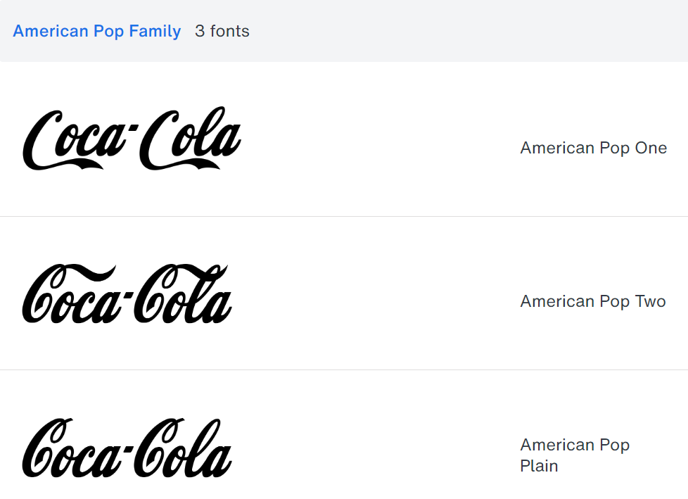
It works well if you’re trying to appeal to nostalgia and vintage familiarity. Makes for some pretty cool merch too, don’t you think?
#C2. Commercial Script Font (Ford)
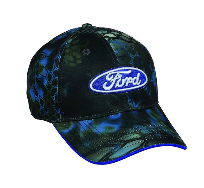
Similar to the Coca-Cola logo, the Ford logo also uses a style of Spencerian script popular in the 19th and 20th centuries for its elegant and fluid strokes.
The Ford logo’s script is based on a specific variation known as “Ford Script.” There’s a free font available for personal use called Ford Script, which closely mimics this style of script. However, it’s considered by designers to be badly drawn and lacking the refinement of professional font designs. Here’s a better option:
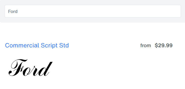
The Ford Script is mostly based off of the Commercial Script font by Monotype. Its smooth, flowing characters made Commercial Script an attractively popular typeface in advertising in the early 20th century.
It also has greater craftsmanship and is available for both personal and commercial use.
#C3. City Medium Font (IBM)
The IBM logo was designed by Paul Rand in 1956. It’s based off of the City typeface created by Georg Trump in 1930. Specifically, the City’s Medium style. The font’s bold, geometric shapes helped IBM project strength and reliability. Rand further modified the logo with horizontal stripes.
This created a unique visual effect that made viewers feel a sense of speed, dynamism, and connectivity… all while maintaining the original typeface’s solid, authoritative feel.
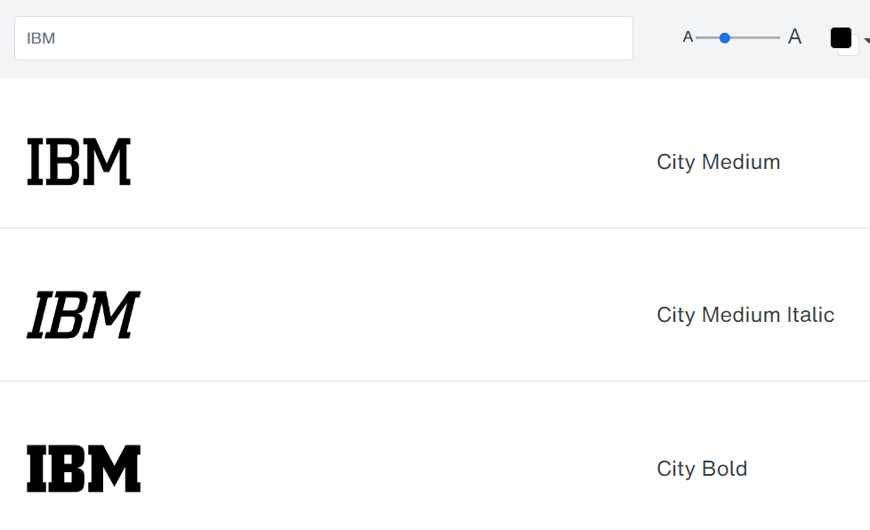
The clean lines of the City Medium typeface makes the logo clear and easy to read across different media and formats. The addition of horizontal stripes created a modern and timeless design and positioned IBM as a leader in technology and innovation.
#C4. Engraver’s Old English BT (The New York Times)
The New York Times logo font was designed by Edward Benguiat. He was a renowned typographer, known for creating several famous fonts and logos for other well-known magazines, like Esquire and Reader’s Digest.
The logo font is inspired by a style known as Old English Text. And it includes Benguiat’s personal artistic flourishes. This made it stand out distinctively as the hallmark of the newspaper’s brand.
The intricate, ornate letterforms give viewers a sense of tradition, authority, and timelessness. The aim was likely to help highlight The New York Times’ reputation for journalism.
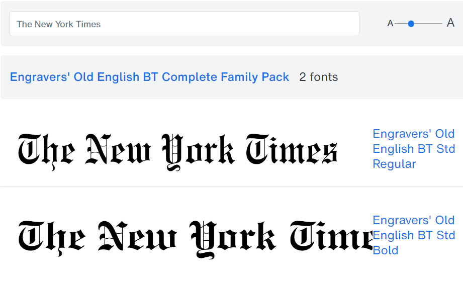
One of the most stunningly similar typefaces in the Old English Text style is the Engravers Old English BT font. And if you look closely, you’ll see why it works well for logo design. Lots of serifs, lots of elaborate detail, help to instantly make any brand memorably stand out.
It instantly gives out a feeling of established authority and credibility, that’s crucial for brands like The New York Times. Don’t think the font mattered that much? When the company attempted to tweak their logo font once, they lost over 1,000 subscribers – a massive number back in the day. They never did it again!
#C5. Victorian Orchid Regular (Rolex)
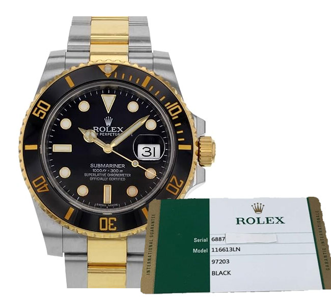
It is said that the original Rolex watch logo font was created by the founder of Rolex himself, Hans Wilsdorf. And while the original font was handcrafted and tweaked over the years up ’til its current iteration, the main feeling of the font was kept consistent.
It features strong serifs and thick strokes, demonstrating the boldness to reign as king of all watches.
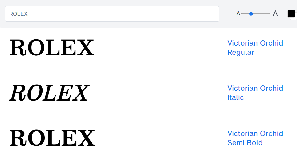
The previous version of the Rolex logo featured a prominent up-pointing ‘R’ tail stroke, as if looking in casual defiance at the world. The current modification of the logo loses this stroke for a more dominant and less casually luxurious feel.
However, the Victorian Orchid Regular font by Dharma Type is the font I’ve found that bears the closest resemblance to both the current and previous font iterations. It’s the perfect font for your brand, if you believe your products have the quality to claim dominance of your industry.
Considering how small watch faces are, you can be sure that this font works well at small sizes.
#C6. Garamond Classico Font (Harvard University)
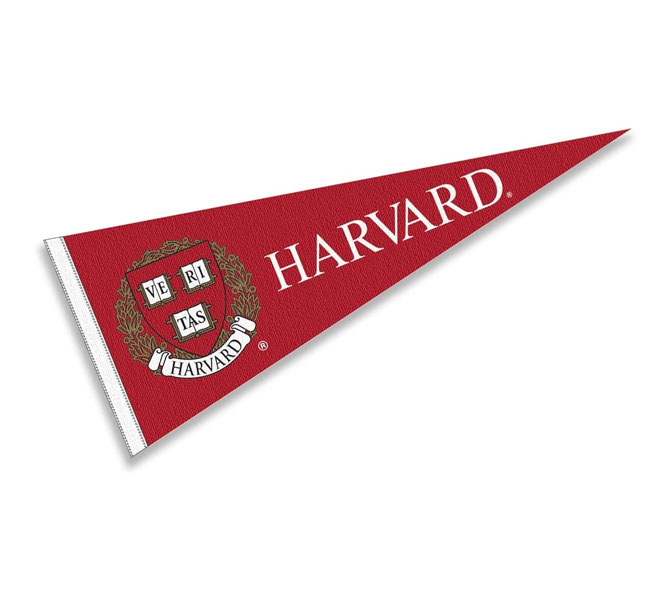
For decades, the emblem and associated fonts of Harvard University have come to define the upper class of institutional learning. The Veritas emblem (representing truth) come in two forms. With just the shield of books, or adorned with wreath and embellishments (used during events).
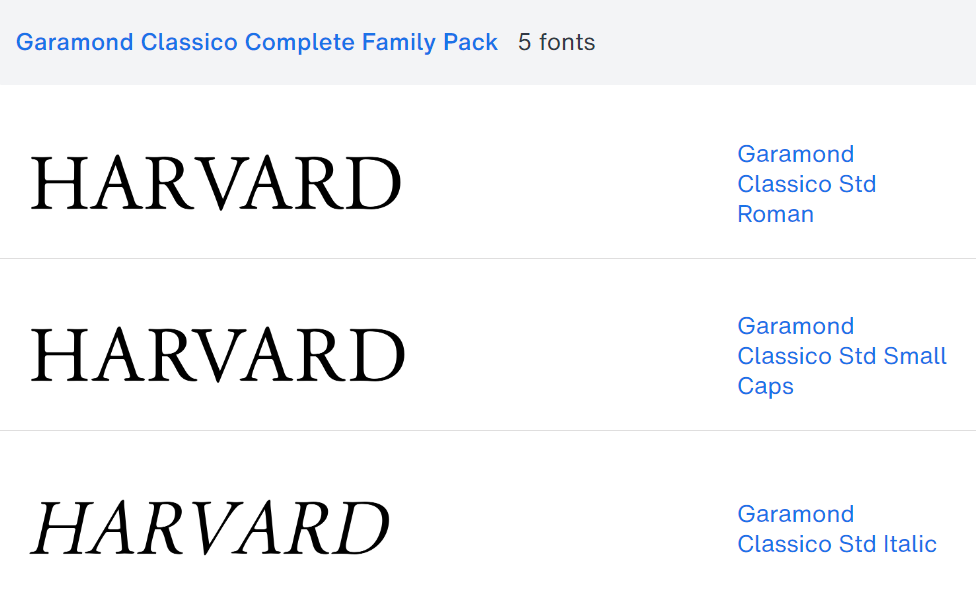
The Harvard logo uses fonts from the Garamond font family. And while there are probably hundreds of variations of the Garamond font, I’d say it most closely resembles the Garamond Classico font variation by Linotype.
The serif font is highly readable, whether from a distance or at smaller sizes. And it works well for building an upper-class brand that gives a feeling of old-world establishment and authority.
#C7. CG Triumvirate Font (Hershey’s)
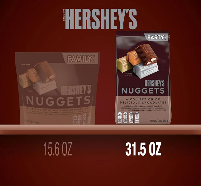
The Hershey’s logo font is based on a custom-designed typeface built in-house, called Milton font. It was named after Hershey’s founder, Milton Hershey. It focuses on simplicity, and boldness.. with a tint of velvety smoothness snuck in… reflected by the ending curve on the ‘R’.
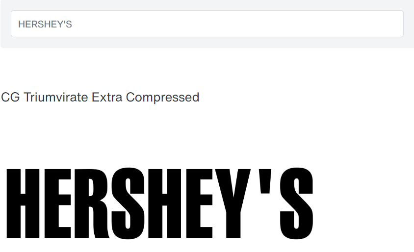
The CG Triumvirate Extra Compressed font most closely mimics the structure and typographic feel of the logo, with the exception of the personalized apostrophe. The letters are rectangular and blocky, reflecting blocks of chocolate. And the slightly raised x-height promises an elevated experience.
If you have a simple standardized product or service that promises to quickly, directly, and consistently satisfy your prospects every time, this might be a good font to look into…
#C8. Nicolas Cochin Font (Dior)
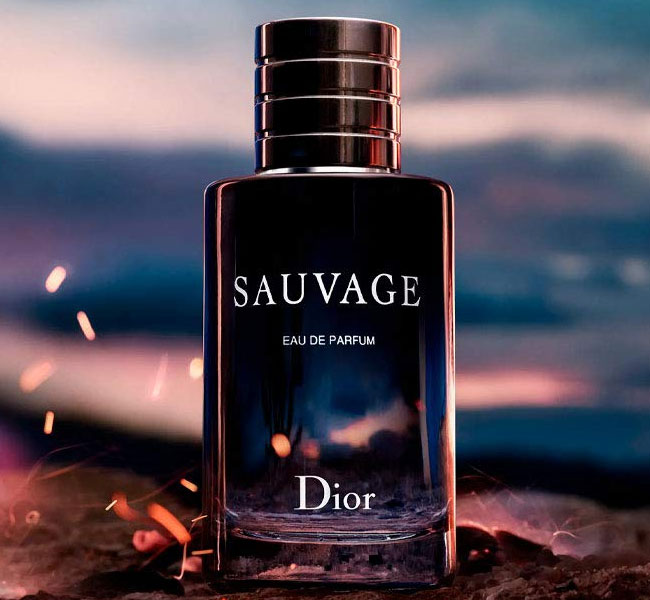
The Dior logo is said to have been created to reflect femininity, elegance, and romance. This is reflected in their font choices for the logo.
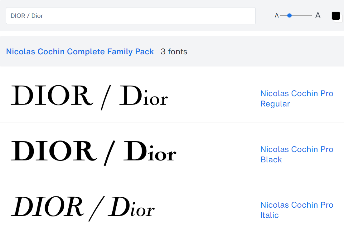
The logo seems to be based on the Nicolas Cochin font family, created by French engraver Nicolas Cochin in the 18th century. The font has strong thin serifs, and an elegant, geometric curvature. The simple, yet minimalistic font design speaks to both luxury and elegance.
If you have a brand that conveys the same feelings, this might be a winner.
#C9. Penumbra Serif (Time Magazine)
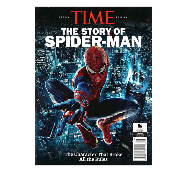
The Time Magazine logo uses a customized serif font in the style of Roman Square Capitals. This includes sharp strong serifs, thick and thin contrasting strokes, and squarish dimensions. It gives the logo a very standardized, clean, orderly look that is positioned to stand out, yet not distract.
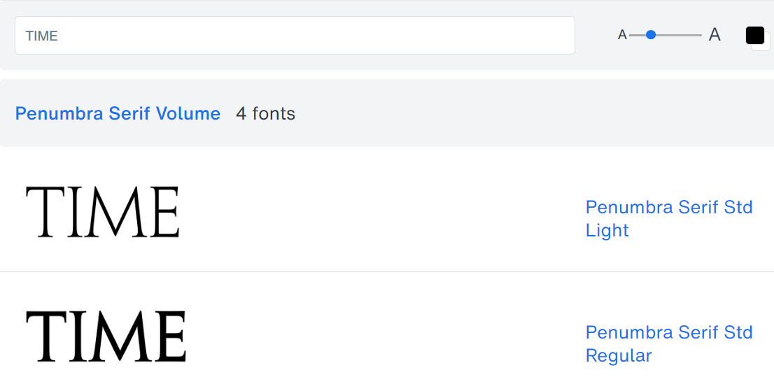
The closest typeface to the Time Magazine logo font seems to me to be the Penumbra Serif font family.
The art director of Time Magazine, Arthur Hochstein, once mentioned that the best cover designs are all about simplicity, strong typography, and clear imagery. The typography used for the font is both simple, strong, and also clear. A great font choice if you’re constantly projecting your branding on top of images.
#C10. Jindo Bold Font (Chanel)
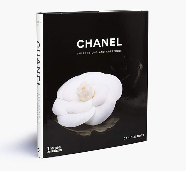
Chanel uses a simple sans-serif font that aims to merge classic simplicity with modern elegance. The geometric shape, thick lines, and square capitals helps them achieve a timeless look.
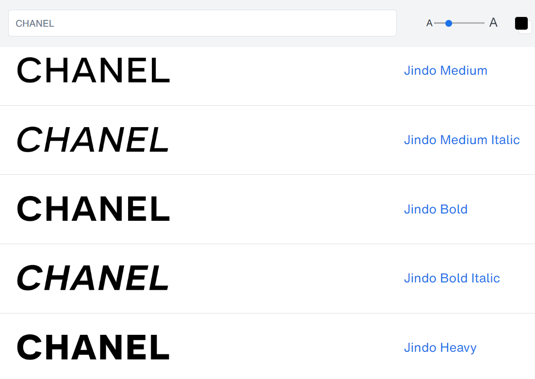
While the Chanel logo font is largely a custom design, the Jindo Bold font comes extremely close to mimicking the original effect. With its geometric letterforms, thick lines, and square capitals, it looks great for a brand that want to merge the simple classics with timeless elegance.

#C11. Goudy Old Style (Guinness)
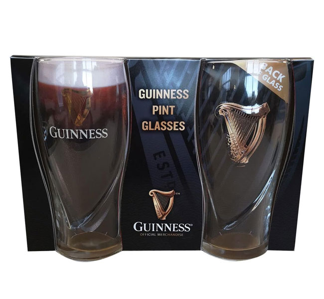
Guinness uses a custom typeface for its branding. It has evolved over the years with many design enhancements by John Gilmore. One of the most iconic features of the logo that has been kept over the years is the iconic slits in the letter “N”.
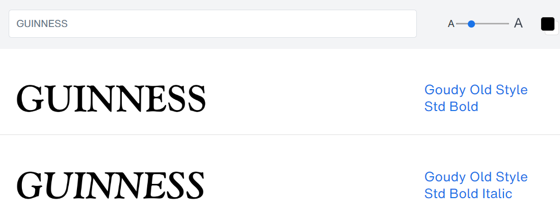
While the exact Guinness font is not available for commercial use, the Goudy Old Style Std Bold font comes remarkably close to achieving its likeness. With the exception of the slits in the letter “N”, of course. If you’d like to achieve a bold and straightforward brand, that is iconic with black-and-white aesthetic, then this might be for you.
#C12. Marcelo + Rosella Fonts (Prada)
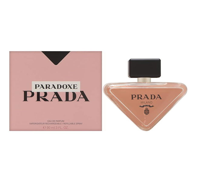
For their logo, Prada uses a custom classic serif typeface that portrays elegance and high contrast between its thick and thin strokes. Its blocky contours creates a feel of high-end fashion coupled with sophisticated luxury.
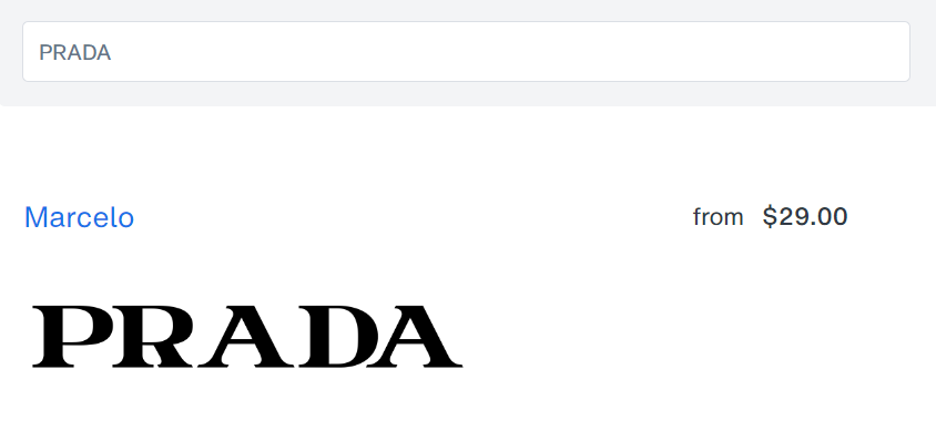
Click To Try Marcelo Font
After much observation, I’ve found that the Prada logo font is most similar to a combination of the Marcelo font and the Rosella Pro Solid font with some slight modifications. Most notable is the modification of the extended ‘A’ top, and the squarish curvature.
Well, there’s no rule that you can only use one font in a logo. As long as they both look good together, and work well to achieve the desired result, have at it…
#C13. Baskerville Font (Tiffany & Co.)
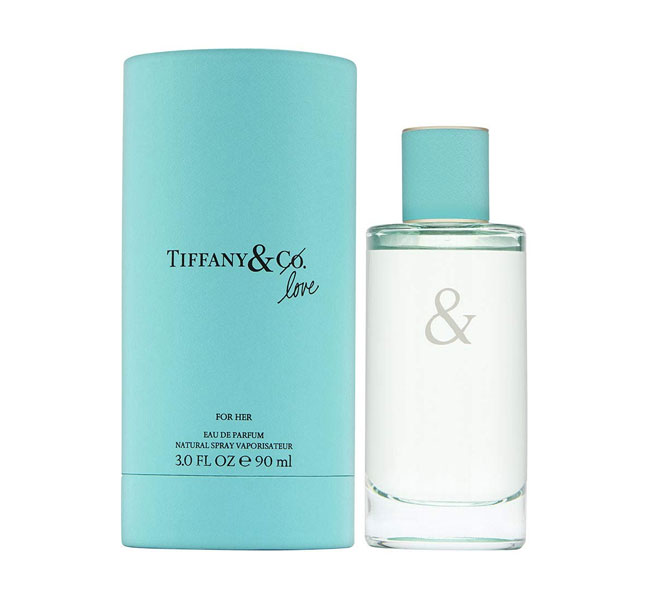
The Tiffany & Co. logo font very closely resembles a variation on the original Baskerville font by Linotype. Some subtle tweaks compared to the Baskerville Font include larger font sizes for the ‘T’ and ‘C’ that help to highlight punctuation. The ampersand ‘&’ has also been toned down from a more playful feel, to a more refined, prim and proper look.
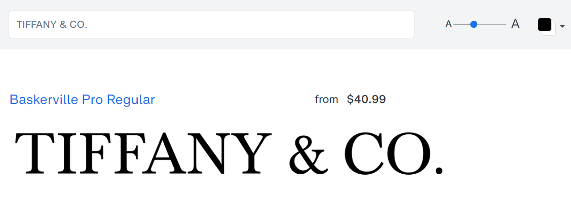
The Baskerville font works well if you’re looking to merge classic appeal with elegance for your brand. It is simple, clean, and delicate as well, depending on the feelings you’re trying to convey.
#C14. Leviathan Font (Levi’s)
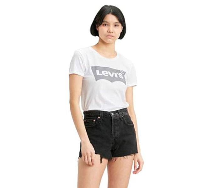
The Levi’s logo font uses a lot of contrasting elements, yet blends them together in a confident way. From the contrast between uppercase and lower case letters, to the contrasting lines between thick and thin.
If you are creating a brand that wants to be unconventional, yet confident at the same time, then this boldness is what you want. While the Levi’s logo is a custom font, the Leviathan Black font by Hoefler & Co. makes a strongly similar substitute with a very slight difference.
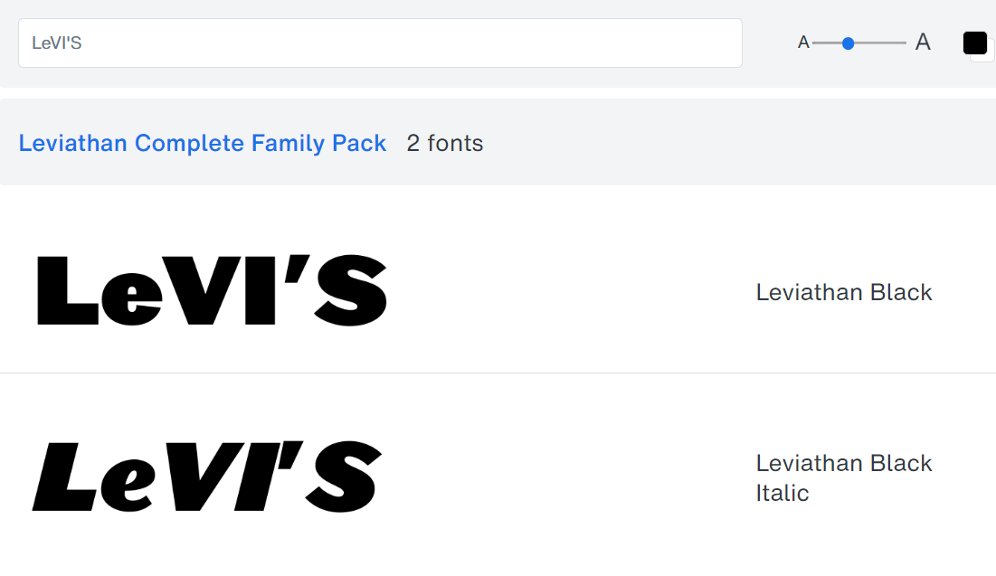
The original Levi’s font is tighter has more tightly closed apertures, making it feel slightly more rational and exclusive, while the Leviathan font is slightly more dynamic, open and friendly.
#C15. Ye Paradigma Font (National Geographic)
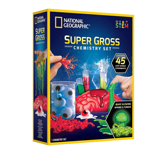
The font used in the National Geographic logo is a custom sans-serif typeface. It’s bold, has all caps, providing a clean modern look that works well with its iconic yellow rectangle. The emphasis is on simplicity and strong brand recognition.
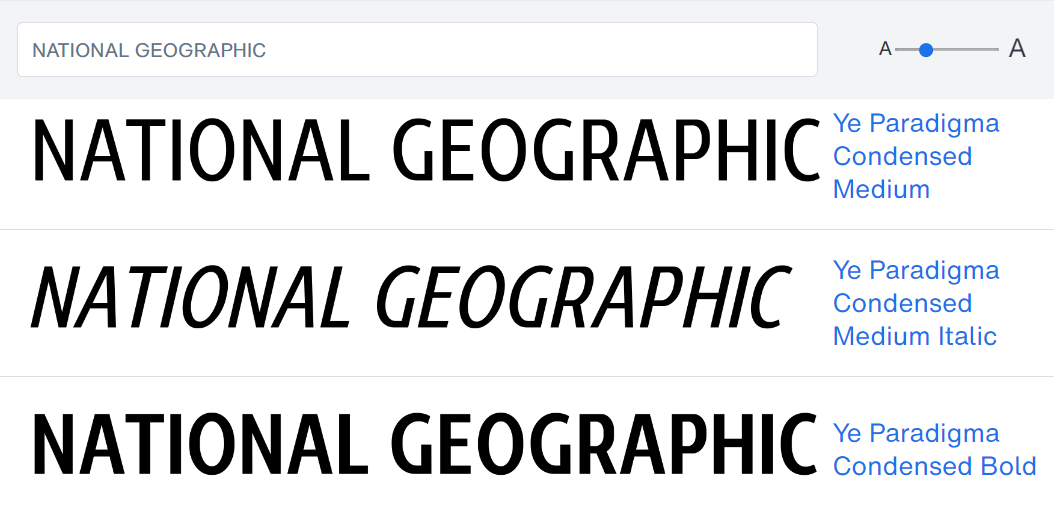
The font I’ve found that gives the closest feel to the original typeface is the Ye Paradigma Condensed font family. The National Geographic font is somewhere between medium and bold. But either way, the styles do well maintaining the simplicity and openness of the original, removing even the bar on the G.
It’s a great font to use if you’re going for a simple and classic, yet modern and clean look for your branding.
#C16. TXTGroovy Smooth Font (ABC News)
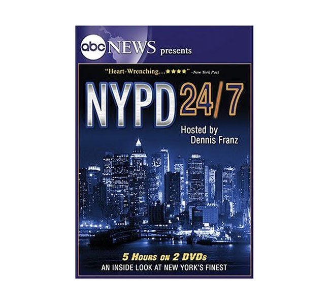
The ABC logo is a custom sans-serif typeface that features bold, simple geometric letterforms. The circular simplicity, paired with its trademark circle, creates a timeless and recognizable identity that you grasp immediately. While a timeless classic, it has built a clean and modern appearance at the same time.
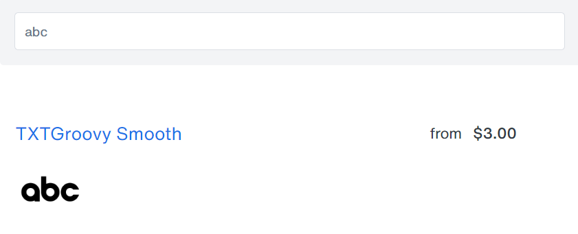
The font that most closely resembles the ABC logo is the TXTGroovy Smooth font. To be precise, it is very similar to the previous version of the logo which had a shorter ‘b’ extender and more open ‘c’ mouth than the current version. However, over the decades, the company has been constantly adjusting these two variables, hovering between bigger and smaller extenders and openings constantly.
The typeface is very simple, clean, and easy to get. It works well for a brand that wants to be known for its simplicity and easy recognizability.
#C17. Corporate A Font (Mercedes Benz)
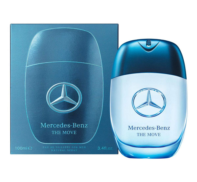
Mercedes-Benz uses a sans-serif typeface called the “Corporate A” font, designed by Prof. Kurt Weidemann. It is interesting because this typeface was first designed as a trilogy, together with the “Corporate S” font, and the “Corporate E” font. Together, they were known as Corporate ASE.
This complements the Mercedes-Benz three-pointed star logo, which symbolizes the brand’s power over land, sea and air.
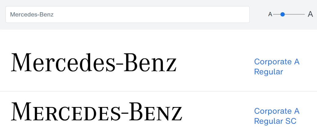
The typeface was initially exclusively designed for DaimlerChrysler as a corporate font, but now the ASE trilogy may be licensed and used without restriction. It has a clean, modern setting, along with slightly condensed lettering style. Perfect if you want to build a brand that boasts both dominance and classical simplicity.
#C18. Futura Book Font (Fruit of the Loom)
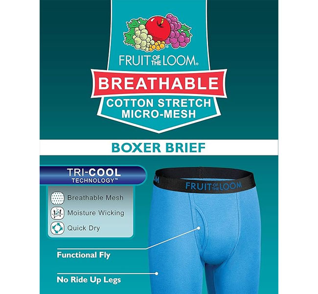
Fruit of the Loom is one of the oldest known surviving brands. It’s even older than Coca-Cola. The name of the company comes from when they were just getting started, and one of their customer’s daughter drew pictures of fruit on their clothing. And the clothes started selling like hotcakes.
Thus, I like that the focus of the font is on accentuating the artwork of the fruits in the logo. The original logo font was a serif font, and moved to a clean and classic sans-serif. The geometric and even-width letters highlight their simple focus on consistent quality.
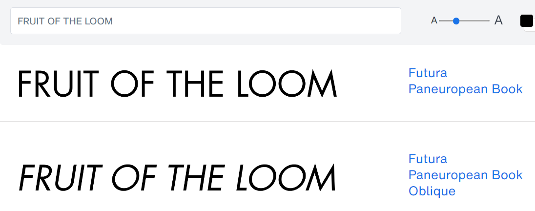
Fruit of the Loom uses the Futura font by Linotype, most notably it seems that the Futura Paneuropean Book font is a striking fit. If you’re building a classic brand that focuses on simplicity and quality, one that you hope to endure for centuries, then click the button above to give the font a try.
It works especially well if your focus is on complementing the simple artistic images that make up the rest of your logo.
#C19. Beaufort + Harsey Font (Dr. Pepper)
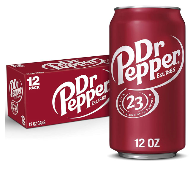
I like how the Dr. Pepper logo keeps a consistent swirl throughout. Not only the swirl that surrounds the logo text, but they repeat the same style of swirl from letter to letter, and even the ‘p’s and ‘r’s have swirls that help to emphasize this.
Click To Doctor Your Font
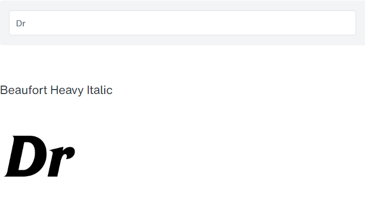
The Dr. Pepper logo font is one of the toughest to decipher, as it feels as if it is made up of two different fonts merged together. Then again, maybe it is? But I think a good match that bears some resemblance to the original font would be a combination of the Beaufort Heavy Italic font and the Harsey Regular font.
One seem closer to the word ‘Doctor’, and the other closer to the word ‘Pepper’. When you think about it, it makes sense that Doctor should be more formal, and Pepper should be more free-flowing.
#C20. Univers + Futura Font (Fedex)
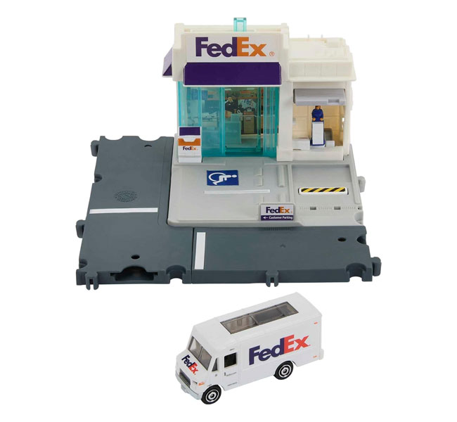
One of the most interesting things about the Fedex logo font is the fact that they managed to sneak in a neat little arrow into the negative space between the ‘E’ and ‘X’. Most people know about this by now. And it’s meant to symbolize speed, precision, and forward motion.
CLICK TO SHIP THIS FONT
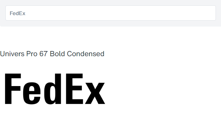
The original font for the Fedex logo was designed by Lindon Leader of Landor associates as a combination of two fonts – the Univers 67 Bold Condensed font and the Futura Bold font. He used tight letter spacing and increased the size of the lowercase letters to create his iconic ‘white arrow’ that people are still talking about today.
If you’re planning to build a brand where you make sure things get there on time, every time, then you might want to consider this font combo.
#C21. ITC Fenice Font (Ralph Lauren)
The Ralph Lauren logo has largely been unchanged ever since it came out. So you know they’ve been doing really well, and their brand identity has been rock solid. They typically use the logo and typeface together for more formal wear, and the logo alone for their line of casual wear, like polo shirts.
The focus of their logo type has been on bold capitals, with thick and thin serif lines and strokes through. This helps them to convey style and elegance.
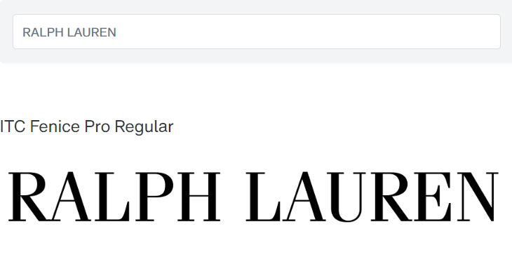
The Ralph Lauren logo uses the ITC Fenice Regular Font. With its thick and thin strokes, and elegant serifs, it makes for the perfect font for displaying luxury and elegance. If you’re planning to build a luxury brand, this is one font you may want to play with. Test it out with the button above.
#C22. Shield 2 Letters Font (Warner Brothers)
The Warner Brothers brand identity is one of the most enduring in all of entertainment history. The irregularly-shaped signature shield instantly draws attention to the initials within, and the two letters fit nicely inside. Unlike most initial-based logos, the WB is very striking and catches your attention instantly.
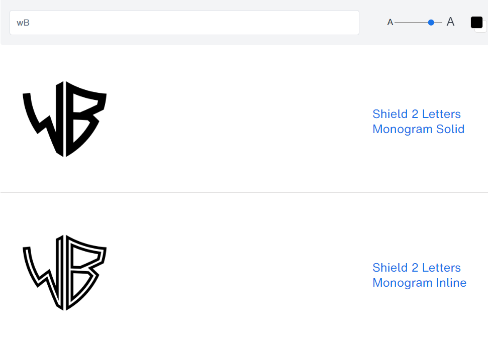
While the Warner Brother’s logo is likely a custom-font design, or maybe even hand-lettering, it does bear a strong resemblance to the Shield 2 Letters Monogram font if you modify it a bit. If you’re planning to build your brand around two letters, this might be a good font to start with.
You can try it out by clicking on the button above. Remember: use small letters if you want your letter on the left of the shield, and capital letters if you want your letter on the right of the shield.
#C23. Minion Black Font (Dreamworks)
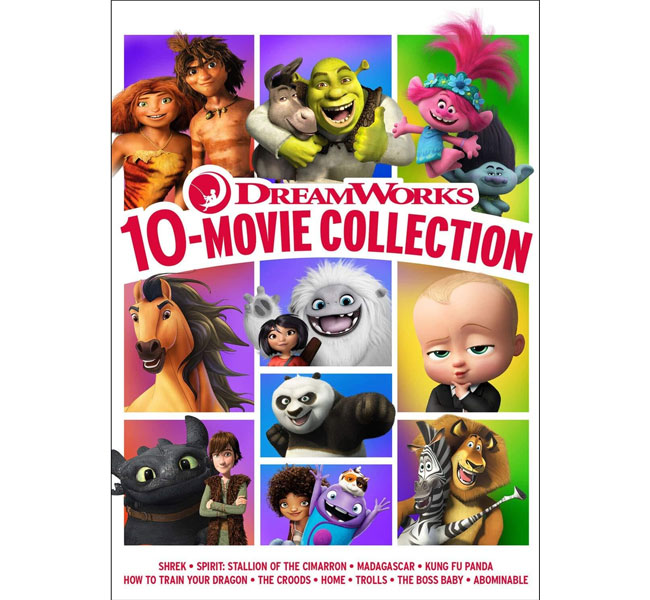
The Dreamworks logo is one of my favorite logos of all time. Because it’s not just another ‘thing you do to brand yourself and make people remember you’, but they actually designed it to evoke emotions of curiosity and wonder, much like their movies do.
The font logo though, has remained largely unchanged from when it first came out, going with a contrasting all-capitals serif font.
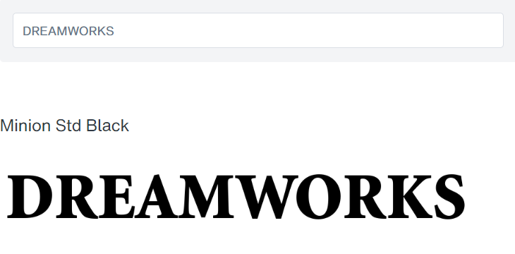
The font that Dreamworks uses for their logo is the Minion Black font by Adobe. Though they’ve squished the font down vertically, which is a little weird, but the font makes for an elegant logotype if you’re planning to build a dreamy, and imaginative brand.
#C24. Neue Haas Grotesk Font (Jeep Logo)
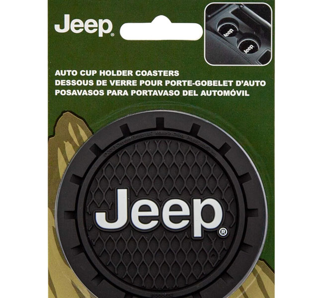
The Jeep logo font has remained largely unchanged since the 1970s. Which means that they’ve probably been doing pretty well with it. It’s basically a geometric font with bold, thick strokes. Apparently they want to capture the feel of strength, durability, and off-road capability with the typeface.
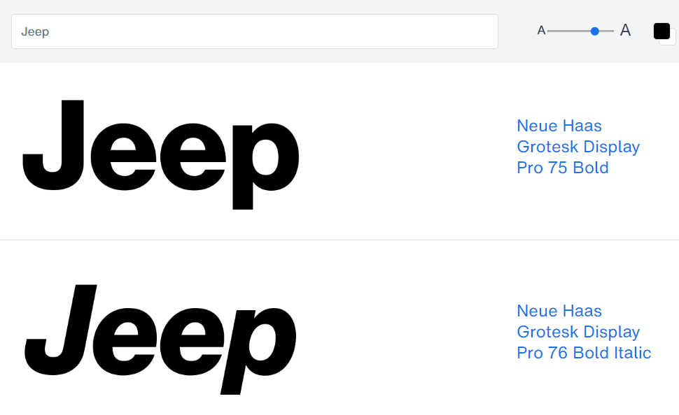
The font used for the Jeep logo seems to be the Neue Haas Grotesk Bold Font, with some personalized modifications made to the letter ‘J’ to give it a deeper dip. Personally, I think they used the letter ‘U’ for the ‘J’ and cut the side off. I tested it, and it seems to be a good fit.
If you’re planning to build a rugged brand, then this might be the font for you. Grotesk fonts are popular among top brands.
#C25. Avenir Next Font (Toyota)
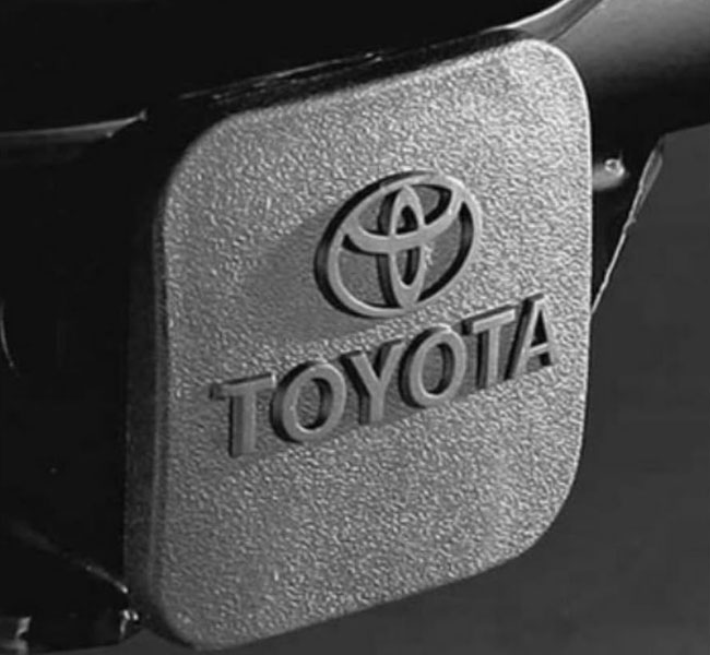
Toyota is all about consistency and quality. So their simple logo type does reflect that. It’s an all-caps sans-serif that is clean, clear, and bold. Apparently, they wanted to project feelings of strength and reliability with their typeface.
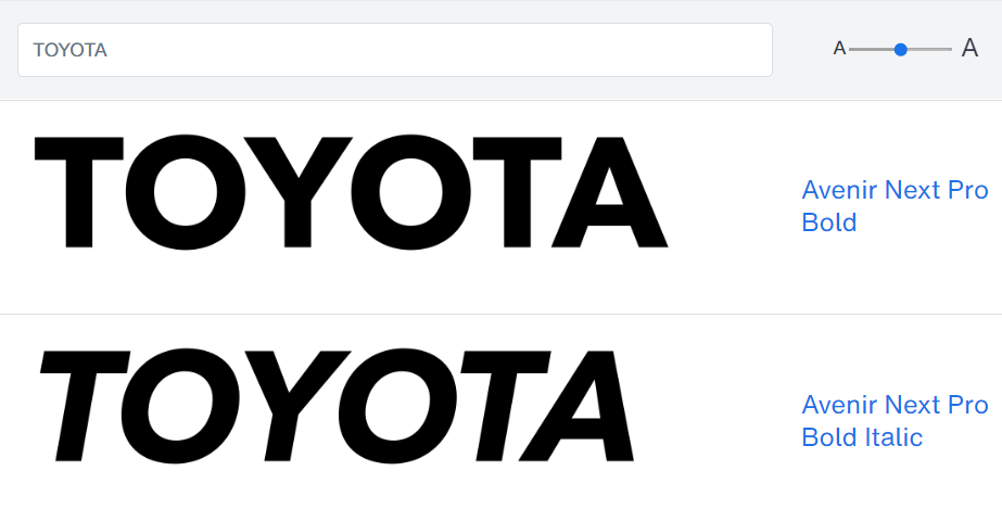
Toyota uses the Avenir Next Bold font by Adrian Frutiger and Akira Kobayashi for their logo font. Simple, straight-forward and clean. We’ve featured the Avenir Next font before as one of the top ranked minimalist fonts based on the sales data.
So if you’re looking to project an image of simplicity, reliability, quality, and consistency, it might be a good go-to font for your branding.
#C26. Futura + Verona Font (Louis Vuitton, LV)
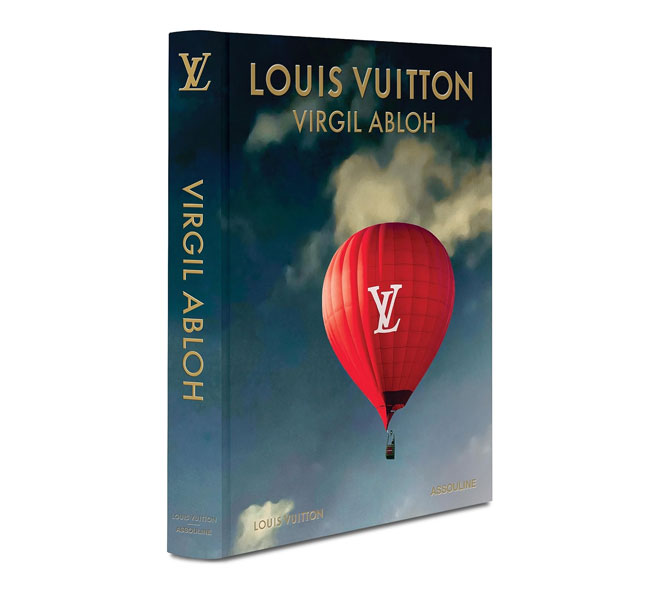
When Louis Vuitton first started his company, he want to create the highest-quality luggage. Then the counterfeiters came in and tried to mimic his stuff. So he started branding his bags with his signature logo, the LV letters.
These two letters have remained unchanged since the 1800s, which just shows how powerfully done they were. The elegant and bold styles gives off vibes of luxury and sophistication. The inspired Roman typefaces reflect classic influences and refined aesthetic.
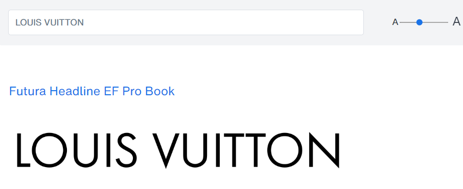
The Louis Vuitton wordmark uses the Futura font. As for while style of the Futura font, it is likely the Futura Headline font. Though it seems that they do switch it around between different fonts. The font is clean and straightforward, with geometric shapes. The bold and elegant lines speak of luxury and sophistication.
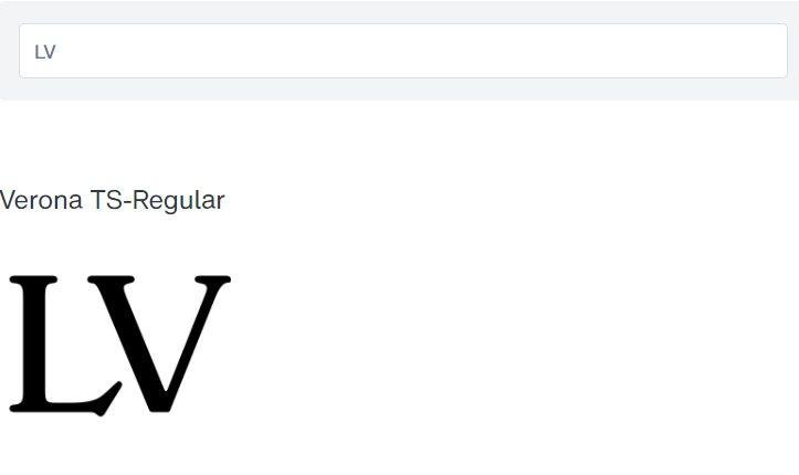
Same like for Fisher-Price, I do believe the ‘LV’ logo font is based off of the Verona typeface. The similarities are striking. The only difference being that the serifs have been cut with sharp edges, instead of the rounded edges that are typical. The ‘L’ would also be a striking match if it were italicized.
Unfortunately, this Verona font family doesn’t include italics. So a good substitute would be the Replay Pro Bold Italic font for the letter “L” italicized. These two font families, combined with some cutting and sharpening of the edges, would make for a good luxury brand identity.
20 TOP PLAYFUL & ARTISTIC FONTS
These are fun and energetic fonts. Typically people go after these for brands targeting a younger audience. Or for the adult who is a kid at heart.
#P1. Variex Regular Font (Baskin Robbins)
The previous Baskin Robbins logo typeface is extremely similar to (or maybe it actually is) the Variex Regular font by Emigre. It’s fun. It’s lively. And the letters have different thicknesses, giving you a playful vibe.
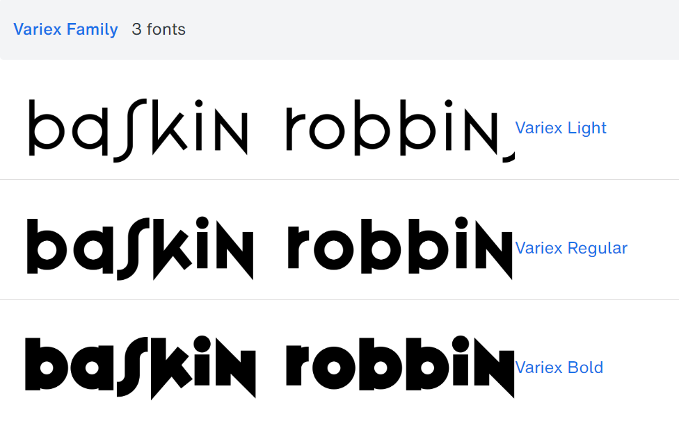
The Variex font makes you feel cheerful and welcome. Great for brands that want to seem friendly and approachable. That being said, it could be a great choice for logos in the food and drink industry, children’s products, entertainment, or any type of business where your job is to make people’s lives more fun and engaging.
#P2. ITC Clover Font (General Electric)
For the General Electric logo, the company uses a personally designed and trademarked font called GE Inspira. This font is only for use within the company’s operations. Even advertising firms granted access to the font are only allowed to use it for GE-related branding campaigns.
The logo font gives the appearance of one big swoosh that swirls smoothly from the ‘G’ all the way to the ‘E’. It was designed to create feelings of adaptability, fluidity, trustworthiness, innovation, and dependability. It also gives feelings of approachability, unlike the more Classic logo fonts.
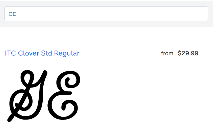
Notice how the original logo font has even stroke thickness throughout, and it curves and turns tightly from the head of the ‘G’, to the tail, to the head to the ‘E’, to the tail. It’s all done fluidly with minimal curvature and waste, which highlight efficiency as well as interconnection.
The font I’ve found that most closely conveys these feelings is the ITC Clover font by ITC. While it loses the interconnecting stroke between the letters, it maintains the feelings of fluidity, stability and confidence that the original font inspires. So if your brand focuses on instilling both innovation and stability at the same time, this might be a good choice.
#P3. LDWalt Font (Disney)
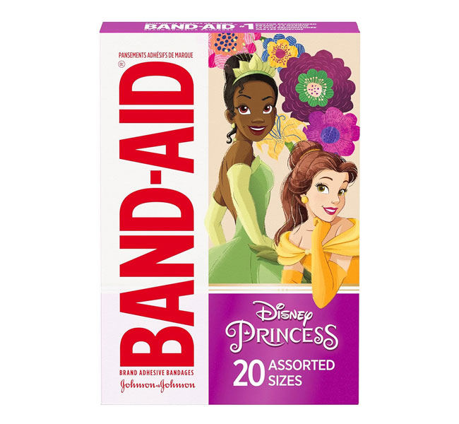
People all over the world love the Disney logo font. Because it radiates nostalgia. And its whimsical qualities remind them of fond memories of childhood, along with their most beloved characters.
The font was designed based on Walt Disney’s autograph, thus capturing the playful spirit of Disney’s signature storytelling and animation. The fact that it was handwritten also makes it instantly recognizable, and it resonates with you emotionally.
The rounded letters and friendly appearance reflect the warmly enchanting world of Disney. It helps build appeal in fans who associate it with excitement and new adventures.
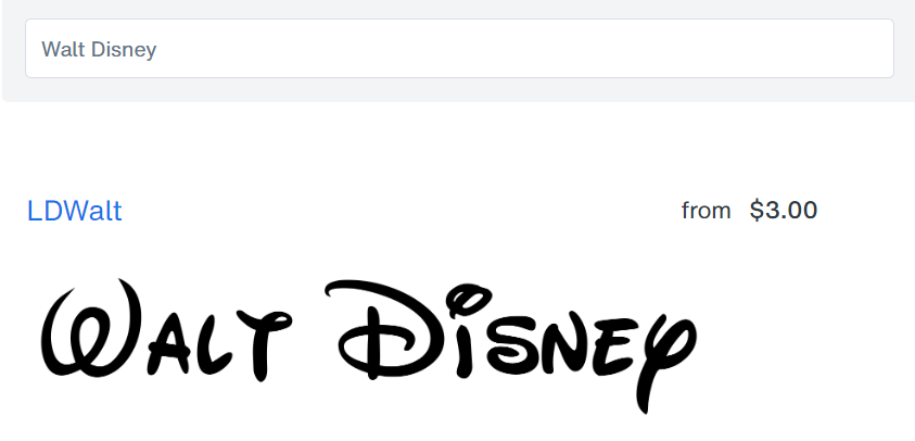
If you’re building a brand that is in the business of telling stories, and forging a personal connection with your audience, then the font I’ve found that most closely resembles the Disney font is the LDWalt font.
While not exactly the same, it is handwritten in a similar style, and carries the same whimsical feelings. Just click the button above to try it out.
Using a Disney-inspired font in your branding can evoke feelings of joy and nostalgia in your audience. It also makes it easy to connect them to the magic and wonder that your brand brings. The fun typeface builds a sense of playfulness and creativity in your customers, encouraging them to positively engage with your brand.
#P4. Balloon Font (Nickelodeon)
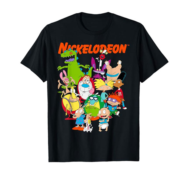
The version of the Nickelodeon’s logo people loved the most was the 1984 – 2009 version. It had a vibrant “splat” and playful font that captured the fun and creativity of Nickelodeon’s classic cartoons, resonating with millions of viewers who grew up with the channel.
This was also when the company finally decided on its signature color palette of orange and white. The font style, along with this rest of the logo, was focused on making viewers smile and feel happy. The playful sans-serif font created a stylish and memorable look for the time, making it stand out from its competitors.
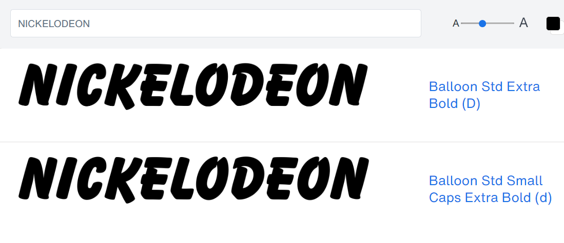
For the Nickelodeon logo font, it was originally designed using a style of the Balloon font by URW, most likely the Balloon Std Extra Bold font as you can see above. If you’re aiming to build a brand that focuses on bringing people smiles and happiness, with lots of fun along the way, you can test and download the font by clicking the button above.
Just like it did for Nickelodeon’s, using this playful font in your projects may help to quickly build a strong brand identity, while positioning your brand as nostalgic in the eyes of your audience over time.
#P5. Cool Daddy Font (Lego)
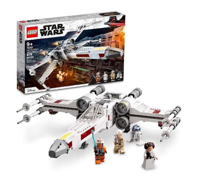
One of the reasons why Lego is one of the most iconic brands of all time is because it’s logo font perfectly captures the fun and creativity you experience when playing with bricks.
It has a playful, rounded appearance. And the thick, bubble-like letters in bold, all-caps are instantly recognizable, even from a distance. You just instantly know it’s Lego.
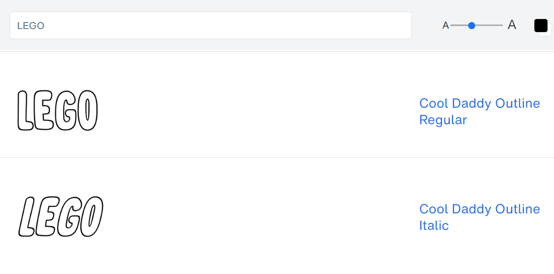
If you’re planning to build a playful and creative brand that’s instantly recognizable and loved by kids and adults alike, I’ve found that the closest font to achieving the same effect is the Cool Daddy Outline Italic font. You can click on the button above to test it out and download it.
The Lego logo font is made up of soft, rounded curves that complement its bulky appearance… making it appear friendly and approachable. When you use the Cool Daddy font, you’ll likely be able to achieve that same ‘personalized’ and warm appeal with your audience.
#P6. Fun Club Outline Font (Play Doh)
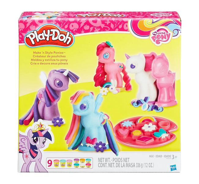
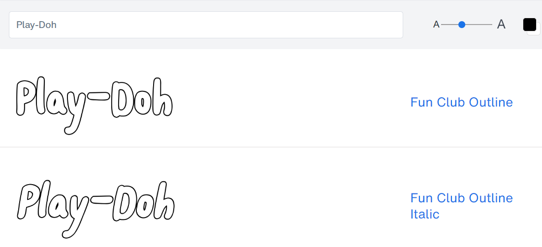
The Play-Doh logo font is very similar to the Lego logo font in that it focuses on recognizable, thick round letters. The playful, hand-drawn style further helps it to capture mindshare among a younger audience. It’s all about creating a spirit of play.
The logo font’s design has come to be synonymous with creativity and childhood. An interesting aspect of the font is the use of highlights and shadows that gives it a tangible feel. From a distance, the lines around the letters appear uneven, as if moldable like Play-Doh.
While the logo gives a child-like feel, you definitely don’t want a font that seems childish and immature. Especially if you’re doing anything related to early childhood education. At the same time you’ll want the font to not be too rigid, and lose its playfulness.
The Play-Doh font is a custom-design, meaning it’s not available for download. But I believe that the Fun Club Outline font does a good job of coming close to the spirit of the original, with some minor trade-offs. You can give it a try, and access it using the button above.
Using it will give your audience a sense of fun and imagination, while leaving them with a positive and light-hearted experience.
#P7. Cronos Pro Bold Font (Crayola)
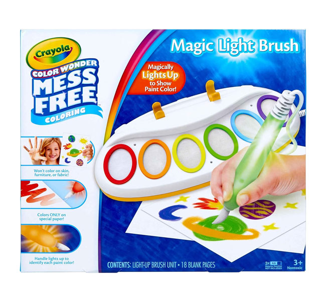
Vibrant colors and memories of good, peaceful times are all things that people love about the Crayola branding. This is reflected in the vibrance of the font, as well as subtle details that make it more artistic, like the gentle protrusions over the ‘r’ and ‘a’.
The seemingly geometric font shape also helps to create a warm and inviting feeling.
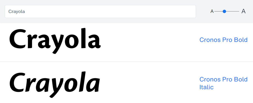
It seems that the Crayola logo font is largely based off of the Cronos Pro Bold font by Adobe, with some personal customization of the letter ‘a’. If you’re looking to create a similarly fun and artistic experience for your audience, you can test and download the font by clicking the button above.
Using this font will give your brand a perception of fun, approachableness, friendliness… while having tints of artistic creativity mixed in.
#P8. Letraset Crillee Font (Nerf)

The Nerf logo font highlights the brand’s playful and energetic spirit. It does this by tilting the letters diagonally to the right. Along with the swoosh and the tiny contrasting serifs at the corners, it gives the the feeling of speed and motion.
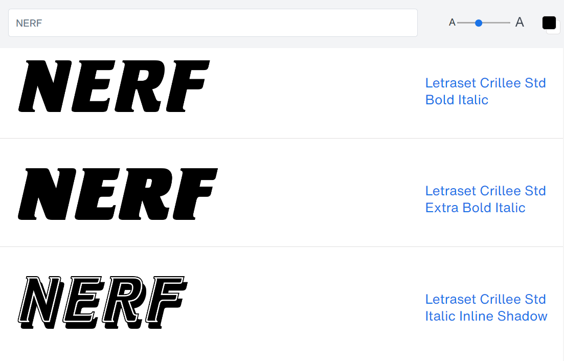
The Nerf Logo uses the Letraset Crillee Font, specifically the Letraset Crille Std Bold Italic. The font’s slight right leaning and its geometric forms create feelings of power and speed. If you’re building a brand that emphasizes fun, speed, and maybe even power, you can grab this font for a whirl by clicking the button above.
The font will impress your audience with a cool, modern appearance. It’s best to space the letters closer together to achieve the desired effect.
#P9. Jabberwub Font (Fanta)
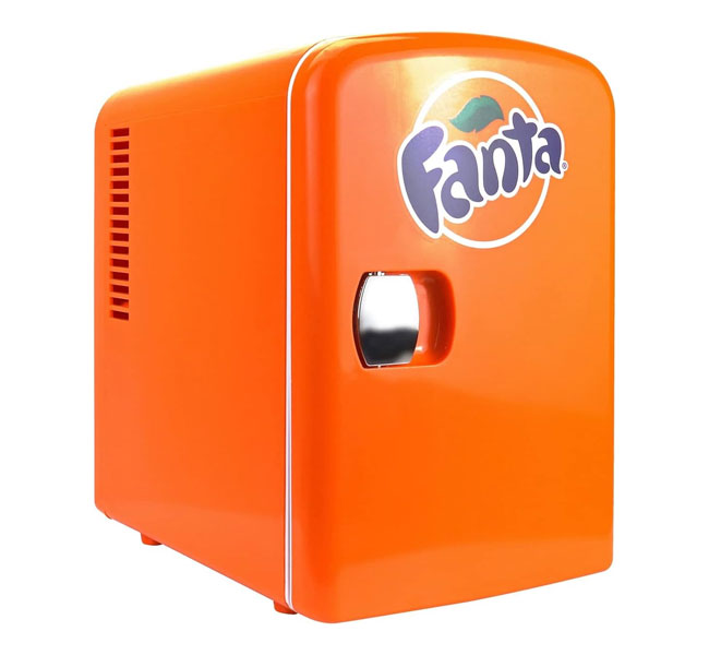
Fanta did a good job reflecting their brand’s fruity beverages in their playfully vibrant logo font. The freeform well-rounded letters and extremely dynamic, contrasting thick and think strokes create a visually appealing and memorable identity. It gives a strong feel of fun and spontaneity.
Upon closer inspection, I strongly believe that the Fanta font was just your average fancy bubbly font put into Photoshop with a ‘Warp’ effect applied in a couple of random directions.
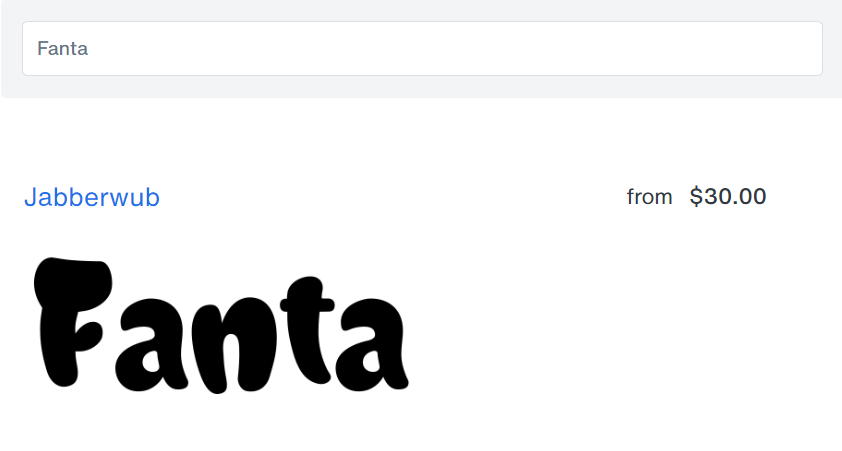
From my observation, I’d say that the original font was most likely something in the style of the Jabberwub font. Just put it into Photoshop, move the letters closer together, apply a ‘Warp’ in random directions, and have a pretty good mimic of the original design. If that doesn’t impress your audience, nothing will…
#P10. Barley Script Font (Kellogg’s)
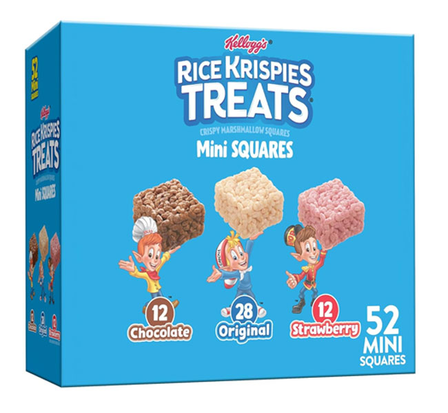
People have a strong emotional connection to the Kellogg’s logo because it reminds you of breakfast, the first meal of the day you had for years. However, none of this would be possible without the logo font’s iconic script style and vibrant red colors that make it instantly recognizable.
The Kellogg’s logo uses a custom script typeface. They’ve been using the same font since the early 1900s, which proves how timeless it has been. Elegant, flowing letters remind you a traditional breakfast with Kellogg’s.
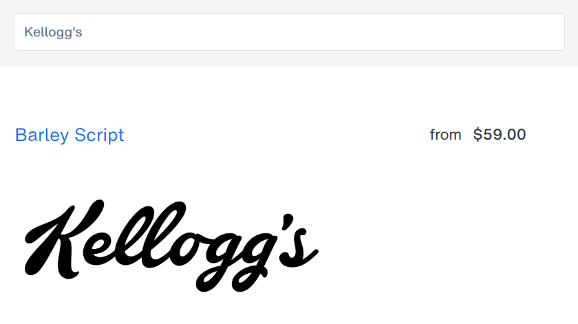
While the exact Kellogg’s typeface is unknown, you’ll find that the Barley Script font by Mans Greback is remarkably similar, capturing the embellishments of the letter ‘K’ perfectly, as well as the irregularly heighted ‘l’ and the consistent and smooth flowing motion of the script.
If you’d like to make your brand a fun and warm way to start the day, then click the button above to try the font out. It’s been working for over a century…
#P11. Polyphonic Narrow Bold Font (M&M’s)
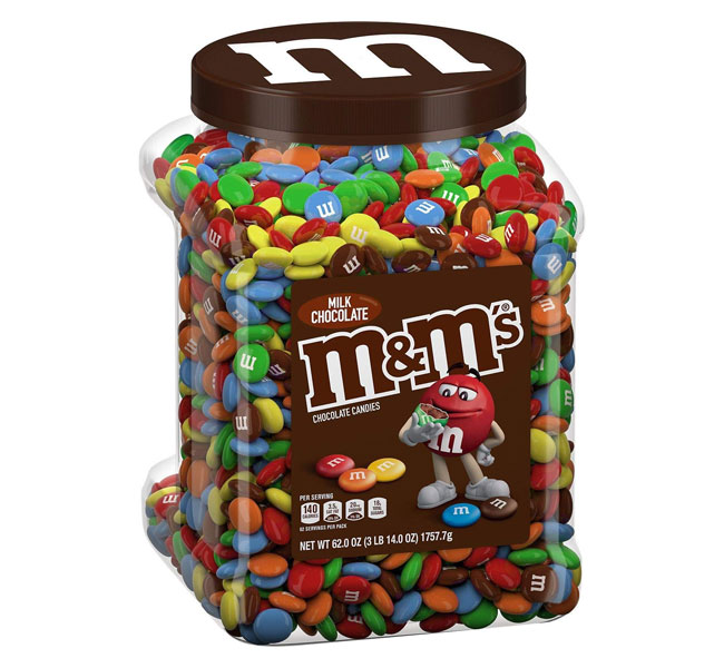
The M&M’s logo uses some classic serif fonts, but in a fun sort of way. By repeating the same letter twice side-by-side, separated by a small ampersand in a more playful font style, and a little tilt to the right in the style of Nerf… it takes something old and adds an element of fun to it.
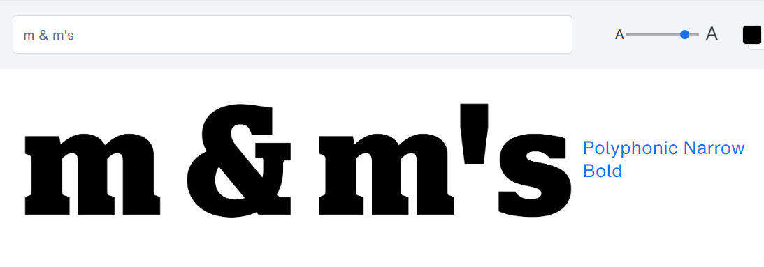
After a lot of searching, I found that the Polyphonic Narrow Bold font gives the closest resemblance to the M&M’s logo with respect to the letters. Especially the letters ‘m’ and ‘s’, which are shockingly similar except for some slight modifications. Like the filling out of the curves at the top of the ‘m’s and the cutting of some slight serif spaces on the ‘s’.
The ampersand ‘&’ was likely taken from a different, more playful typeface, or modified as well. You can test it out by clicking the button above.
#P12. TS Verona Font (Fisher-Price)
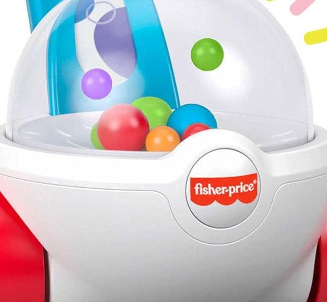
What I like most about the Fisher-Price logo font is how strongly it reminds me of early childhood. The flat ‘S’ reminds me of crawling as a baby, the uneven ‘H’ legs remind me of the unevenness you go through as you’re learning to walk, the tilted ‘e’ as if you’re a child waiting to be fed and constantly looking up and crying.
It just puts all the feels in the right places.
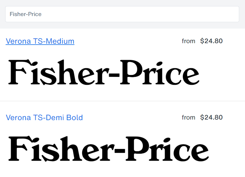
I’ve found that the Fisher Price logo font is most likely based off of the Verona TS font by TypeShop Collection with some personalized customizations. Like rounding off all the sharp edges, flattening the ‘s’. However, the signature uneven ‘h’ legs are unmistakable, along with the upwards-tilted ‘e’.
Most similar is the Medium or Demi-Bold styles.
If you’re planning to build a fun, nostalgic brand that reminds your audience of the unevenness and fun they have through life, then this font is a good bet. It just adds a playful and carefree element to all your branding.
#P13. The Bonkey Font (Fruit Gushers)
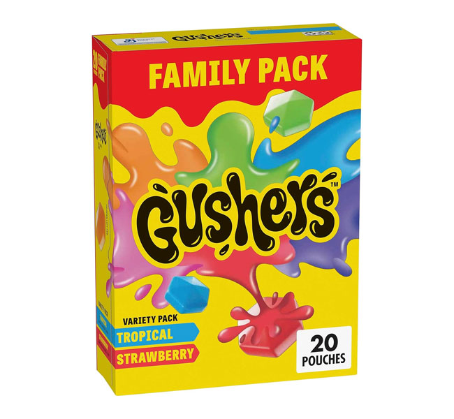
The original Fruit Gushers logo (now known as Gushers) featured bold capitals, being squeezed at the right end, much the way you would squeeze a Gusher between your teeth. The new logo redesign focuses on the a playful, wet and liquid feel with clear, direct bold fonts.
Likely, the redesign wanted to make the font clearer on multiple media, especially smaller screens like mobile. One thing that Gushers does well with all their logos though, is that they try to capture the experience of eating a Gusher right in their fonts.
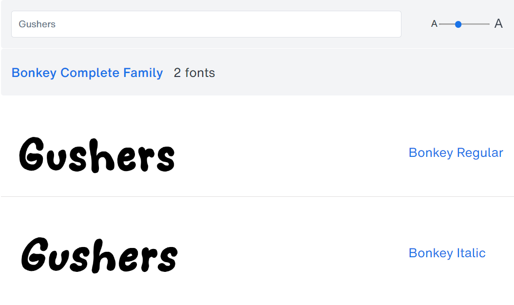
Similar to the Fanta font, the Gushers logo font is a personalized font that was likely designed by stretching and warping a squishy, liquidy font and applying highlights to the tips of the letters.
A font with a similar, liquidy feel to the Gushers logo is the Bonkey Font. I see a lot of similarities. All you need to do is to squish the font as you wish in your photo editor of choice. Click the button above to try it out.
#P14. Tailwind Black Font (Popsicle)
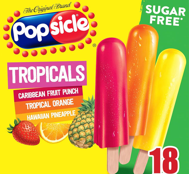
With a popsicle in the background of the logo, the Popsicle font is well-designed to be big, bold, round, and fun… easily readable, and standing out from the rest of the logo. I’d say the current evolution of the logo font is a better choice with its geometric shapes, and round curves.
The previous logo font had lots of sharp edges, contrasted a bit too much with the popsicle logo in the background.

A font that achieves a similar result and feel as the Popsicle logo font is the Tailwind Black font. It maintain the signature rounded letters, and upward tilting ‘e’, with minimal differences in the width of the other letters. Notice that the capital ‘p’ is just the small ‘p’ moved up.
Overall, it achieves the same effect, which is a playful boldness which captures attention instantly, and standing out instead of blending into the logo background. You can test out this font by clicking the button above.
DID YOU KNOW: “The popsicle we know today was first invented by the founder of the Popsicle company when he was just 11-years old. One day he went out in the snow to play, with a cup of fizzy water mixed with jam for a snack. The liquid froze with the spoon still in the cup and became his first popsicle. He liked the treat so much, he started selling frozen lemonade popsicles, incorporated his company, and his fortune began from there.”
This font captures the spirit of invention – if you have something new and innovative, where your invention is so good the results speak for itself, this typographic approach might be for you.
#P15. Gainsborough Font (Candy Crush)
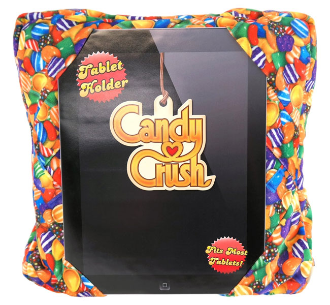
I like the way the Candy Crush logo font portrays the characteristics of the game – sleek, smooth, simple, and dandy. At the same time, it gives off a vibe of being whimsical and fun.
Specifically, the alternating between tall, thin lettering and rounder, more geometric fonts makes for some interesting eye candy.
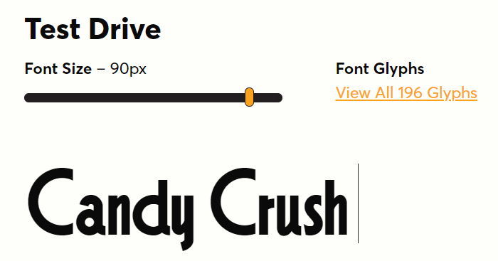
The Candy Crush saga logo font is based on the Gainsborough font by Harold Lohner. There are some slight modifications to the original font, like the sharp angular cut on the ‘d’ and the extended ‘y’ and ‘h’. If you’re going for a sleek and fun brand, you can try it out by clicking on the button above.
#P16. TT Slabs Condensed Font (Ben & Jerry’s)
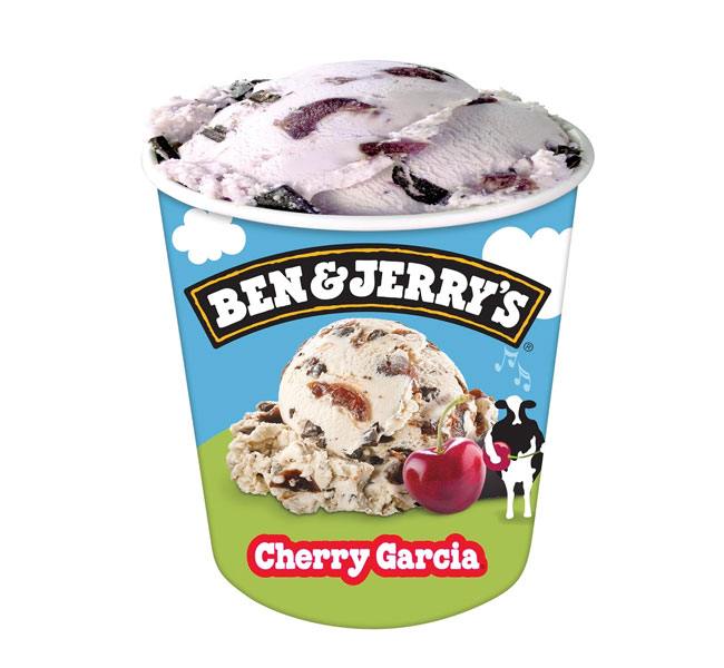
The Ben & Jerry’s logo font gives me a vintage feel, but at the same time also gives me a very personal feeling because of how it looks like the lettering was done with a marker. The edges and curves are nice, yet imperfect giving a human touch to the design.
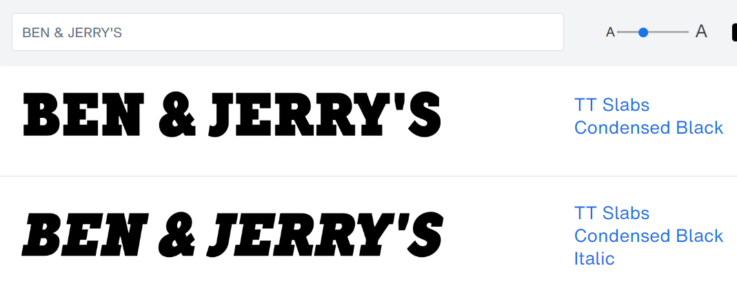
The font for the Ben & Jerry’s logo was a custom-designed typeface. However, it has very strong resemblances to the TT Slabs Condensed Black font with some minor modifications making the original more hand-drawn. And with some touches on the ampersand, J, apostrophe, and S.
If you’re going for a playful vintage look that screams ‘personal’ for your brand, then this font might be a good place to start. Click the button above to check it out.
#P17. Neue Haas Grotesk + Futura Maxi Font (McDonald’s)
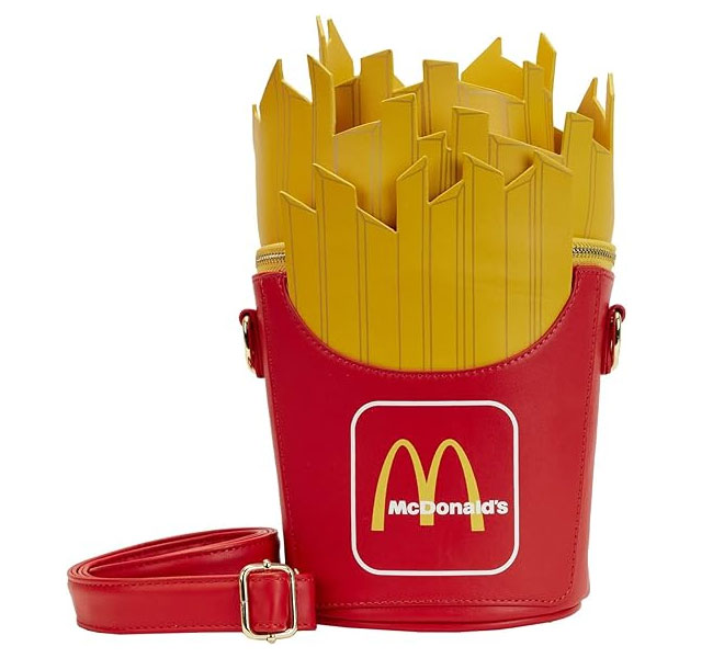
The McDonald’s logo is one of the most iconic in the world, almost everyone recognizes it from miles away. However, while arches like those are easily hand-drawn, what helps convey the message of those arcs is the text conveying the McDonald’s name on the right of it.
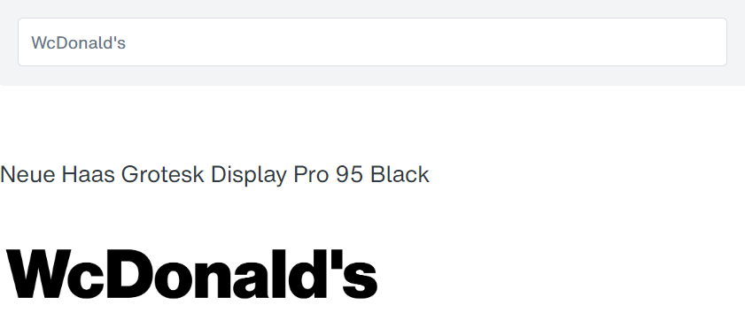
Based on my observation, the font for the McDonald’s logo is very likely the Neue Haas Grotesk Display Pro 95 Black font. As many might have guessed, it’s possible that the M shape is likely done with an upside-down ‘W’, with the other letters squished down slightly, cutting off the height of the ‘l’ and ‘d’.
If you’re planning to build a brand with consistent service and delivery where people always know what to expect, you might want to look into playing with the consistent Neue Haas Grotesk.
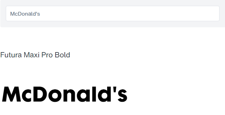
Another font with similar characteristics is the Futura Maxi Pro Bold font. With it’s wide-legged M, and squished-down capitals, as well as the shortened ‘l’ and ‘d’ tops, it makes a good alternative if you’re looking for something more compact with a lot of impact.
#P18. ITC Clearface Pro Font (Dairy Queen)
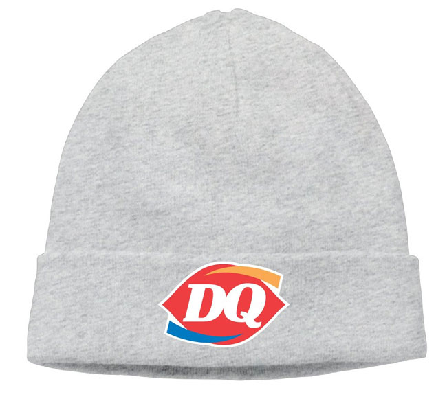
The Dairy Queen logo is basically two serif letters in italicized style. The serif helps to contribute a tint of elegance, while the italicized ‘Q’ seems to denote the smoothness of ice cream.
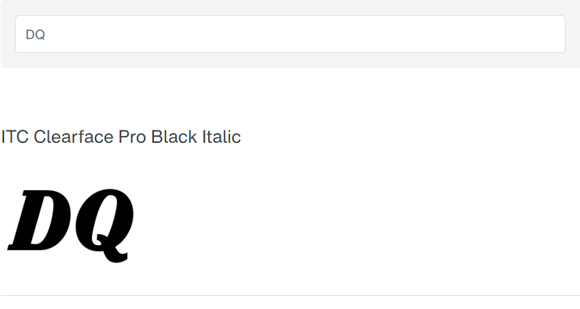
The DQ logo fonts hold a close resemblance to the ITC Clearface Pro Black Italic font. If you want to create a brand with the smoothness of ice cream, and the elegance of a queen, you might want to try this font out by clicking the button above.
#P19. CA Normal Serif Font (Cap’n Crunch)
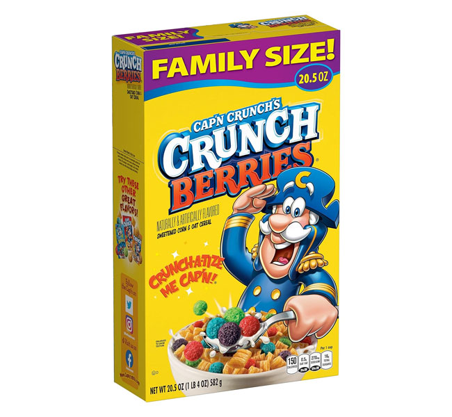
The Cap’n Crunch logo is another play on the use of serif capitals in a fun and creative way. I like how they were able to capture the feeling of the ‘crunch’ when you bite into the cereal by alternating the fonts up and down. The serif all-caps helps to portray a feeling of “captainship”, yet without being too formal, further accentuated by the ‘R’ tail.
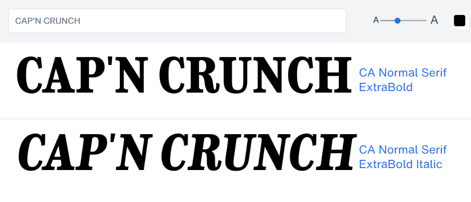
Similar to the Dior logo, the Cap’n Crunch logo uses a style of font that many know as “Egyptian”, giving it both sophisticated and playful vibes at the same time. While there are several different fonts along the same vein, I’ve found that the CA Normal Serif Extra Bold font comes the closest to the original.
The font on the cereal box is typically italicized, with additional 3d rendering and perspective adjustment, so if you’re trying to make you brand pop-out and larger than life, that’s something you can look into.
#P20. Bakeshop Bold Non-Connect Font (Wendy’s)
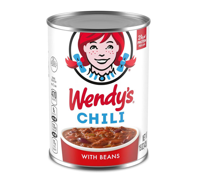
The main focus of the original Wendy’s logo was on their old-fashioned hamburgers. Over the past few decades, they’ve been focusing more on making their brand, including the font and logo, more friendly, approachable, and personable. Very similar to what other brands are doing as well.
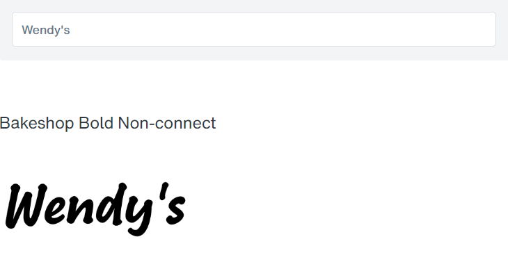
The current Wendy’s logo font is likely hand-written instead of using a font. Thus, any font that achieves a handwritten effect will help you reach the same result. But one thing you’ll notice is that the Wendy’s font is… extremely bold and simple! No excessive lines or flourishes. Just straightforward rounded letters.
It is also imperfect and personable, with the strokes constantly overlapping the letters, as in the case of the ‘e’ and the ‘d’. While not the exact font, one that I’ve found comes very close to achieving a similar feel is the Bakeshop Bold Non-connect font.
The lettering is personable, very informal yet not childish, and moves slightly upwards in a similar way to the Wendy’s logo. You can download it by clicking the link above.
#P21. Third Rail Font (Mr. Beast)
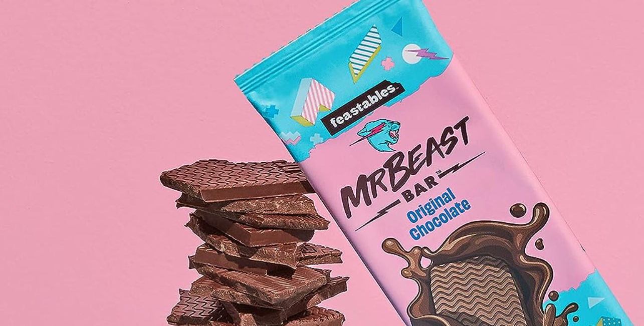
The Mr. Beast logo uses a wild and raw font that looks like it was drawn with a Permanent Marker. It stands out, and really complements his brand name and image. It also tilts slightly to the right, as if italicized, and gives a feeling of speed and power.

The font Mr. Beast uses is The Third Rail font, and fortunately, it’s a lot easier to get than his YouTube thumbnail font. If you’re planning to build a wildly viral brand, then this might be the font for you.
22 BEST MODERN & CONTEMPORARY FONTS
Clean, contemporary, these fonts just shout out the fact that you’re on the cutting-edge of your industry.
#M1. Relish Pro Font (Google)
The Google logo font is simple, clean, and sans-serif modern. With geometric lettering, and alternating colors to make it more interesting, it is eye-catching and easy to recognize at any size. It makes sense considering that Google is used across almost all ranges of devices.
Thus, the main aim with the logo is clarity across different platforms and screen sizes.
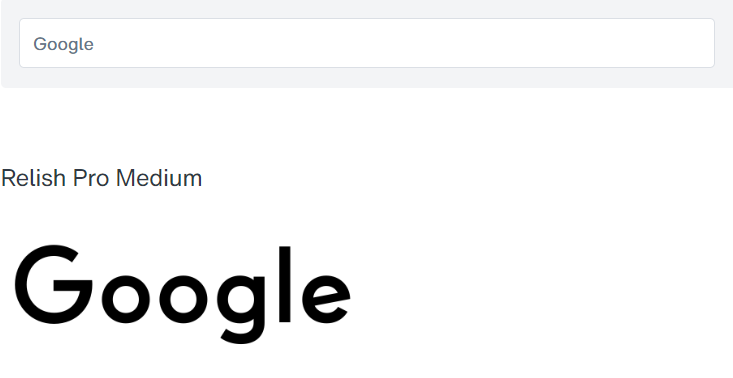
The Google logo uses a propriety in-house font called Product Sans. However, if you’re planning to build a digital brand that is clear and easily recognizable no matter what device your audience is using, then The Relish Pro Medium font comes the closest to the original Google font.
It even includes the playful, tilted ‘e’. Bold, clean, modern, and circular.
#M2. Gilroy Font (Airbnb)
The Airbnb logo is interesting, because it combines the letter “A”, an upside down heart, as well as a location pin, all in one design. It might be a paperclip too. But the Airbnb logo font follows the same modern concept as Google, with a simple and clean geometric sans-serif design.
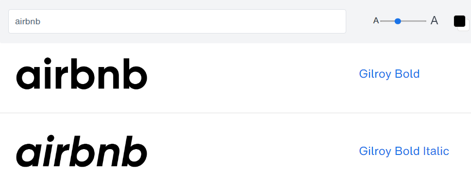
While the Airbnb logo font is said to be a custom typeface known as ‘Airbnb Cereal’, I’ve found that it is shocking similar to the Gilroy Bold font. From the circular, geometric letters, to the short reaching ‘r’, the shortened ‘b’ tops, and the slightly condensed ‘n’.
Anyways, if you’re planning to build a global, digital brand that is quickly and easily recognized worldwide, then this font might be your best bet. Click the button above to check it in and out.
#M3. Gotham Font (Spotify)
The Spotify logo is yet another instance of clean, modern, geometric typeface used by a tech company. It seems they like these sorts of fonts a lot. And if that’s the type of brand you’re building, perhaps the public has even come to expect that.
It is understandable though, because this type of font is seen by most as being easier to read on different screen sizes and devices.
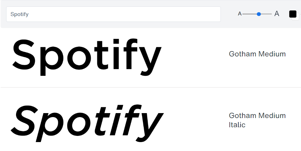
The original Spotify logo font seems to be based off of the Gotham Medium font by Hoefler & Co. They are both the same, with the only difference being the circular ‘i’ dot instead of a square. Another great choice for digital brands if you’re going there, especially if it’s related to music.
The sharp angles in letters like ‘s’, ‘t’, ‘f’, and ‘y’, and smooth curves in letters like ‘p’, all helps to accentuate sleek, smooth, and crisp clear service. If you have a similar service, this might be for you.
#M4. DIN Neuzeit Grotesk Font (Uber)
Clean, simple, bold, sans-serif and geometric. All common themes with tech-related modern logo fonts. The same holds true of the Uber font. No surprises at all. Except for the slight tail sticking out of the ‘U’.
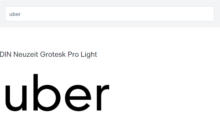
While the Uber font is an in-house thing, one of the closest matches to the feel and design of it is probably the DIN Neuzeit Grotesk Pro Light font by Linotype. Everything is virtually the same, except that the top of the letter ‘u’ has been enlarged. Or perhaps, they took the capital letter ‘U’ and added a tail on the right.
At any rate, if you’re offering simple and easy direct service online, then this might be a font you’ll want to look into.
#M5. Bebas Neue Font (Netflix)
The Netflix font has followed a largely similar trend of going with All Caps letters. But eventually, they decided to simplify stuff and remove all the drop shadows. And thus, focusing on simplicity and minimalism, both as a brand and also in their branding.
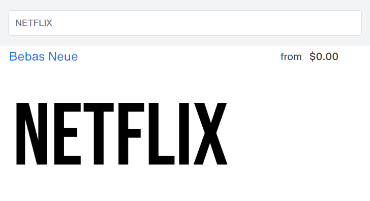
The Netflix logo font seems to be based on the Bebas Neue font. The resemblance is stunning. With the exception of a round curve distortion underneath the letters, which can be done in any good image editor.
If your brand has a strong focus on simplicity and good times, then this isn’t a bad choice.
#M6. Alternate Gothic Font (YouTube)
The YouTube logo font has remained largely unchanged since the beginning. The only thing they played around with was moving the red background around, and eventually, separated it from the text. The simplicity of just text isn’t bad.
Unlike the other tech giants, the YouTube logo has a nice sense of style, clean and interesting.
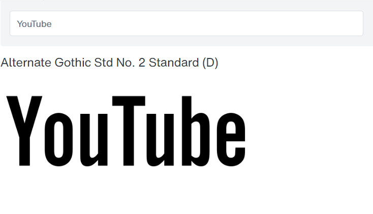
The YouTube logo seems to be strongly based off of the Alternate Gothic Std No. 2 Standard (D) font by URW. The tall and thin letters coupled with sharp, angular curves makes for a sleek and and interesting design. It might do well for a similarly, sleek and interesting brand.
#M7. Geometrico Sans Font (Adobe)
The latest evolution of the Adobe font follows in the way of the geometric letterform. It still maintain the mirroring ‘d’ and ‘b’ letters which create a form of cohesion. But they’ve also replaced the letter ‘A’ directly with their logo in some versions of their logo. It seems like minimalism, and cutting things down has been a theme.
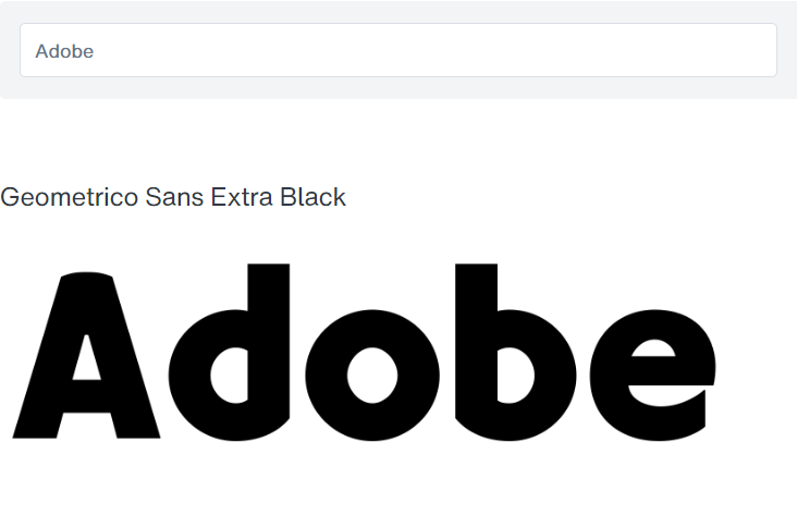
The latest evolution of Adobe’s font seems to be very similar to the Geometrico Sans Extra Black font, with the rounded, geometric characters. All except the proprietary ‘A’ of course. If you’re looking to build cohesion and simplicity in your brand, then this might be a good font to play with.
#M8. Sharp Grotesk Font (Dropbox)
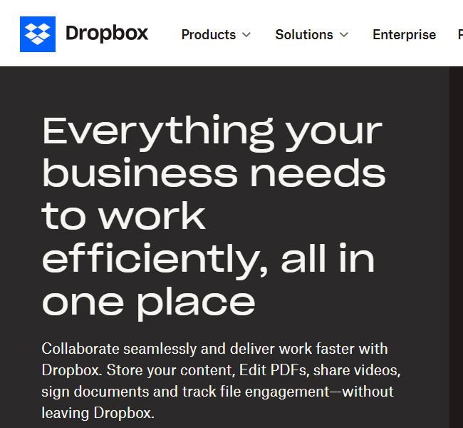
Like most other companies in the tech space, the Dropbox logo font has evolved over the years to become more and more rounded and geometric. What is interesting about the logo font is that they’ve taken care to make the letter-width equally space, so it feels very orderly and box-like.
The sharp curves over the ‘r’, ‘p’, ‘b’, make for some interesting feels.
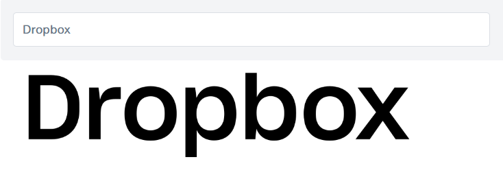
The font used by Dropbox is the Sharp Grotesk Paneuropean Medium 20 font. You can try it out and download it by clicking on the button above.
#M9. Grandista Font (Instagram)
In sharp contrast to other modern companies in the tech space, Instagram choose to go with a script font for its logo branding. And a very fancy script font at that. The font boasts some sharp curves, and is smooth and sleek, while being even and organized.
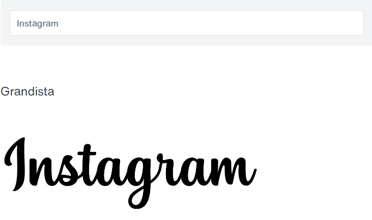
The Instagram font is extremely similar to the Grandista font by Mytha Studio. If you’re building a modern brand that focuses on beauty and aesthetics, then this might be the font for you. Click the button above to try it out.
#M10. Tesla Font (Tesla)
As far as modern fonts go, the Tesla logo font is definitely more ‘futuristic’ than the rest, neither going for geometric or anything rounded. As far as readability, I don’t know. But after seeing it a few times, the unique look cements itself as the Tesla logo font automatically, even if you can’t read the text.
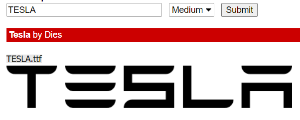
While the Tesla font is a custom-designed typeface, there is a fan-made version that’s free for personal and commercial use under the Creative Commons license, granted the user credits the author. If you’re planning to build a futuristic brand, then this font might be your go-to.
Or if you prefer something without any restriction, you might try The Resistance Is Lowered Font, which is really similar without the added cuts in certain letters like the ‘e’ and ‘a’. The Syndicate font is another one with less similar looks, but more similar vibes.
#M11. Neue Haas Grotesk Font (Pinterest)
The Pinterest brand identity is considered to be one of the most successful modern brands of the last few decades. While the logo has remained largely the same, they’ve pivoted a bit on their logotype, going from a script font, to a geometric sans-serif, just like everyone else.
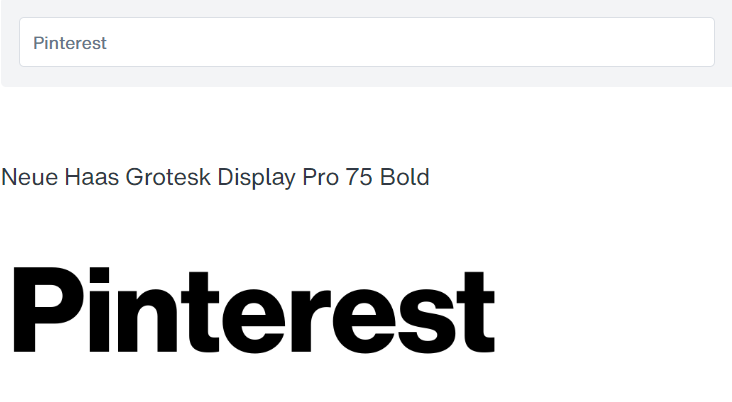
The Pinterest logotype seems to be based on the Neue Haas Grotesk Display Pro 75 Bold font, with the exception of the square-dotted ‘i’, which has been replaced with a circular dot.
It looks like Grotesk fonts are popular with brands building a mostly digital presence, like Pinterest, Dropbox, and Uber. But it has been working!
If you’re planning to build a Pinterest marketing automation, or other related social app, then this might be the font for you.
#M12. Special Alphabets 4 Font (X)
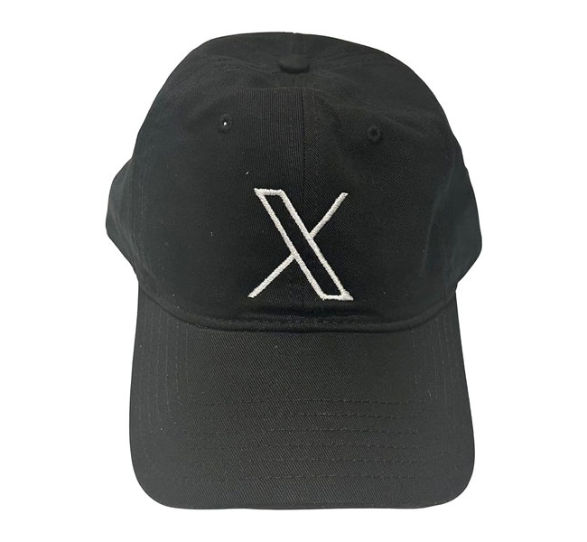
Formerly known as Twitter, the logo for X basically makes logotype as minimalistic as you could possibly be. It’s only one letter. It has no fill. And one leg is thinner than the other. That being said, if you’re going for the ultimate in minimalistic branding, there’s much to be learned.
Throughout history, brands with simply letters have done pretty well. For example, your typical three-letter news channel, or your typical three-letter fried chicken chain.

The X logo is basically the letter ‘x’ from the Special Alphabets 4 font by Monotype. If you’re planning to build a minimalistic and futuristic brand that aims to become a global village, then it’s a font you might want to look into. Click the button above to play with it.
#M13. Aspira Wide Font (Facebook)
While the Facebook parent company has rebranded as Meta, the original Facebook platform still retains its original brand identity. The current Facebook logotype is also a geometric typeface with similarly-widthed characters, much in the style of Dropbox.
But it has opted to go with sharper edges and cuts for its lettering.
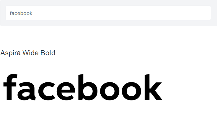
The Facebook logotype font seems to be based on the Aspira Wide Bold font, with a modification on the ‘a’. The cuts on the tops of the ‘b’ and ‘k’ are strikingly similar. If you’re building a brand that allows people around the world to connect, perhaps this might be the font for you.
#M14. Futura Extra Bold Font (Nike)
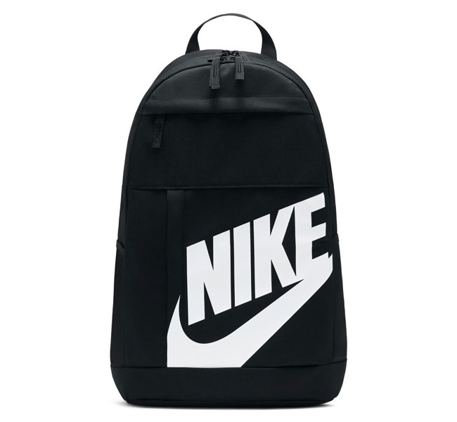
The Nike logo is one of the most recognizable brands in history. In addition to the logo, the logotype has been equally iconic. The bold capitals, combined with the tightly spaced text, tilted at a strong oblique perfectly express power and speed.
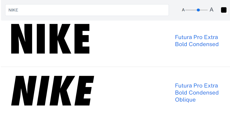
The Nike font is known to be using the Futura Pro Extra Bold Condensed font by Linotype. They do apply an extra oblique to their logo fonts as well. In addition to this Futura version, there’s also a version that’s known to be specially designed for Nike, the Futura ND for Nike 365 font, which is available for purchase.
#M15. Univers Next Font (Samsung)
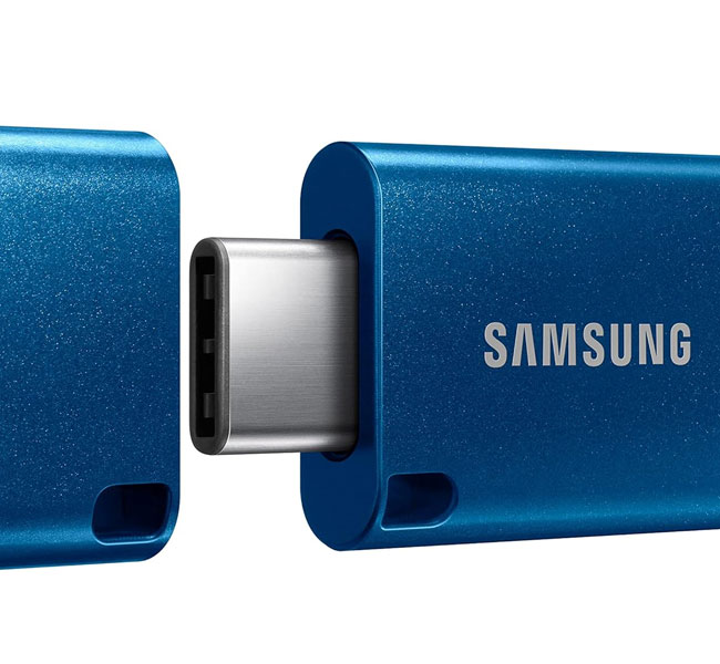
Samsung has always been using sans-serif capitals for their logo text, but over time they’ve evolved their brand identity from a bolder look, to one that’s cleaner and more modern. The focus on simplicity and readability is to highlight how much they emphasize quality and usability in their products.
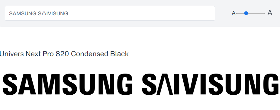
The Samsung logo font is very likely based on a variant of the Univers Next Pro Condensed Black Font. The only modifications would have been made to the A, M, and the G. It can be achieved by removing the center line from the ‘A’, or simply by using a variety of lines and slashes, and adjusting letter spacing.
#M16. Myriad Pro Font (LinkedIn)
Unlike other companies in the tech space, LinkedIn went with a more geometric, bold, and wide design for it’s logotype right from the beginning. And it hasn’t swayed away from that since then. It’s obviously been working well for them, as companies worldwide rely on them for quick and easy hiring.
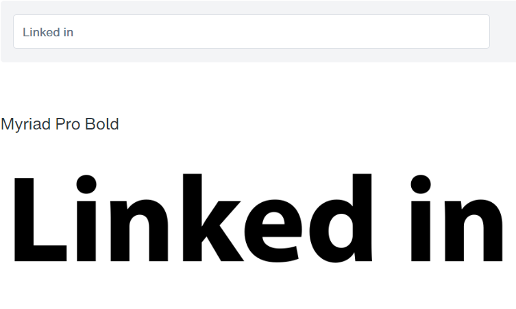
The Linkedin logo type seems to be based on the Myriad Pro Bold font. Not any differences that I can see at a glance. If you’re building a brand that focus on B2B, business to business, I’d say that this is a nice font to test out on your branding.
#M17. Futura Bold Font (PayPal)
The thing I like about the Paypal logo font and type isn’t the font itself, but the fact that they used two shades of blue that work well together. And they repeat these two shades for their logo. But the font itself has trended towards being more geometric as well over time.
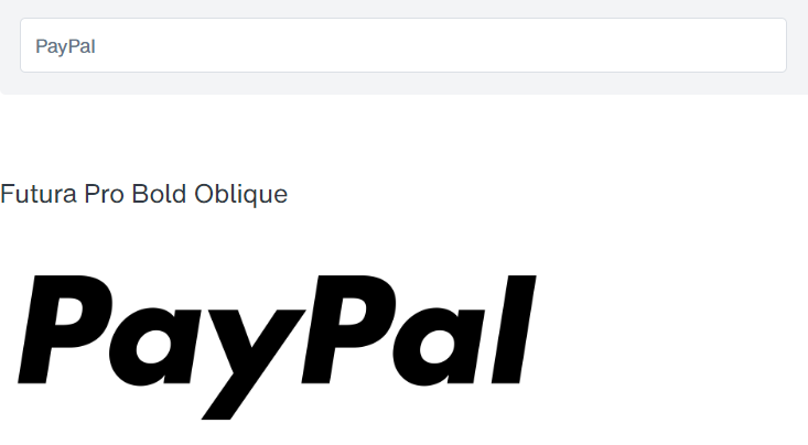
It seems that the Paypal logotype is based on the Futura Pro Bold Oblique font. The only different being that the letter ‘y’ is slightly shorter, so it was quite possibly trimmed for some personal customization. The Futura font family is popular with quite a number of top brands. Give it a try, and you might just be one of them.
#M18. Hyperspace Race Font (TopGolf)
From tech-driven digital companies to tech-driven golf, one thing TopGolf does well is making their brand identity feel modern and futuristic. They initially went with a simple geometric san-serif typeface like all the other tech companies do, but rebranded their logo to be more ‘high-tech’.
Their current logo font features a more contemporary blockish design, with lots of cuts and squarish corners. The accent on the letter ‘G’ creates an interesting negative space image of what looks like the head of a golf club.
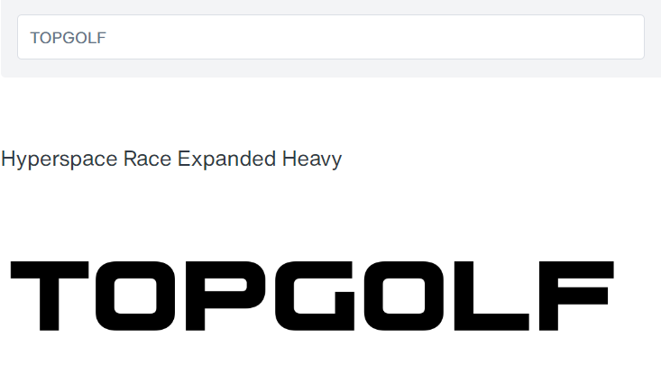
The font that TopGolf uses for their logo seems to be the Hyperspace Race Expanded Heavy Font. They did make some minor modifications to the font. Such as adding a sharp cut to the letter ‘G’ and italicizing the text very slightly to the right to give the illusion of movement.
But if you’re build a brand that is tech-driven, futuristic, and merges something old as time with something cutting-edge (like merging golf with new technology), then this might be a font you’d want to look into using. Click the button above to test it out.
#M19. TT Fors Font (Adidas)
I generally prefer Nike over Adidas. I think the founder of Nike, Phil Knight (listen to his Amazon biography), is a badass. But this is about Adidas so…
The Adidas logo changes every decade or two. But one thing that they haven’t changed over the last several decades in the logo are two things: the 3 stripes, and the logo wordmark font.
Their logotype font uses all lowercase letters to improve approachability and recognizability, in contrast to brands that use all uppercase letters. The focus is also on a clean, geometric, modern look with the typeface.
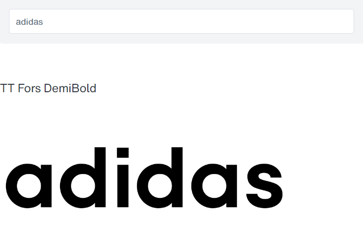
It seems to me that the Adidas logo type is extremely similar to the TT Fors Demi Bold font. The only difference is in the height of the ‘d’ and ‘i’ tops, which was shortened, likely drawing inspiration from the ITC Avant Garde Gothic Demi Bold font.
The font is clean, geometric, and wide-lettering makes it clear even from a distance. If you’re building a brand where you believe that ‘impossible is nothing’, then this font may help that boldness stand out.
#M20. Sharp Sans Font (Firefox)
Most modern fonts are just that – ‘modern’. They don’t really look sleek. The Firefox logo wordmark is really sleek. From the color, to the curves, to the geometry… I think a lot of time and thinking went into choosing the font for their branding.
They’re using a geometric sans-serif font with some very smooth curves. It’s also my preferred browser on mobile.
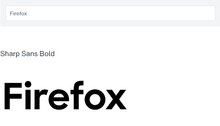
The Firefox logo type uses the Sharp Sans Bold font to achieve its sharp and sleek look. If you’re build a brand that is performance-based, and you score points for sleekness, this is definitely a font I would go with.
#M21. Belong Sans Font (TikTok)
The TikTok logo text initially separated the two words Tik and Tok. They eventually joined it together into one logotype. It’s neat how they highlighted the letter ‘o’ with their signature 3 colors, to make it similar to the effect in their logo.
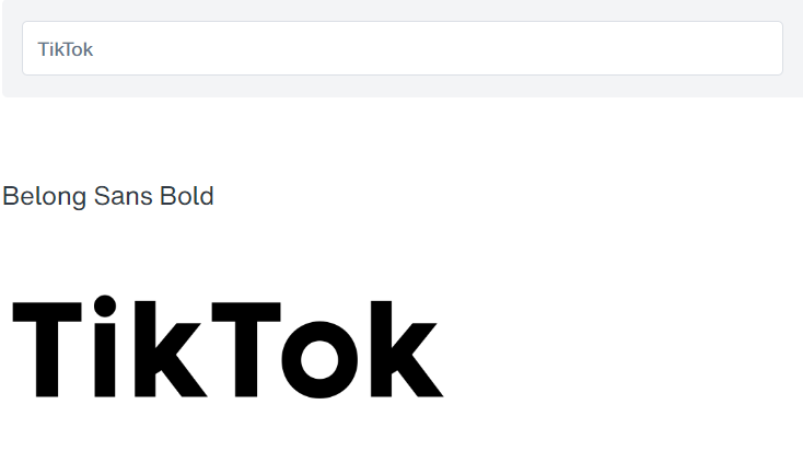
While the TikTok logo font is a custom-design, made up of two or more different fonts, the closest font that I’ve found to the original is the Belong Sans Bold font. It is almost the same in almost everything, from the wide-mouthed ‘O’, to the ‘T’ and ‘K’ height, length and structure.
The main difference would be customization on the letter ‘i’, making it shorter, and the specially cut side on the ‘T’. If you’re planning to build a brand around music or dance or short bits of video clips, then this may be a great font to start with.
#M22. TT Norms Font (DoorDash)
The DoorDash logo was first inspired by the Japanese Shinkansen, representing both speed and efficiency. Their logo font started off with all lowercase letters, and eventually switched to being bold with all uppercase block capitals.
One of the most interesting things about their design is their use of the color red to stimulate your appetite.
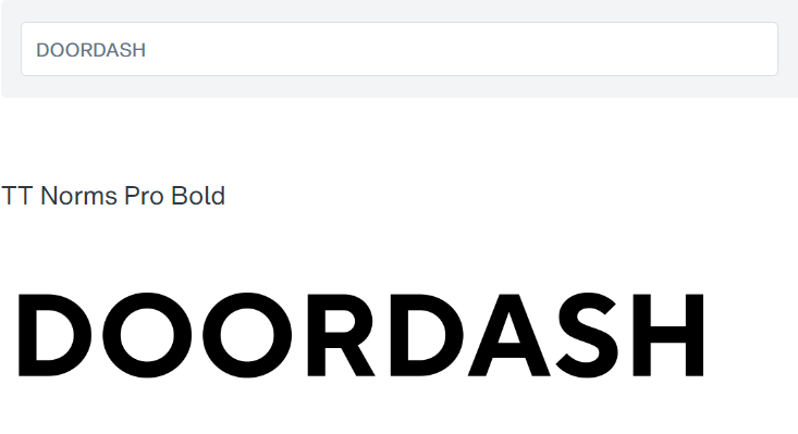
DoorDash uses the TT Norms font by TypeType. Most probably with the Bold style. It’s simple, clean, and gets the job done. No bells and whistles with dozens of different font mixes. Just one font.
13 TOP HAND SCRIPT & CALLIGRAPHIC FONTS
Elegant and flowing. If you’re going for a handwritten, personal look, then these fonts are for you.
#HS1. English 157 BT Font (Cadillac)
The original Cadillac logo was based on the family crest of the founder of Detroit (the company name was named after him). Thus the focus of the brand identity has always been on nobility and craftsmanship.
The script font used for their logotype is a reflection of this, helping to emphasize the brand’s long-standing heritage in the luxury automobile industry.
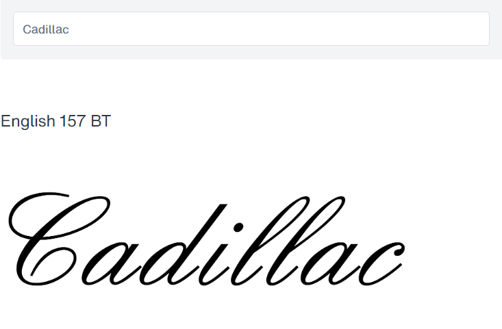
The original Cadillac logo is said to be a handwritten script based off of the English 157 BT font. Removing the letter-spacing, you will see close similarities to the original.
However, it was still customized. So if you’re building a brand steeped in nobility and heritage, and you’re looking for something closer to the current logo iteration, you might want to try the Birthstone Formal font.
#HS2. Cupid Hearts Font (Johnson & Johnson)
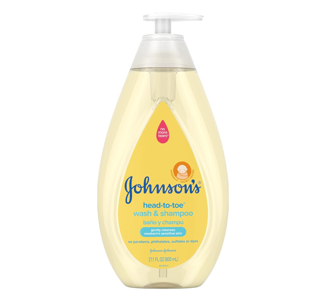
The Johnson & Johnson logo design was taken from the signature their co-founder used to sign the first company cheque. Eventually, they started using it on their horse carriages, and eventually on their baby products. They’ve used the same script font logo for almost 150 years.
It’s a shame that they decided to move towards a sans-serif logo design recently. I seriously doubt it’s the type of image they should be portraying. And I’m pretty sure they’ll be switching back once their branding starts tanking. Thus, let’s continue focusing on the script logo font which they successfully used for over 100 years.
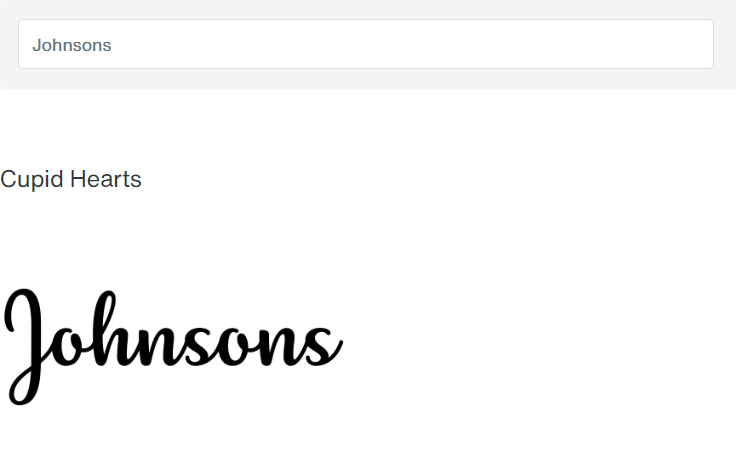
While the original Johnson & Johnson’s logo font is a custom script, based on one of the co-founder’s cheque signature, I have found a script font that resembles it very closely.
The Cupid Hearts font manages to catch what’s unique about the Johnson’s logo… namely, it hits the right balance between personal, handwritten script and predictable evenness. A lot of script fonts are either too playful, or too predictable. This font balances both, just like the original.
The lettering styles are also very similar. If you’re planning to build a personal brand in the health or baby niche, then this font might help you.
#HS3. Mr Rafkin Font (Ray-Ban)
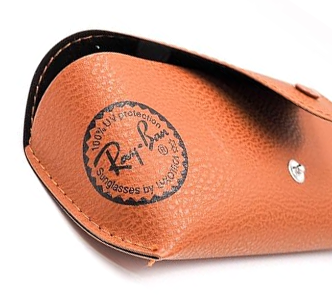
Ray-Ban has been using the same logo font since the 1930s and it’s been working pretty well for them in the high-end eyewear market. It features a custom script font with round, uneven swooshes and straight thick lines, creating an impactful contrast.
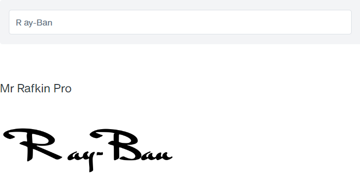
As with most script logo fonts, the original design was likely a hand-drawing, and not a font, though it may have taken inspiration from some fonts of the time. However, when it comes to similar fonts, I’ve found that the Mr Rafkin Pro font comes the closest to matching the vibe and feel of the original.
With its thick strokes, and bold, compact lettering, you’d just have to tilt it on its side and it’d make a remarkable resemblance. If you’re planning to build a luxury wear brand, and want to give it a personalized touch and feel, you might want to visit Mr Rafkin’s.
#HS4. Lendiga Font (Sharpie)
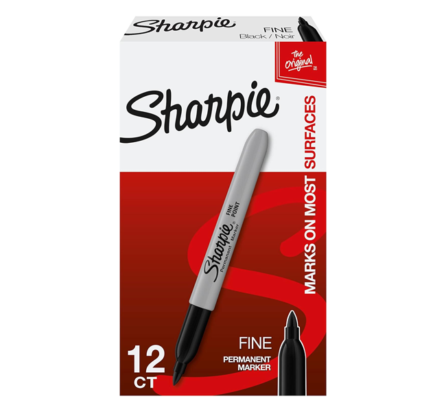
The Sharpie logo wordmark is pretty cool, because it looks just like it was written with a Sharpie. And I guess that’s what Sharpies are for. Creating fonts and logos. Script-based fonts often add an element of friendliness and approachability.
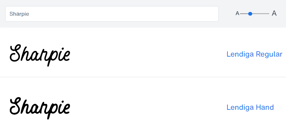
While the original Sharpie logo was a custom-design drawn with a Sharpie, there are a number of fonts with a similar vibe to the original. The font that comes the closest, I think, is the Lendiga font.
It has similar, tall and narrow letters, a slight tilt but not too strong, thick Sharpie-like strokes, and separation between the ‘p’ and the ‘i’ to create some rest for the eyes and making it more interesting. If you’re planning to build a household brand, this might be the font for you.
#HS5. Sunny Sam Font (Cadbury)
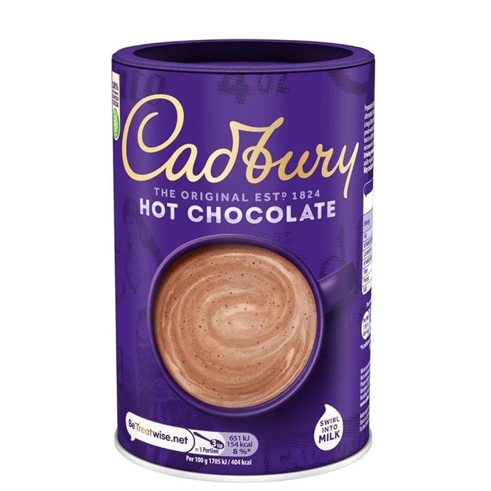
The Cadbury company originally used a classic serif font for their logo wordmark during the 1800s. They then changed that logo font to a script one using the founder’s, William Cadbury, signature as a base. They still use the same text logo today while modernizing it with different shades of purple or gold.
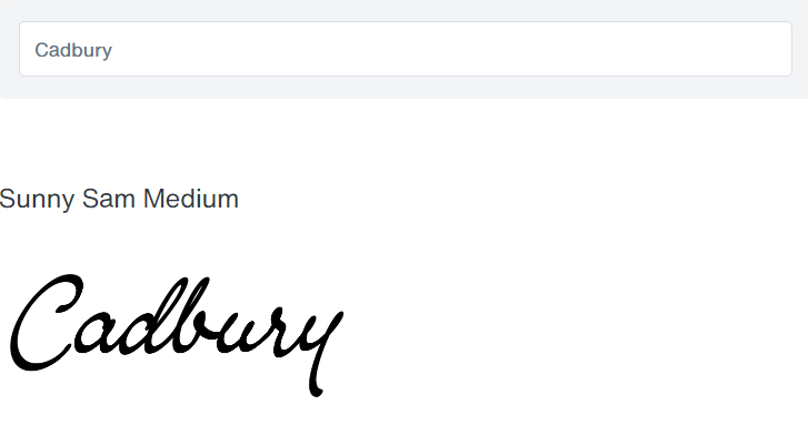
While the Cadbury company has continuously been using their signature script logotype for their branding over the last 100 years, one thing that has changed is that the letters used to be more tightly packed and spaced. They’ve been regularly spacing the letters out over time to make the logo clearer.
The font that comes the closest to resembling the original signature logo that I’ve found is the Sunny Sam Medium font by Mans Greback. Not only does it give a similar vibe and feel, with the same slight letter tilting and incomplete ‘y’, but it features the same thick strokes, along with adequate spacing between the letters for readability.
If you’re planning to build an elegant confectionary brand, then this is one font you might want to melt in your mind.
#HS6. Vadelma Font (Lay’s)
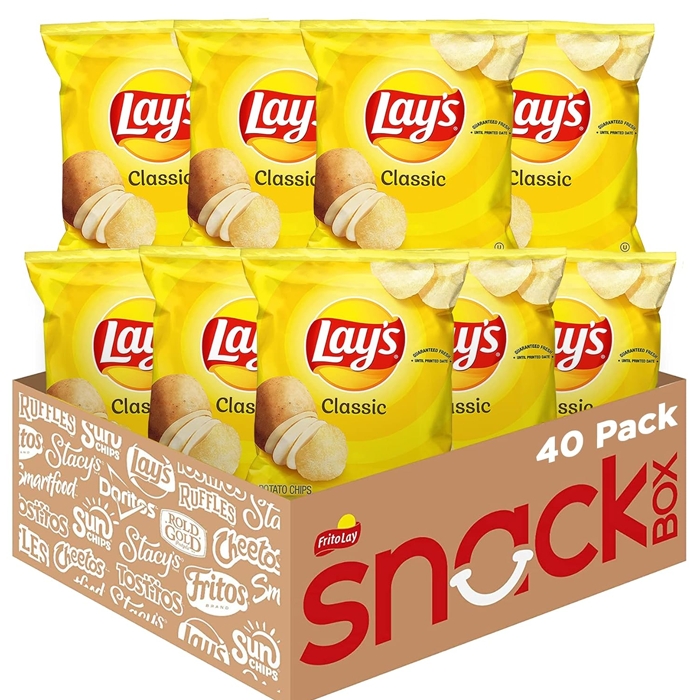
The Lay’s logo type has evolved over time, moving from a standalone serif and sans-serif design, to eventually using the script font it’s using today. The focus of their branding has been on projecting energy and quality.
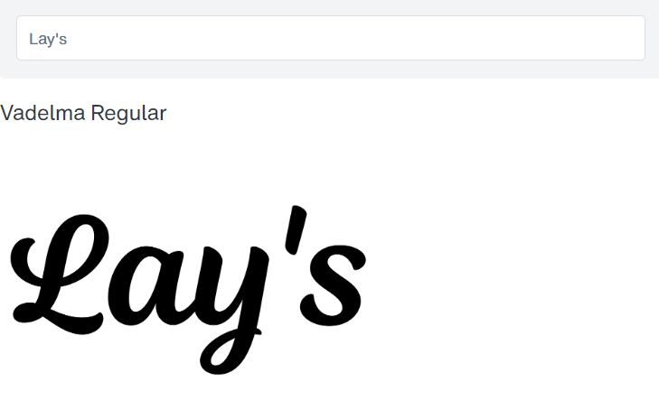
The font I’ve found that has the most similarities to the Lay’s logo custom font seems to be the Vadelma font. The script font is simple, and evenly spaced, with no excessive strokes, and retains the standard ‘s’. The capital ‘L’ has a similar flow as the original, except for a curl at the top.
If you’re planning to build an addictive brand that sits on tables around the world, then this might be a memorable, yet simple font to start with.
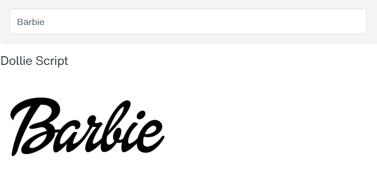
#HS7. Dollie Script Font (Barbie)
Barbie’s first logo in the 1950s was a simple script font that conveyed playfulness and style. Over the years, they rotated through all sorts of different logotype fonts, from modern sans-serifs, to tilting the fonts, to more playful fonts.
But after everything was said and done, they still decided to go back to their original logo font from the 1950s several years ago. Which says something. The original is still the best.
CLICK TO JOIN THE BARBIE WORLD
The font that has the closest similarity with the original Barbie logotype is most likely the Dollie Script font by Mans Greback. It makes sense. Barbie is just a dollie. If you’re planning to build a brand based around girl’s toys or entertainment, then this might be the font for you.
#HS8. Black Jack Font (Kleenex)
The aim of the Kleenex logo is to project softness, tenderness, and expertise. So it probably didn’t make sense that their earlier logotype designs were rock solid, bold, and used huge capitals. They eventually got the idea though, and transitioned to softer, gentler, more scripted fonts.
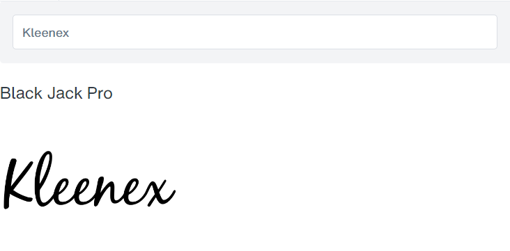
While it’s clear that the Kleenex logo wordmark is a custom hand-drawn design, I’ve found a font that is extremely similar to the original logo called the Black Jack Pro Font. It’s almost the same with some minor differences. Like the ‘K’ not being connected to the ‘l’, and a thinner stroke.
But if you’re planning to build a brand that projects softness and tender-loving care, while being the expert in your industry, this might be a good font to wipe your nose with.
#HS9. Channel Font (Hallmark)
When some people see the Hallmark logo, they think of Christmas. Others think of birthdays. But regardless of which event you associate it with, it’s done an amazing job associating its brand with some of the most popular holidays of the year. The Hallmark logo projects elegance and tradition.

The original Hallmark logotype was penned by lettering artist Andrew Szoeke, so it wasn’t based on a font. So you likely won’t find a Hallmark font. However, The Channel font by Mans Greback is remarkably similar to the original logo.
If you’re planning to build a brand that focuses on tradition, seasons, and holidays, then this font could help you celebrate success early.
#HS10. Fantasia Script Font (Harrods)
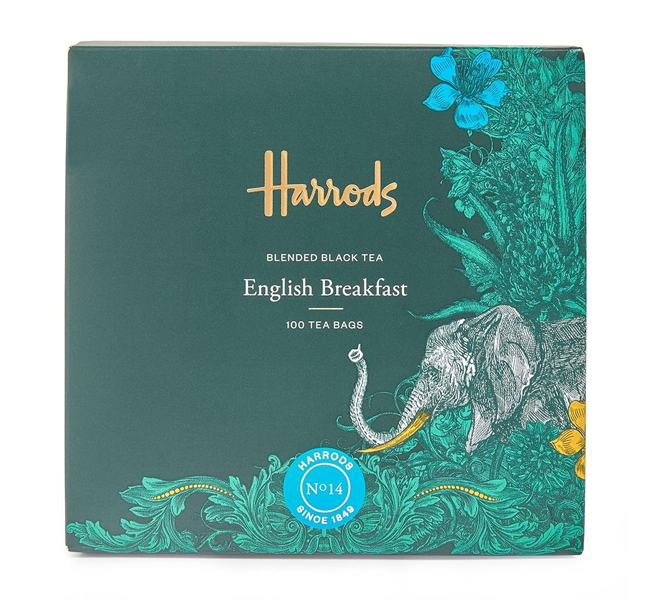
The Harrods logotype expresses luxury and sophistication. The green and gold colors also tie it back to its British heritage. The bold lines and smooth curves are a signature of this font. And the elongated horizontal bar on the letter ‘H’ adds additional flair to the design.
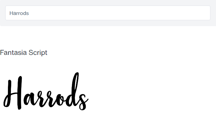
One thing that makes the Harrods logo stand out is its use of thick and thin strokes. There are a lot of script font logotypes that use consistently thick strokes, and that removes some of the feel. I think Harrods also does a good job balancing the use of thick and thin.
While the Harrods logo text is likely a handwritten (most probably based on the founder’s signature like everyone else does), I’ve found that the Fantasia Script font is a similar option that captures the look and feel very close to the original.
It does lose a bit of the ‘heritage’ feel because of fewer straight lines, but I believe it retains the vibe you’d want if you were looking for a font for a luxury retail brand.
#HS11. Inglesa Script Font (Cartier)
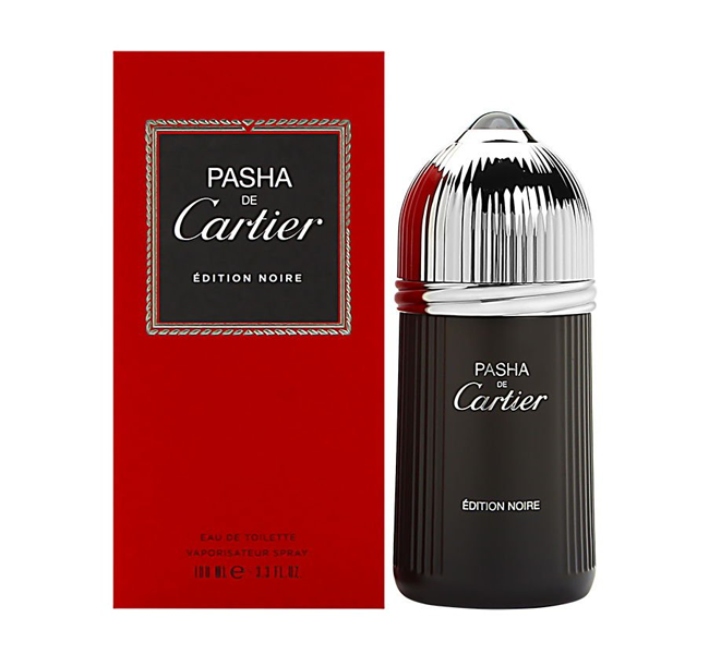
The Cartier logo has remained unchanged since the company was first founded in Paris in the 1800s. The logo type features some smooth and delicate lettering, but it contrasts this with some sharp cuts and serifs for an edgier style. It focuses on projecting quality, luxury, and aristocracy.
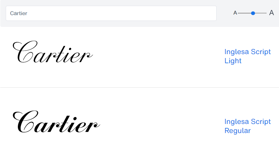
While the original Cartier logotype is likely based on hand-lettering of the time, or maybe a signature of the founder, there one or two fonts that bear close similarity to the original. The font that I’ve found to be the most similar to the Cartier logo wordmark is the Inglesa Script Light font.
From the angle of the lines, to the positions of thick and thin strokes, to the rounded swirl at the tip of the ‘r’. Everything seems to be just like the original, with minor differences. Like the extra swirls on the ‘C’, and the slightly extended ‘t’.
But if you’re planning to build a brand based on luxury and aristocracy, perhaps this font will raise your nobility a bit.
#HS12. Magnite Alt Font (Nicole Miller)
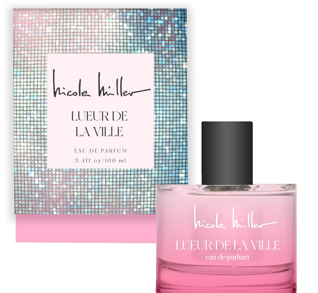
While the Nicole Miller logo has evolved over the years, the focus has always been on building a feeling of chic and modern aesthetic with accessible luxury for the modern woman. The Nicole Miller logotype is both sophisticated and playful with its handwritten script lettering.
One thing that makes the wordmark stand out is the use of exaggerated lines, such as on the ‘n’, ‘m’, and especially on the ‘r’, which accentuates this playfulness and style.
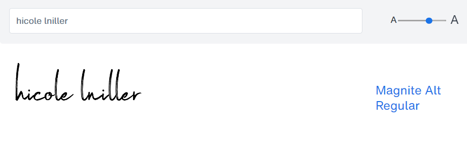
The Nicole Miller logotype is likely just a handwritten signature. You can tell that it’s not based on a font by the fact that the repeating letters like ‘l’ are totally different each time. But one font that has a similar vibe and style is the Magnite Alt Regular font by Tom Chalky.
If you’re going for an accessible luxury brand, then you can pretty much achieve what you want by playing around with the different letters. Notice how I used the ‘h’ instead of the ‘n’ for the name Nicole to replicate long straight lines.
#HS13. Sintyabelinda Font (Virgin)
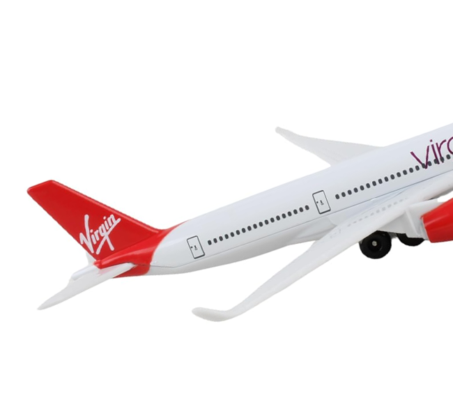
The Virgin logotype has remained largely unchanged throughout the years, except for slight modifications to make it clearer. It features what appears to be a hand-script font with underline, that is drawn with thick, uneven strokes. They tilted the text at an angle to create feelings of power and progress.
And the huge ‘V’ in the logotype is said to represent both the company name and victory.
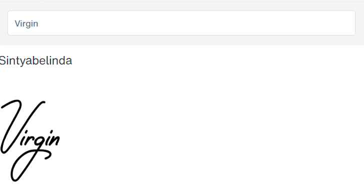
If you’re planning to build a brand that focuses on bringing people places, then the Sintyabelinda font is one of the closest matches to the original Virgin logo. You’ll just have to tilt the font at an angle, and it’ll help you relive all your airsickness moments.
10 TOP SERIF FONTS
These fonts are traditional, elegant, and easy to read. Great if you want to create a more established and solid feel.
#S1. Didot Font (Vogue)
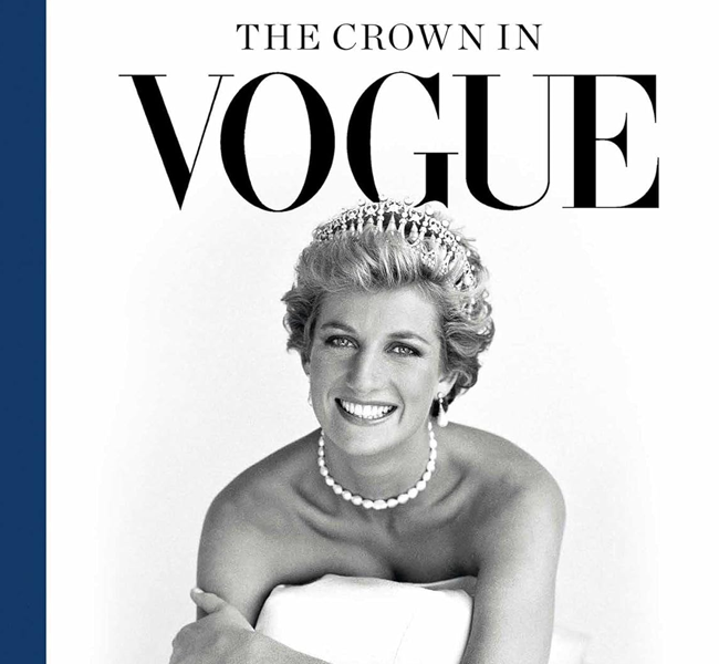
The Vogue magazine logo has change significantly since the 1980’s, but it’s been more or less unchanged since the 1990’s. One thing that’s remained constant though, is the essence of style and sophistication. It’s something a fashion magazine can never do without.

DIDOT is the serif font used by the Vogue Magazine logotype. Specifically, the Linotype Didot Pro Headline Roman font. It has a luxurious and high-end feel. While it is a serif font, its gentle strokes help it to pair well with soft fashion photography.
It may have some bolder strokes, but never gives off an imposing feel, something that is generally frowned upon in the fashion industry. If you’re planning to build a fashion-related brand, then this is a timeless choice.
#S2. Memphis Font (Hermès)
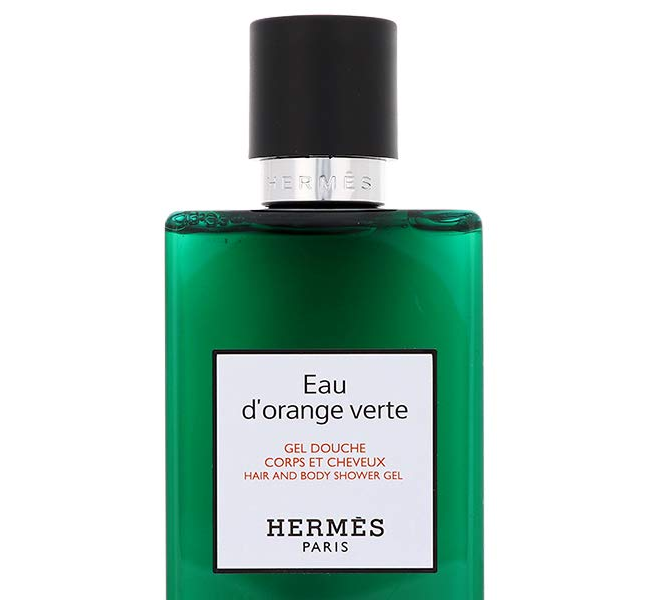
The Hermes brand first got started with horse-related goods, during a time when most people were using horse and carriages. Their brand focus has always been on simplicity, elegance, and timeless high-quality craftsmanship.
The Hermes logo wordmark uses a type of serif known as a slab serif, which basically means that the serifs are blocky, vertical or horizontal.
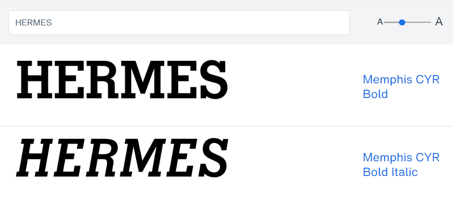
The Hermes logo uses the Memphis font by Linotype, most likely the Memphis CYR Bold font style. It’s simple, sturdy, with clean fine lines and a classic aesthetic… all the things the Hermes brand wants to portray.
If you’re planning to build a brand around simplicity and high-quality craftsmanship, with a touch of classic aesthetic, then this might a font you want to ride on.
#S3. New Yorker Type Font (The New Yorker)
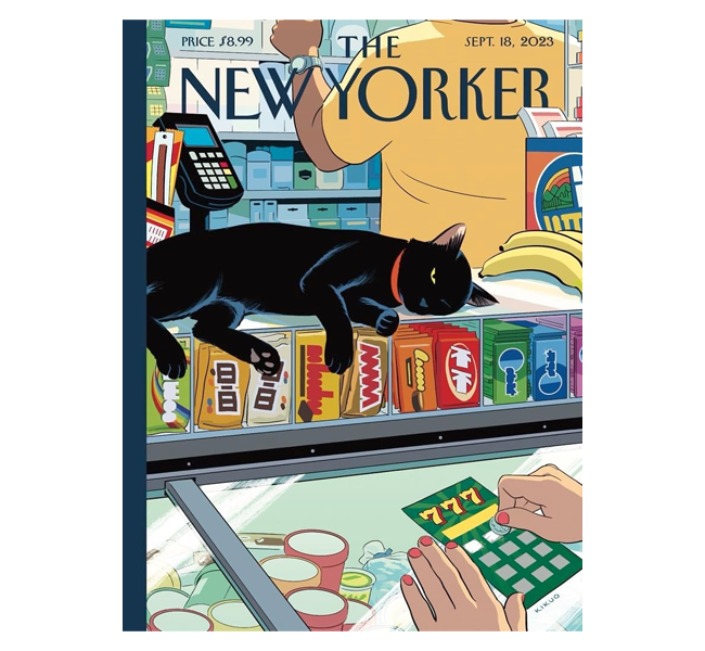
The New Yorker logotype uses an elegant and sophisticated serif style. It’s been using the same wordmark since the magazine began. And it is interesting how it combines classic, sophistication, and a tint of playful at the same time.
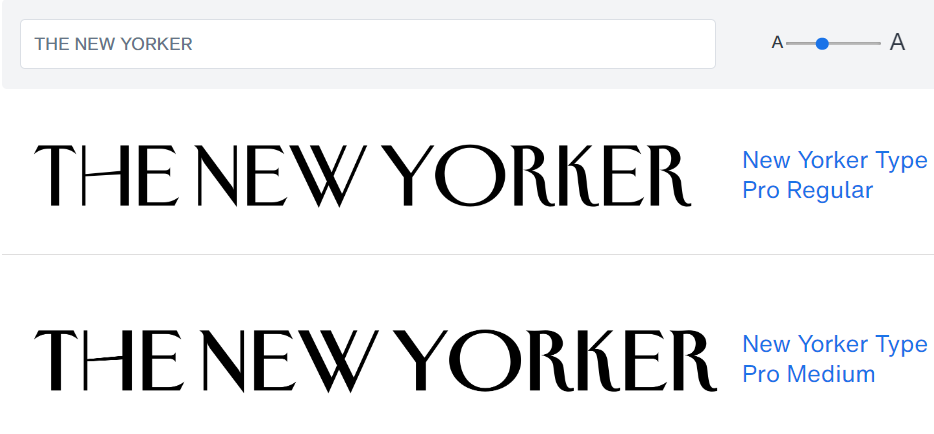
The New Yorker Type font family is a typeface that was hand-drawn based on the original New Yorker logo by Rea Irvin. The aim of the font was to revive the style of the logotype once again. There are tiny differences. However, it is more or less the same as the original.
If you’re planning to build a brand based around wit, commentary, politics and art, you might want to give this font a try.
#S4. Goldenbook Font (Gucci)
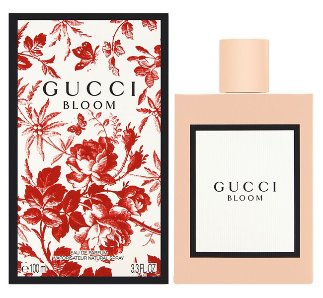
Unlike other luxury brands, the Gucci line has evolved both its logo and logotype several times throughout the last century. They’ve stuck with the latest logotype font iteration for several decades though. Much like Hermes, the Gucci brand originally focused no leather and horse-related accessories.
The logotype font is a modern geometric one, focusing on bold all capitals. They’ve also evolved the font from a sans-serif style, to a serif one.
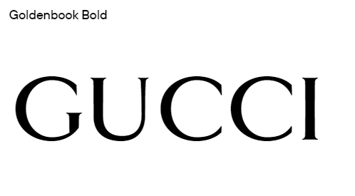
There are a couple of fonts that come close to mimicking the original logo font. One of the closest ones is the Goldenbook Bold font. It’s more or less the same, with the exception of some slight extra width on the ‘G’ and ‘C’. If you want to create a closer look to the original, you can squeeze the letters slightly horizontally.
But overall, if you want to build a brand that screams elegance and confidence, then you might want to go with this font.
#S5. Tabac G2 Font (The Guardian)
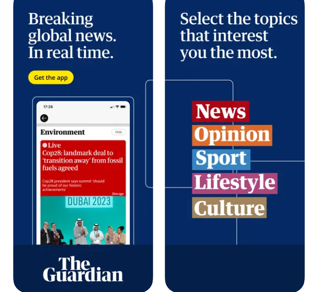
The Guardian’s logotype has been constantly changing throughout the years. Basically, they change it whenever global design trends change. However, the current logo font hasn’t been changed for a while. So let’s look at that.
Their original logo when they were founded used a font that focus on seriousness and formality. The current font is more playful, with diagonal serifs found throughout the lettering.
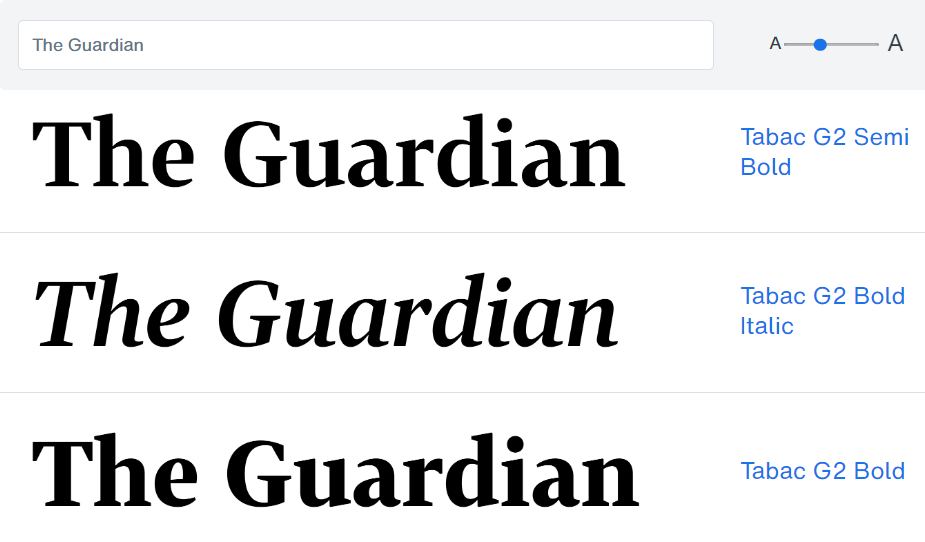
The Guardian logo is likely based on the Tabac G2 font, either the Semi Bold or Bold style version. It’s almost a direct similarity, with some small differences. Like the additional serifs added to the tip of the ‘a’, a little tweak on the ‘r’, and a shorter ‘d’ head. But overall, everything else looks the same.
If you’re planning to build a brand around serious, thought-provoking news, then perhaps this is the font you should test next.
#S6. Escrow Font (The Wall Street Journal)

The Wall Street Journal has been using the same logotype more or less unchanged for the last century. Some say it reflects the brand’s attention on tradition and authority. The logo uses all capital serifs with bold, thick and thin lines.
One thing interesting about the logo is the constant inclusion of a single period at the end of their brand name.
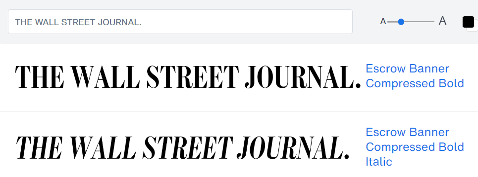
The Wall Street Journal commissioned Cyrus Highsmith to design a font called Escrow. There are several different styles of the font. But the style you see used in their logo is likely the Escrow Banner Compressed Bold font.
The Escrow Banner was drawn by Richard Lipton based on the original design, and it was designed to be used for titles and headlines. If you’re planning to build a prestigious financial news or newsletter brand, then perhaps this font might be professional enough for you.
#S7. Goudy Modern Font (Ritz-Carlton)
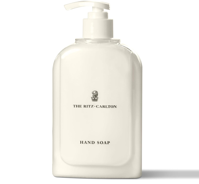
The Ritz-Carlton has been using the same logotype since the 1960s, but the recently upgraded to a more modern version of the same font in 2015. While the Ritz-Carlton branding is all about luxury and prestige, the new Ritz-Carlton font has a thicker, cleaner, and sharper look.
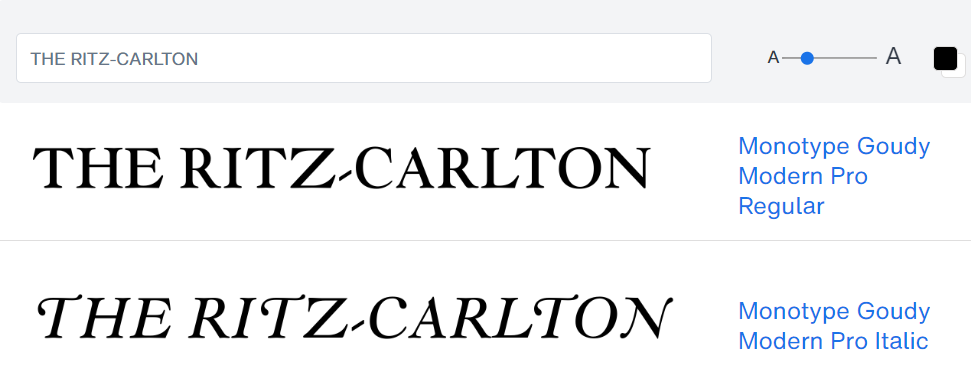
The current Ritz-Carlton font is using the Goudy Modern font with a few tweaks added in here and there, like to the hyphen and the letter ‘C’. The font is a mixture of classic and modern. And it’s pretty interesting, considering that the previous Ritz-Carlton logo font was the old classic Goudy font.
If you’re planning to build a luxury accommodation brand that’s both modern and classic, then this might be the font for you.
#S8. Italian Didot Font (Giorgio Armani)
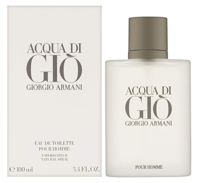
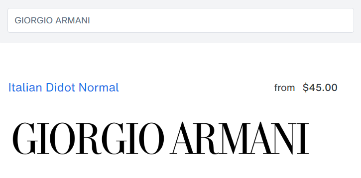
The Giorgio Armani logotype features serif all capitals with thick and think strokes, creating an elegant and sophisticated look. The serifs are delicate and distinct, and the gentle curve on the ‘R’ accents the luxurious feel.
Click To Call Your Font Giorgio
The Giorgio Armani logo font is based on the Didot Font, specifically I’ve found that the closest similarities likes with the Italian Didot font variant. While most Didot fonts are all almost the same, the Italian variant has the signature ‘G’ leg that is prevalent with Giorgio Armani.
If you’re looking for a good font for sleek, luxury branding, then the Italian Didot Font might be another great option. If you’d like a ‘fatter’ version of the font that’s not as ‘slim’, you can also try the ITC Bodoni 175 font which is basically the same, but fatter.
#S9. Clarendon Extra Wide Font (Sony)
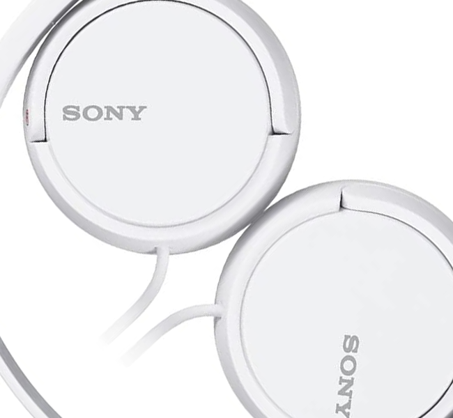
During the early days of the company’s founding, the Sony logotype featured a font with exaggerated, vertically stretched-out letters from top to bottom. This made it unique and stand out. But after a couple of years, they decided to stretch their logo horizontally instead of vertically.
So, as you can see, the current iteration of the Sony logo features a font that’s squished flat, vertically, and stretched wide (horizontally).
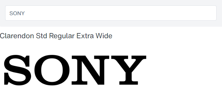
The original Sony logo wordmark uses the Clarendon font. However, it’s been modified to be squished down, and stretched out horizontally. A variation of the Clarendon font that comes close to that is the Clarendon Extra Wide font variation.
If you’re planning to build a brand that’s known for its technological innovation, then perhaps the Clarendon font will fit over your ears.
#S10. ITC Novarese Font (Swarovski)
The Swarovski brand uses an elegant uppercase logotype to enhance the luxurious look and feel of the brand. They’ve been using the same font since the 1980s, but basically with less bolder and cleaner, more modern line work.
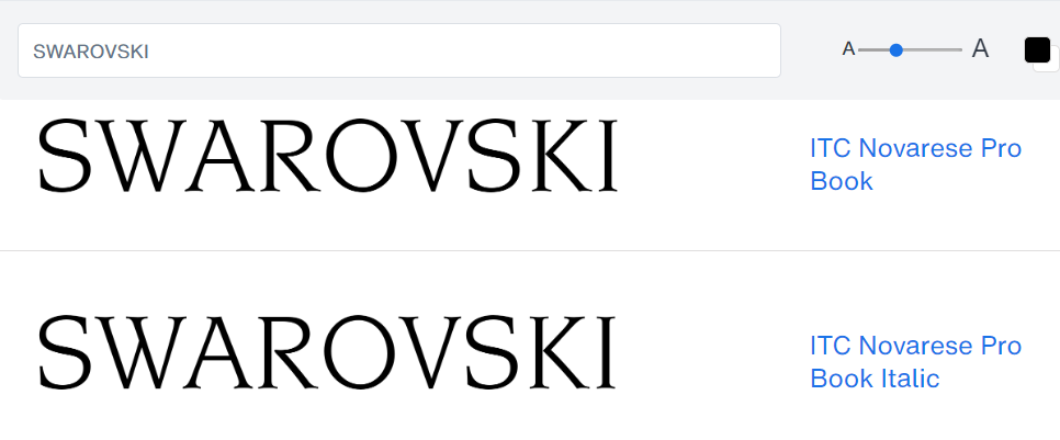
The font used for the Swarovski logo is the ITC Novarese font. It’s a serif font with elegant curves, and fine serifs that are delicate and portray sophistication. If you’re planning to build a brand based on jewelry, or expensive stuff people hang on their bodies all day, then this might be your font.
9 BEST SANS-SERIF FONTS
Modern, yet versatile. These fonts have enough flexibility that you can use them for a variety of different branding scenarios.
#SS1. Segoe UI Font (Microsoft)
Over the years, the Microsoft logotype font has evolved in many unexpected and interesting ways, from using Heavy Metal fonts, to streamlined sans-serif typefaces. But the current version uses the very simple Segoe UI that comes installed in most Microsoft systems.
 The Microsoft Logo uses the semi-bold version of the Segoe UI font. If you want to use it for commercial use, it’s currently packaged into Windows computers, so you can access it anytime.
But if you’re planning to build a tech company, you might want to reconsider using the font. Because the font was originally created by Linotype and licensed to Microsoft, but there were several disputes where Microsoft tried to claim ownership, leading somewhat of a boycott against the font.
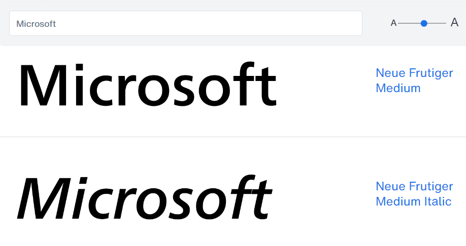
A better option would be the Neue Frutiger font, on which the Segoe UI font was originally based. They are almost the same, with a few very minor differences.
#SS2. Visby CF Font (Intel)
The current Intel logo font uses a geometric sans-serif with a couple of key features. The dot on the ‘i’ is squared, with sharp edges on the ‘i’ and ‘l’. And the bar on the ‘t’ is lower than typical, along with half of the ‘t’ bar being wiped away.
The current Intel logotype seems to be based on the Visby CF Font by Connary Fagen, specifically the bold style. The only major different might be the missing half of the ‘t’ bar on the left, which seems to have been a personal modification.
If you’re planning to build a tech hardware brand built-around innovation and speed, then you might need the Visby CF font inside.
#SS3. Helvetica Font (Post-It)
The Post-It is one of history’s most useful inventions, retaining it’s place as a staple in homes and offices around the world. One of the things that Post-It has done with their logotype to help carry this feel is to create an expression of friendliness and approachability with their font.
The Post-it logo wordmark seems to be based on the Helvetica Black font by Linotype. It goes for a very simple, direct, clean, and modern feel with the logo. If you’re planning to build a brand that’ll be in homes and offices worldwide, then Helvetica might be a good bet.
Only caveat though? Helvetica is one of the world’s most hated fonts because of how popular and overused it is, so you’ll need a lot of brand street cred to counteract that.
#SS4. Oceanwide Font (Reddit)
The new Reddit logotype uses a customized font called Reddit Display, that uses a geometric sans-serif font, with sharp edges. The previous logotype had rounded edges. A special distinction of the font – it has negative space “conversation bubbles” in the center of the ‘d’ and other letters in it’s font set.
While the Reddit Display font is largely for the company’s in-house use, if you’re looking for something commercially similar for branding, one of the closest matches to the Reddit font is the Oceanwide Bold font.
It’s almost exactly the same, with some exceptions. Like the longer ‘e’ mouth. And without the ‘conversation bubbles’ inside the ‘d. But other than that, it captures the same look and feel.
If you’re planning to build a social media brand, then this might be the font for your next logo.
#SS5. ITC Avant Garde Font (Calvin Klein)
The Calvin Klein logotype recently switched their font and logo design back to the same one they used during the 1970s, which was the logotype they became popular for as it was displayed prominently on their underwear.
It seems like a recent trend is that established companies are finding inspiration from old designs, which shows you how timeless those fonts and logos originally were. Perhaps they should never have switched. They would have built the brand value even more.
The latest Calvin Klein logo uses the ITC Avant Garde Gothic Pro Book font. It’s a geometric, sans-serif font that aligns with the brand’s minimalist and modern aesthetic. If you want to build a similar feel of brand, you might want to wear this font.
#SS6. Nasalization Font (NASA)
Over the years, there have been two main logos that NASA has kept coming back to over and over again. The first is the logo known as “the meatball” which everyone is familiar with, because it’s been used for the past several decades. It features a blue ‘meatball’ grabbed by red ‘chopsticks’.
The second logo is known as “the worm”, and it features a continuous red line of text with the words ‘NASA’. It hasn’t been used since the 1970s, but NASA continues the trend of companies reviving old logotypes, and has brought ‘the worm’ logo back in recent years.
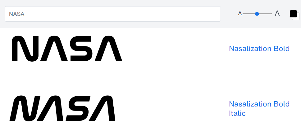
There’s a font that’s basically a replica of the current NASA worm logotype, and it’s called the Nasalization font. Very clean and with all the curves. If you’re planning to build a space-age brand, then this is the font that you should liftoff with.
#SS7. Myriad Pro Font (Walmart)
The Walmart logo has been all uppercase bold capitals since it was founded, but the recent logotype has been proper case with large and small letters. It features a light blue color, increasing feelings of sophistication. And a bright yellow spark, that represents the spark of inspiration that started the first Walmart.
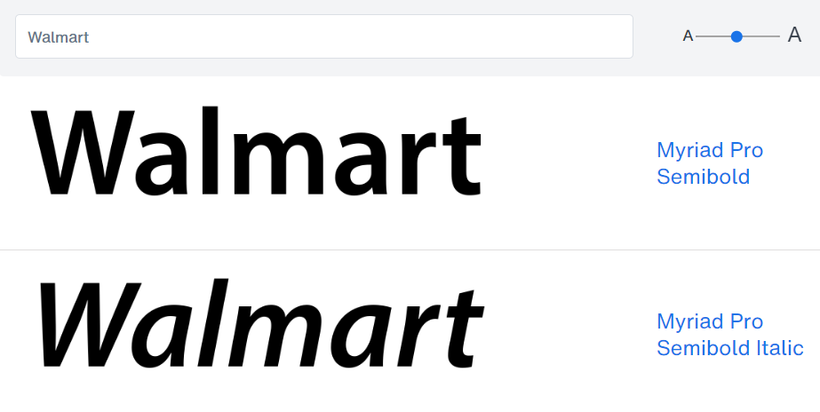
The previous iterations of Walmart logo used the Myriad Pro font as a base. But even now, the latest iteration, while created with a custom logo font, it was still based on the Myriad Pro font.
It’s basically the same thing, but with a few tweaks on the original logo – softer ‘legs’ on the ‘W’ and ‘a’, a slightly shorter ‘l’, and half the bar removed from the ‘t’. If you’re planning to build a brand around everyday low prices, the Myriad Pro font might work for you. Just like it worked for Walmart.
#SS8. Neue Helvetica Font (WhatsApp)
The WhatsApp logo has now become one of the most recognized icon in the world. During the course of the years, while the logo has gone through some slight tweaks, the logotype has been more or less the same, going with a classic, approachable font.
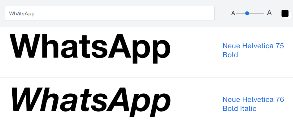
The font used by the Whatsapp logotype is the Neue Helvetica 75 Bold font. It features a clear and very readable design with clean lines and proper casing. If you’re looking to start a social networking brand, then this is a classic that works almost anywhere.
#SS9. Chica Gogo NF Font (Zoom)
If you lived anywhere in the world where there was a lockdown, chances are you’ve used Zoom. For digital conferencing, and working from home. The Zoom logotype has gotten simpler and simpler over the years, until it reached it’s current sleek, geometric iteration.
The Zoom logo font used to be based on the Kaleko 205 typeface. But it eventually went so far from that, I believe that the Chica Gogo NF font is a closer approximation to the original. With it’s geometric shapes, and totally smooth ‘z’ and ‘m’ curves without any ‘sticks or stones’, it’s just a few tweaks away from the Zoom logo.
If you’re planning on building a communication brand, then you might want to chica gogo.
Tips For Choosing The Right Font
The start and end of a successful logo begins with how well you understand your brand. Before you make the life-changing font choice for your logo, here are some tips to craft out the essence of your brand so you can choose the font with the most matching vibes…
Key Brand Attributes To Consider
Some things you will want to think about:
- Target Audience: Who are you trying to reach? What are their general demographics like age and gender? What are their preferences and expectations?
- Brand Personality: What type of character does your brand have? Is it playful, funny, and off-the-cuff? Or maybe sophisticated, professional, and luxurious? Perhaps rugged, or maybe something else?
- Brand Values: What principles do you follow to guide your business? Reflect these values in your visual identity
- Brand Voice: How do you talk to your audience? Try to make sure your font choice complements your brand’s communication tone and style.
Once you’re clear on these elements, it’ll be way easier to pick fonts for your logo that gives your target audience the feels you want. It’ll give your brand identity a strong foundation too.
Criteria For Selecting Fonts
Some additional tips when choosing the best font for your logo:
- Make sure it’s easy to read. Even if at small sizes (test all the different font sizes you’ll likely use) and even if it’s far away (walk backwards from your computer).
- Make sure it’s congruent with your brand. Like we mentioned in the last section.
- Make sure it’s versatile enough. Meaning… you want to make sure it allows use across the media you’re going to be using. Whether that’s print, online, within apps, or more.
- Make sure it’s unique in your industry. Some industries are heavily skewed towards specific fonts, like how it always seems like every lawyer logo uses the same font. Try to stand out and make an impression using fonts unique to your industry.
How To Do Font Pairing
Once you’ve chosen a font for your logo, you’ll likely want to use the same font across all your branding efforts. Like across your stationery, social media, advertising, content, websites, and more. But what if you want a second font to pair along with that? Well, then you’ll have to consider:
- Contrast: You’ll want to mix and match fonts with different styles, like serif and sans-serif. It helps keep your brand visually interesting.
- Harmony: You’ll want font pairs to contrast. But you also want them to harmonize and work well together.
- Hierarchy: You’ll want to create a clear visual hierarchy by using different font sizes and weights. So make sure the fonts you intend to pair together have the sizes and weights you want.
If you want to see examples of font pairing done well, check out my One-Click Font Pairing Generator. Browse through hundreds of typographically-sound font pair examples with the click of a button.
Iterate and Test, Test, Test!
You can spend all your time looking at fonts on a screen. But you’ll never know for sure how well it’ll work until you test.
- Experiment: Try different font combinations. And find your perfect match.
- Feedback: Ask your team what they think. Or people in your target audience.
- Refine: Keeping improving your font choices based on testing and feedback.
Conclusion
Choosing the right font is one of the most important make-or-break factors of your logo design. By deeply understanding your brand identity, thinking carefully about your font criteria, and experimenting with the loads of different ‘historically proven for branding’ options that I’ve listed here…
… creating a logo that leaves a lasting ‘100-year’ impression is now in your grasp!
But no one ever said that it’s easy. Still unsure about the right font even after everything you’ve seen and read? Then it’s time to call in the big boys – professional designers who eat, breathe, and sleep design and branding… so you don’t miss the mark on your visual identity goals.
Once you’ve got the right fonts, and the right expert advice, your logo is an asset that builds brand recognition for you everywhere you go…
To your business success!


