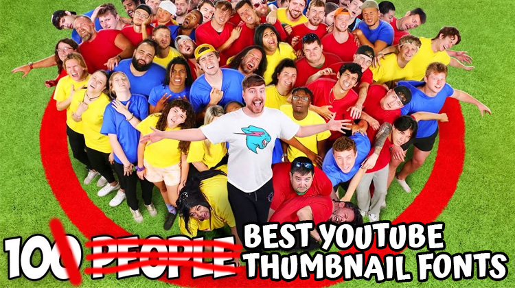
IF YOU’RE looking for the best YouTube thumbnail font to max out your views, clickthroughs, and subscribers, then here’s a list of top fonts that the world’s highest paid YouTubers are using to do just that and… how you can use them too!
Top YouTubers like Mr. Beast have spent multiple millions of dollars split-testing and optimizing their thumbnails to find the fonts that get the maximum number of views and subscribers. They’ve survived the YouTube algorithm wars for years. And have proven their choices with blood, sweat and tears.
Why would you NOT stand on their shoulders and…
Shortcut Your Way To The Top Of YouTube!
To do this is simple, but not easy. Normally, you’d have to browse through hundreds (maybe thousands of fonts) and discover the ones they used in their thumbnails. Lots of work.
Luckily, I’ve done it all for you. All you have to do is:
- Pick and choose the fonts you love best below.
- Choose the ones that fit your channel’s feel and vibe.
- Get them and start using them on every video thumbnail.
Do this, and you’ll dramatically increase your clickthroughs, views, and subscribers with one simple text swap. More font-styling tips at the bottom. But for now, let’s begin:
#1. Hero Sandwich Font (Mr. Beast, 310M Subs)
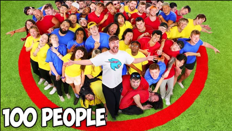
Mr. Beast uses a comic-style, sans serif font for all his video thumbnails. And he even uses the same font for his captions. And it makes sense, because it works like gangbusters. The font he uses is called the Obelix font named after one of my favorite childhood comics, Asterix and Obelix.
But there’s a couple of problems if you want to use the font:
The font is free only for personal use. And the author is no longer selling commercial licenses. Meaning that: If you plan to make money on YouTube, it’s not something you can use unless you own a commercial license like Mr. Beast. Luckily, there’s a workaround…
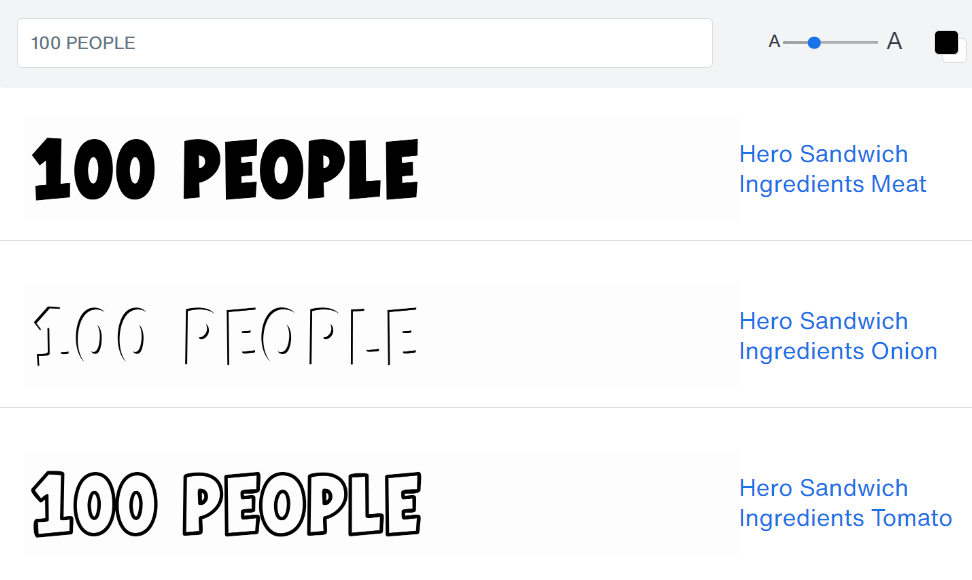
I found a font that is very similar to the font Mr. Beast uses, and it’s called the Hero Sandwich font. From the upward tilting of the letter bases, to the roundish outline and thin and vertical capitals, it’s hard to tell the difference except for the number ‘1’.
Best part? You can get a personal and commercial use license.
There’s 3 styles, from Meat style (normal color fill), to Onion style (which is basically an emboss, to Tomato style (which has colored outline and transparent fill).
If you’re going for a Mr. Beast vibe of video and font thumbnail, you might go for Meat Style, turn the font color white, and add a black stroke outline in your image editor. And if you want to know the logo font Mr. Beast uses, check out my piece on 100 Top Logo Fonts.
#2. BB Anonym Font (Cocomelon, 180M Subs)
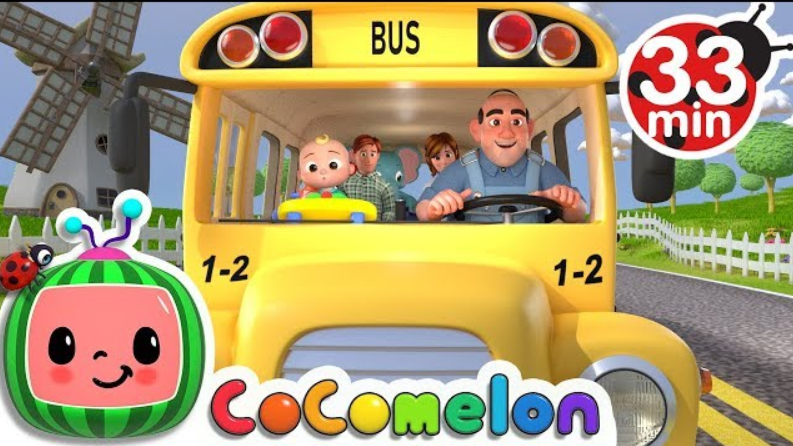
When I first opened up the Cocomelon YouTube channel, I was shocked. Because I wasn’t expecting to find someone with more views than Mr. Beast. While Mr. Beast’s top ranking video only has 645 million views, Cocomelon’s most popular video has over 6 billion views! Insanity!
And it’s not just their most popular video. They have tons of videos with well over 1 billion views, generating them well over $120 million a year. This includes revenue from all the hundreds of thousands of Cocomelon toys they sell on Amazon every month too.
So they are definitely doing well. And it just goes to show you… subscribers aren’t everything. But let’s get into their thumbnail font:
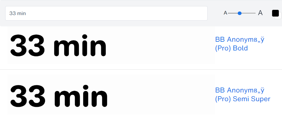
Other than their logo, Cocomelon only uses fonts on their thumbnail for indicating how long a video is going to last. Mostly numbers and minutes. Their font is a bold, wide, rounded-edge, sans-serif that is both friendly and easy-to-read for children.
The closest match I’ve found is the BB Anonym font. Especially comparing the numbers 0 to 9 with Cocomelon’s, they are a very close match. Round, friendly, bold, easy to read, and the letters are wide-enough that children can get it.
If you’re planning to build a channel that is child-friendly and fun, this might be a font you want to go after.
#3. Luckiest Guy Pro Font (Stokes Twins, 84M Subs)
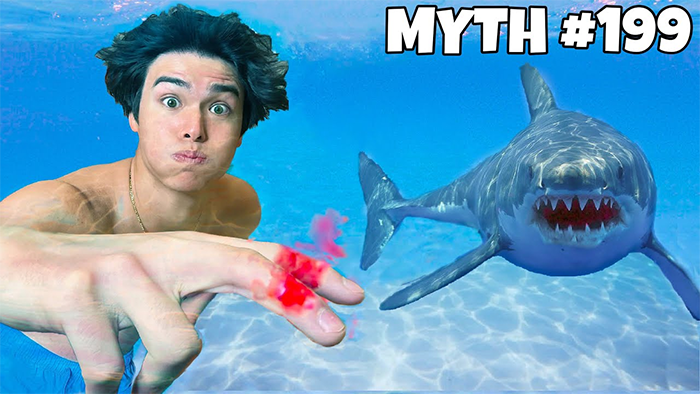
The Stokes Twins uses a similar thumbnail font tactic as Mr. Beast. They’re basically using a comic-style font, with white font color, and a black outline. It makes sense, because it works really for grabbing attention on your thumbnail. Probably better than any other text color combination.
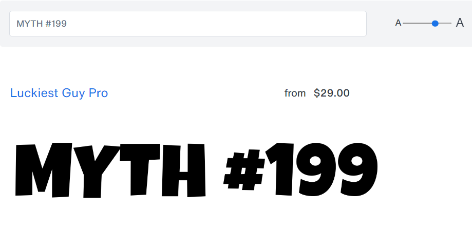
The Stokes Twins use a font called The Luckiest Guy Pro font on their YouTube video thumbnails. Though they don’t seem to use it on their Prime Video series. But if you’re planning on building a channel based on viral videos, then you might want to use this font on your thumbnails.
#4. Intro Bold Font (5-Minute Crafts, 81M Subs)
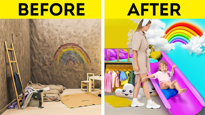
5-Minute Crafts is the most popular crafts and do-it-yourself home improvement channel on YouTube. They are loved by some, hated by some. But regardless, you can’t deny their massive success.
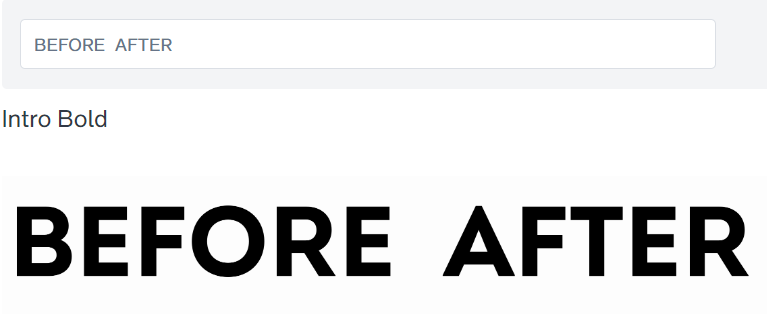
They use a few different fonts for their YouTube thumbnails, but I noticed that there was one font that appeared more often than the others on their most viral videos, and which they use pretty frequently. And that font seems to be extremely similar to the Intro Bold font by Font Fabric.
The resemblance is uncanny.
They most often use it on their split video thumbnails, like Before & After. And the font is used in bold capitals, black, and with a yellow stripe underneath that catches attention. If you’re building a channel in the DIY, Home Improvement, or anything with a lot of Before & After scenes, then you might want to give this font a try.
#5. Impact Font (Mark Rober, 56M Subs)
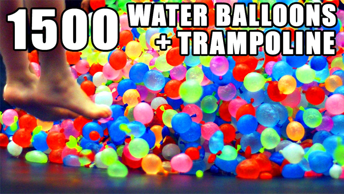
Mark Rober is a former NASA Scientist turned YouTuber. And one of the most successful YouTubers in the world. His videos typically feature scientific experiments, and he often demonstrates remarkable new inventions and robots he builds. He even monetizes his channel by shipping fans 1 robot a month you can build.
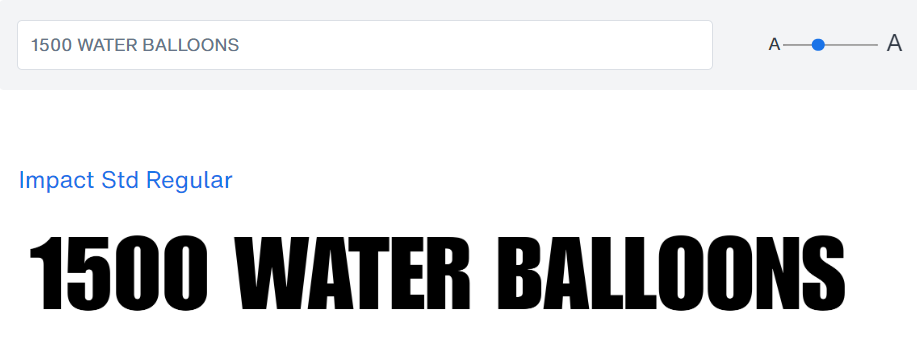
He uses the same YouTube thumbnail font technique as Mr. Beast, going with white text and a black stroke. Because it works. But contrary to Mr. Beast, he uses a less casual, more bolder font.
The font he uses is the Impact Font by Monotype. If you’re building a YouTube channel based on science and robotics, this might be a good font for your thumbnails since a former NASA scientist is using it.
#6. Right In The Kisser Font (Alan Chikin Chow, 56M Subs)
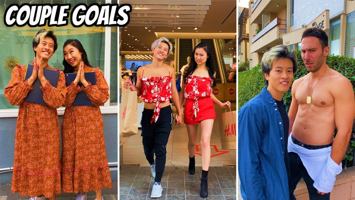
Alan Chikin Chow is an actor, YouTuber, and also the highest-ranking YouTube shorts creator in the world. He’s known for his YouTube series, Alan’s Universe, as well as appearing on TV series like Grey’s Anatomy.
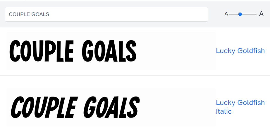
Alan’s YouTube thumbnail font uses the same strategy as other top YouTubers for catching attention and increasing CTR – using a white font with a black stroke. He also uses a comic-style font.
While I’m not sure of the exact font, the closest match I’ve found to the original is the Lucky Goldfish Italic font. If you’re building a channel where you do a lot of skits and comedies, then this might be the font to try.
#7. Arial Font (Ryan Trahan, 16.7M Subs)
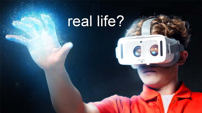
Ryan Trahan is one of the world’s fastest growing YouTubers. And his channel and Prime series focuses mainly on doing all sorts of lifestyle and survival experiments.
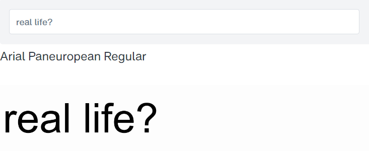
Ryan uses two main fonts for his thumbnails. On his highest performing videos, the Arial font seems to be a staple. Specifically, the Arial Paneuropean Regular font. Nothing fancy. But geometric, clean, minimalist, and very readable.
If you’re building a channel that focuses on lifestyle and survival experiments, and you want something clean and simple, this font is a good bet. The second font that Ryan often turns to (in all caps) seems to be closely similar, or related, to the Taro Extra Bold font.
#8. Helvetica Now Font (TED, 25M Subs)
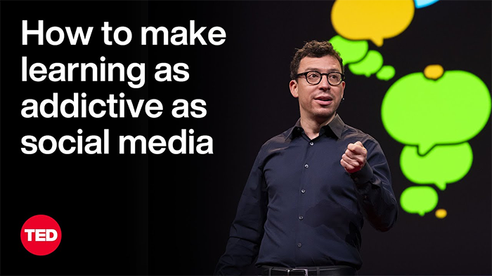
I’m getting bored looking at all these entertainment channels. Let’s switch things up a bit with the TED channel, which is one of top channels on technology, education, and design worldwide.
They have almost 25 million subscribers, and they focus on bringing well-known experts from around the world to share one key insight or idea in less than 18 minutes. Speakers even have to go through mandatory training on how to speak before they give their talks.
Let’s take a look at the font they use for their thumbnails…
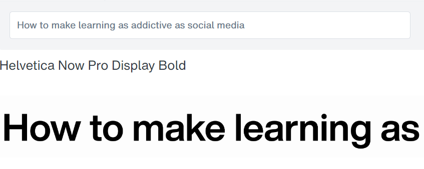
It looks like the TED YouTube channel thumbnails use the Helvetica Now Display font by Monotype with bold styling. Helvetica normally has a square dotted ‘i’, so it looks like they turned on the Stylistic Alternates feature as well for the rounded-dot ‘i’.
If you’re planning to build an educational or technology YouTube channel, Helvetica might be a good bet to start with.
While some designers consider Helvetica as one of their most hated fonts because of how overused it is, it’s legible, clear, readable at different sizes, and work well for what you need it to do.
#9. Font (Unbox Therapy, 24.2M Subs)
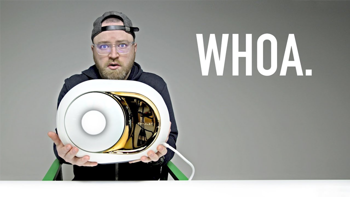
Unbox Therapy is one of the top product and tech review channels on the YouTube platform. With over 24 million subscribers, he doesn’t just get paid for his YouTube ads, but he also earns income from sales of the products he reviews, like the $3000 Devialet Speaker he reviewed above.
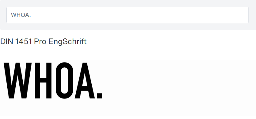
From my observation, it seems like Unbox Therapy is using the DIN 1451 Pro EngSchrift font from Linotype. It’s a tall, thin and bold san-serif font, and he usually uses all-caps for his lettering, which creates a feeling of impact similar to what Mark Rober does.
He uses a white font on a dark grey background. Though he sometimes uses black too. If you’re planning to build a unboxing or review type of channel, than this might be a good font to go with if you want to have a little more impact with the little words that you use.
#10. Loew Next Heavy Font (Tasty, 21M Subs)
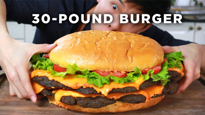
Tasty is probably the top food and cooking channel on YouTube, with over 21 million subscribers. It’s owned by Buzzfeed by the way. And it looks like they’re crushing it when it comes to all things food-related.
Other than ad revenue, it looks like they’re monetizing their channel with their series of popular Tasty cookbooks. And it looks like they’re selling pretty well. Not phenomenal, but pretty well.
Tasty continues the trend of top YouTubers using a white font color. The difference is that, instead of using a black stroke, they are using a black drop shadow to make their text stand out. But it looks like it’s working.
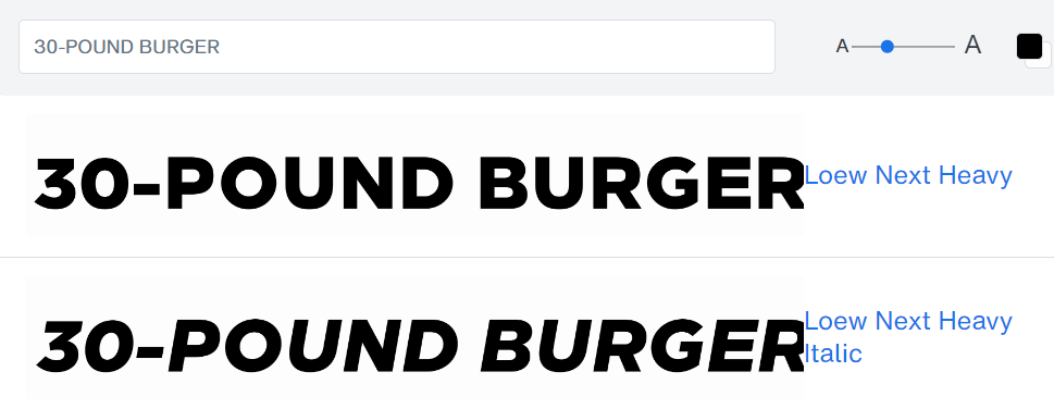
Tasty uses a few different fonts. But the font that appears most frequently on their top viewed videos seems to be extremely similar to the Loew Next Heavy font. It’s a sans-serif font with bold strong letters, and squarish, blocky shapes.
If you’re planning on doing a food-related channel, this might be the font for you.
Conclusion: My Personal Analysis
I analyzed and reverse-engineered the thumbnail fonts from some of the world’s top YouTubers.
You now have insider knowledge you didn’t have before. Knowledge that 99% of beginning YouTubers will never have. Knowledge that means the difference between getting your vids clicked and viewed, or your YouTube channel being dead in the water before you even get started.
Now it’s time to take what you’ve learned, and start impressing the heavens out of your subscribers, family, friends, lovers, and what have you, with your godly YouTube stats. Here’s how you start:
- You can just take these fonts, which are the same ones (or extremely typographically similar) to those used by the top YouTubers in the world, and just copy the ones that are relevant to your niche. And start using them on your thumbnails right away. OR…
- You can study them, and try to understand why they work before you start copying. So you at least have some knowledge of human psychology under your belt.
If you’re planning to do #2, then here’s my personal analysis:
The Best YouTube Thumbnail Font Color
I think it’s pretty obvious by now that the vast majority of the world’s top YouTubers use a white colored font, followed by either a black stroke, or a black background. I can see why though. It’s extremely eye-catching. And literally forces you to stop and read.
I’ve also started using the same color pattern on my thumbnails too after this, and man is it effective.
The Best YouTube Thumbnail Text Background
If you’re going with a white font like most of the top YouTubers do, then I would always go with either a black background, or at least at a black outline stroke or shadow. You’ll have to do this in your image editor. I don’t think there’s a font that includes a black stroke for you. so…
If you’re going with a black font though, I would model 5-Minute Crafts and go with a yellow background. Because the combination of yellow and black is crazy-catchy. Though I don’t think it’s as powerful as a white font.
The Best YouTube Thumbnail Text Style
Go with all capital-letters, and make sure the letters are bolded. I definitely wouldn’t go with small letters, even if it might work, because it’s just too risky. I would also only use one of the fonts above, because they’ve spent millions testing different font combinations already.
Notice how basically all the fonts are sans-serif fonts? And a lot of the fonts are comic-style fonts?
Well, that concludes my personal analysis…
Bookmark this page and keep checking back, because I do update my articles on a regular basis with more insights!
FAQ (Frequently Asked Questions)
1. What are the ideal dimensions for a YouTube thumbnail?
The ideal dimensions for a YouTube thumbnail are 1280×720 pixels, with a 16:9 aspect ratio. This helps you make sure that the thumbnail looks good on all devices.
2. How can I make my YouTube thumbnail stand out from everyone else?
Ignore everyone else and ONLY study the thumbnails of the world’s top YouTubers, like what I mentioned above. Also, use the fonts and tips I mentioned above for a huge head-start over everyone else.
More: Use high-contrast colors, include faces with expressive emotions if relevant, keep text minimal but bold, and make sure your design reflects the video’s content. Consistency in branding also helps thumbnails stand out.
3. What font styles are recommended for YouTube thumbnails to increase CTR?
Bold, easily readable fonts are recommended. Keep them to all caps. Follow my color recommendations above. Fonts should be large enough to be easily readable even on smaller screens. Almost all the world’s top YouTubers use sans-serif fonts.
4. Should I use text in my YouTube thumbnails, and if so, how much?
Yes, it makes a huge difference. But it must be used sparingly and strategically. Aim for 20 characters or less (use my character counter tool to check) to avoid cluttering the thumbnail. The text should summarize the video’s topic or make viewers curious to click and see more.
Mr. Beast usually only uses 1 or 2 words per thumbnail, but he focuses on maxing out the curiosity factor each time.
5. How does the use of human faces in thumbnails affect CTR?
Thumbnails with human faces, especially those showing emotion, tend to have a higher CTR as they can connect emotionally with viewers, making the content seem more engaging.
This is why Mr. Beast always makes a ‘shocked face’ in his thumbnails. He mentioned in an interview that it boosts view rate and clickthrough rate dramatically.
6. What are some effective thumbnail designs that have proven successful this year?
Effective designs include those with a clear focal point (make sure there is one clear character or item that draws the eye more than everything else), use of contrasting colors, minimal but super bold, capital text, and a consistent brand elements.
7. Can using numbers in thumbnails (like “Top 10”) increase CTR?
Yes, numbers can dramatically increase your CTR. Why? Because people are just attracted to numbers. They catch attention, draw the eye, and make people curious. Notice how, whenever Mr. Beast uses text in his thumbnails, he’s almost always including numbers, like “Day 79”.
8. How important is brand consistency in YouTube thumbnails for CTR?
Very important. Consistent branding helps viewers recognize your content immediately. This increases the likelihood of clicks, especially from regular viewers or subscribers. In the long-term, this ‘familiarity effect’ stacks up and you start to grow exponentially.
So, try your best to choose your branding and stick with it. If you’re constantly changing how your fonts and thumbnails look, it could damage viewership.
9. What tools or software are recommended for creating YouTube thumbnails in 2024?
Just use anything you want. Tools like Canva, Adobe Spark, and even Photoshop are pretty popular right now with beginners. They have a ton of templates and customization options for YouTube thumbnails. But these templates might not always be ideal.
Also, if you want to test your luck with some free font pairs, then check out my free font pairing generator. But always remember the points I discussed above.
The last tool I’d recommend is my site’s Daily Deals section, where I share places you can get special discounts on fonts like those listed above. For example, you can get a MyFonts coupon code that you can use if you want to purchase some of the fonts I mentioned.
10. How can I test which thumbnail performs better for my videos?
You can perform A/B testing by creating two different thumbnails for the same video and seeing which one performs better over time. YouTube also allows you to change thumbnails after upload, so you can test different designs on existing videos to see which increases your CTR.


