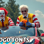
WE ALL HAVE THOSE HATED FONTS that make us scream in rage (‘ARGHHHHHH!!!!! MOMMMMYYYYY!!!’). There are a couple of common ones that are almost certain to generate that reaction in all walks of designer.
Some, because they are just ugly. Others, because they’ve been overused to the max.
Creative Market put together this fun selection of 10 of the most hated fonts in the world that will make designers want to chew your guts out. Be careful when using these fonts in front of them. It could make them loathe you. Or plot assassination. Or worse.
Or it might not. Depending on their temperament. But you never know what could happen. So be warned…
On the other hand, if you want to make designers love you?
Check out my free one-click Font Pairing Generator. You can rest easy knowing that it’ll only give you designer-approved, typographer-approved, elegant font pairs that have been put together the right way…
Top 10 Worst Fonts To Use
@xxxx[{::::::::::::::::::::::::::::::::::>
DANGER LEVEL: WOLF – Any potential threat that poses a danger to an unknown degree.
WARNING: Readers with the following conditions are prohibited from reading further:
- Recent Surgery
- Heart Troubles
- High Blood Pressure
- Pregnant
… or any physical and mental conditions that may be aggravated by horrible fonts.
@xxxx[{::::::::::::::::::::::::::::::::::>
#10. TRAJAN: The Movie Poster Font
@xxxx[{::::::::::::::::::::::::::::::::::>
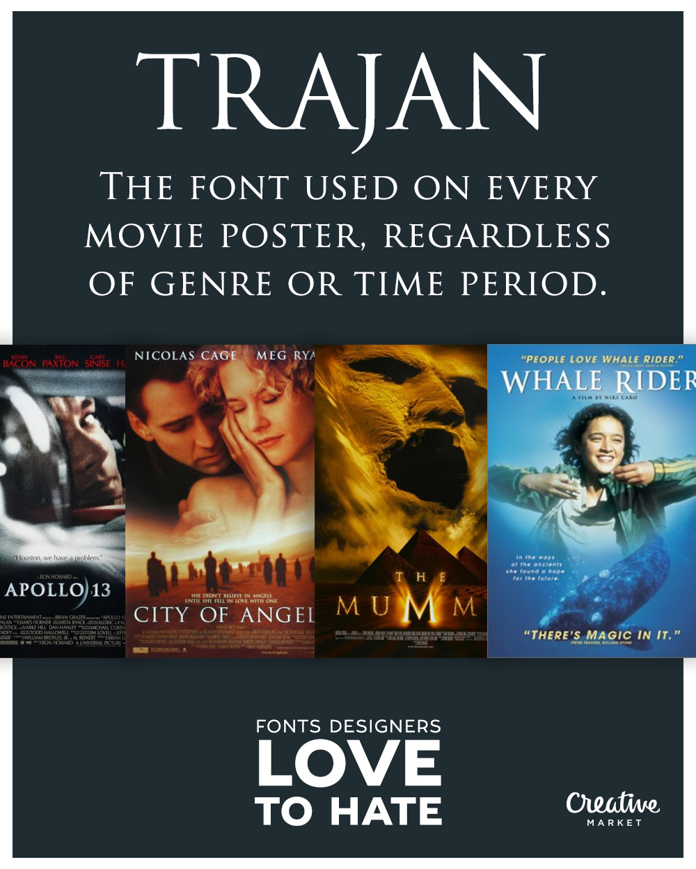
Why Is Trajan Hated? Like many of the fonts on this ‘Most Hated’ list, it just got used too much. Whether that’s on movie posters, book covers, and other popular entertainment media.
The formal feel of the font also makes it less flexible for using in a variety of settings. In other words, it just ain’t versatile enough. And it doesn’t pair well with most typefaces either. Especially when used in more modern design settings given the fonts historical Roman origins.
What Famous Brands Used Trajan? Famous movies that use the font on their posters include Avatar and Panic Room. Starbucks has used the font on their coffee packaging. It’s been used by several banks, churches, and orchestras. It was also used during the 2012 Romney Presidential campaign.
@xxxx[{::::::::::::::::::::::::::::::::::>
#9. BLEEDING COWBOYS: The Unreadable Tattoo Font
@xxxx[{::::::::::::::::::::::::::::::::::>
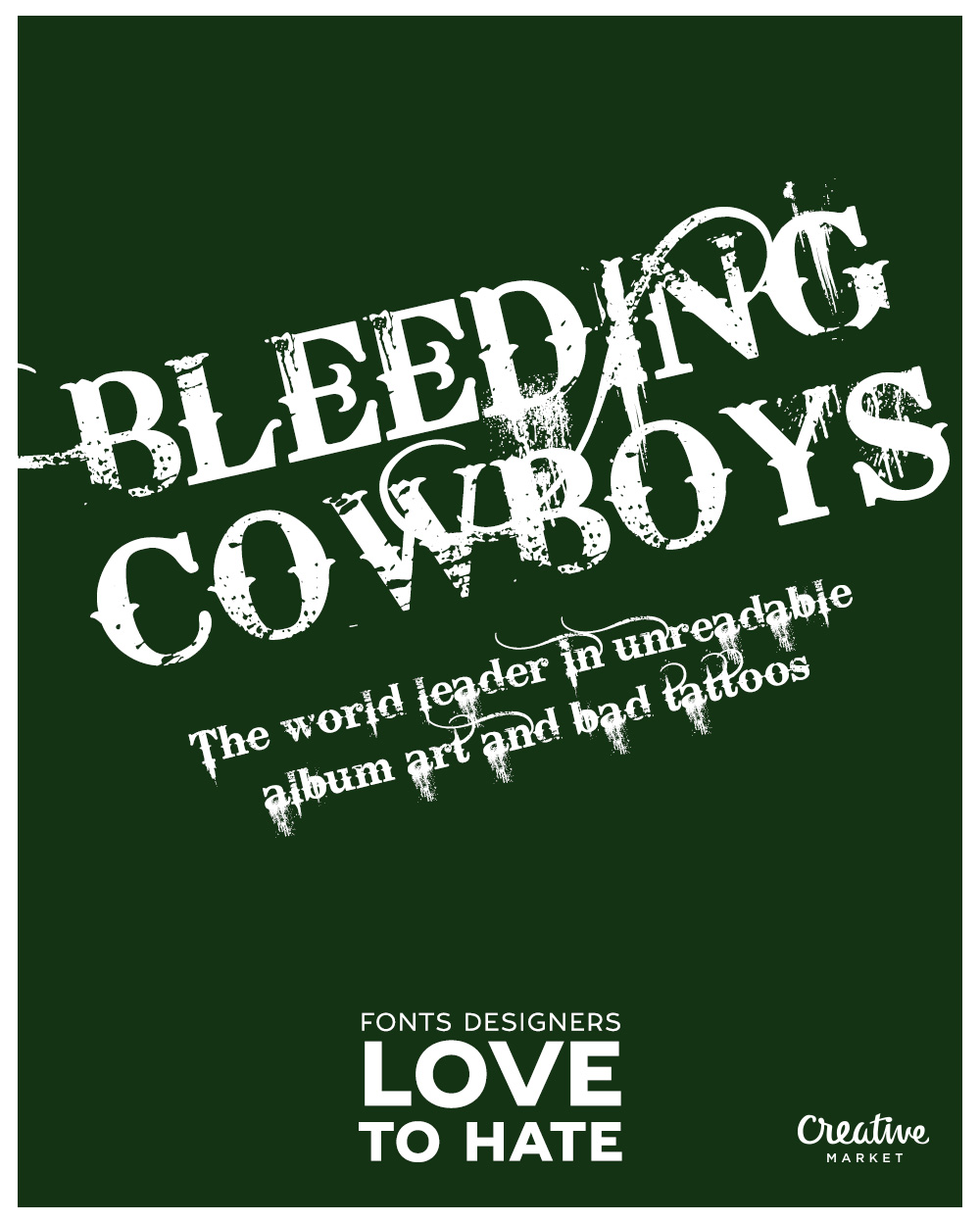
Why Is Bleeding Cowboys Hated? Because it makes your eyes bleed. How? It’s been used around the world on low-quality designs, most notably back-alley tattoos, and cheap t-shirts sold at every flea market. Its reputation has tanked, and is now associated with horrible design.
Many describe it as being visually uncomfortable, so that’s another reason. The unpredictable curves and font randomness just makes it worse.
Famous Brands Using Bleeding Comboys? Rumor has it that Elon Musk had text with this font tattooed on his underside. Just kidding. But it’s been used HEAVILY in country music albums. From Daryle Singletary’s, “Rockin’ In The Country” to “Dana and Lauren”.
![]()
@xxxx[{::::::::::::::::::::::::::::::::::>
#8. LOBSTER: The Amateur’s Favorite Retro Font
@xxxx[{::::::::::::::::::::::::::::::::::>
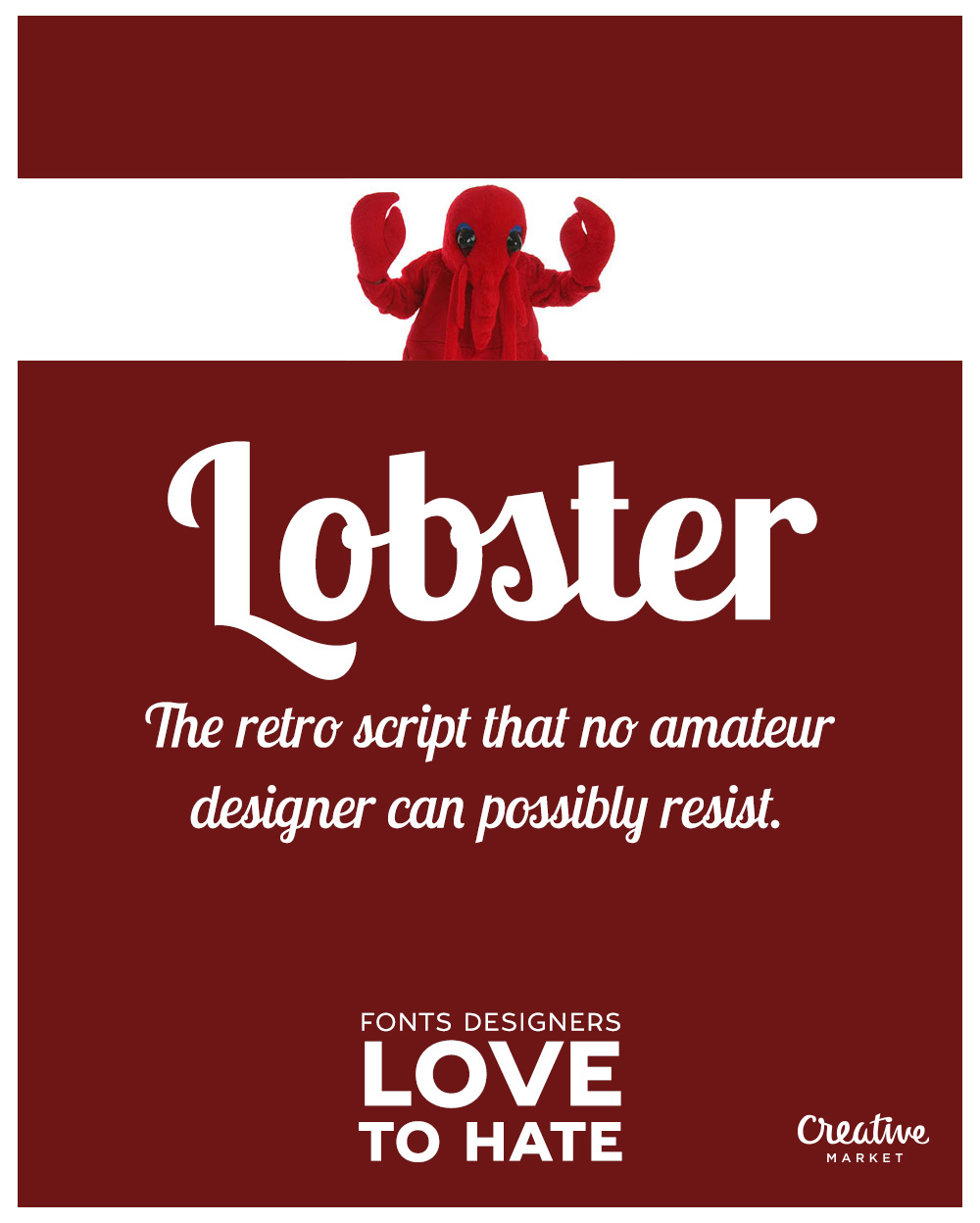
Why Is Lobster Font Hated? It makes you look like a lobster. It’s clunky, and overly expressive with its thick, slab-like letterforms. Used the right way, it could make you look cool. But the loud font style goes against the current trend in minimalist design aesthetic.
The font itself has also been widely used in low effort and cheap designs, further sending its reputation down the gutter. From time to time, it’s been called the new ‘worst font ever’.
Famous Brands Using Lobster Font? Being an open-source font on platforms like Google Web Fonts, it’s been abused heavily by startups and store-fronts. Notable appearances include being used on posters for the Baltic Film Festival in Berlin, the logo design of a number of Greek restaurants and breweries, as well as advertising signage on trucks.
@xxxx[{::::::::::::::::::::::::::::::::::>
#7. BANK GOTHIC: The Other Movie Poster Font
@xxxx[{::::::::::::::::::::::::::::::::::>
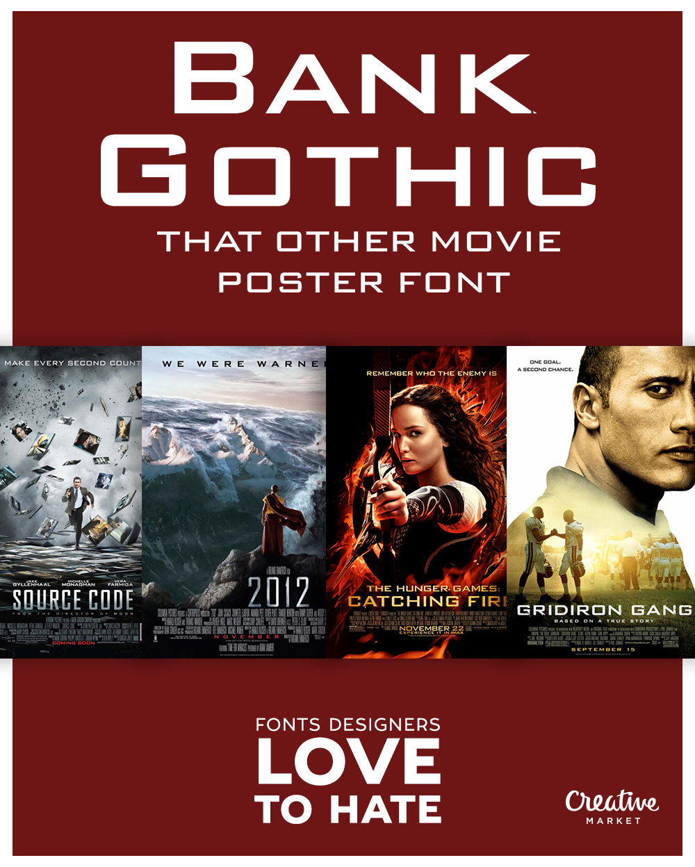
Why Designers Hate Bank Gothic? It’s used too much, especially in poor design choices. It’s considered too old-fashion to fit in with current trends. And how the font is based on classic and traditional letterforms invites criticism for lack of originality.
Famous Brands Using Bank Gothic? Posters for famous movies, like the Hunger Games, Mission Impossible, and Star Trek have featured the font. Video games that have used the font include Grand Theft Auto. And it’s been used in the branding and logos for companies like Craftsman, Slingshot Coffee, and residential and commercial buildings in Germany.
@xxxx[{::::::::::::::::::::::::::::::::::>
#6. HOBO FONT: The Hard To Read Font
@xxxx[{::::::::::::::::::::::::::::::::::>
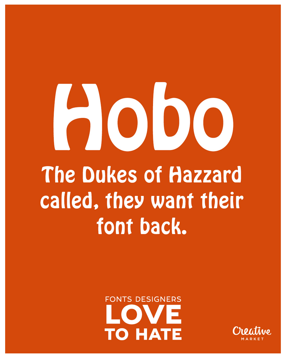
Why They Hatin’ On Hobo Font? You lose all your literacy when you try to read this font. This means that it’s super hard to use on longer pieces of text. In spite of this, it has been used widely for logos and branding. Professionals consider the font playful and whimsical, so its commercial use has been frowned upon.
Famous Brands That Use Hobo Font? It was used in the American Comedy series, Dukes of Hazzard. It was used by Playboy on some of their product line. It’s also used by several food companies, from Maruchan Instant Noodles to Indonesian soft drink, Floridina. Not to mention, on WAY too many album covers.
You’ve probably seen the font being used on that drive-through motel you passed by this morning.
Top 5 Most Hated Fonts
@xxxx[{::::::::::::::::::::::::::::::::::>
DANGER LEVEL: TIGER – Any threat to a large number of people.
WARNING: Are you sure you want to continue reading? Your courage for making it thus far is commended. There’s no need for you to put your sanity in peril by proceeding further…
@xxxx[{::::::::::::::::::::::::::::::::::>
#5. HELVETICA: The ‘Breeding Contempt’ Font
@xxxx[{::::::::::::::::::::::::::::::::::>
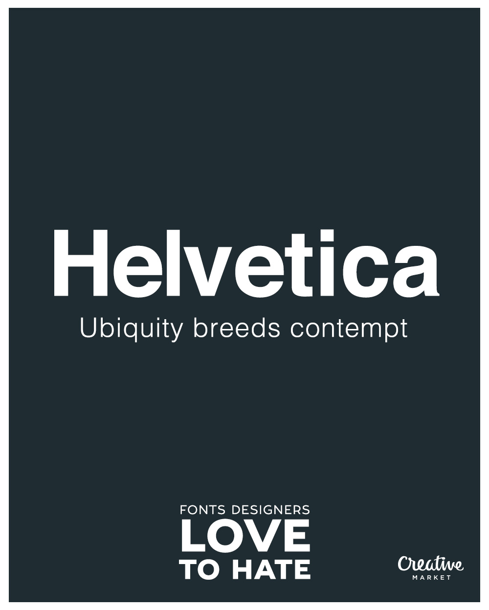
Why The Hate On Helvetica? Helvetica is considered by many to be a beautifully-crafted font. However, wide-spread use through popularity over the last several decades led to its downfall. Many designers think of it as a ‘default’ font, that people use without thinking.
Criticism on the font includes how bland it is, and how lacking it is in personality and creativity… all the labels that high-schoolers everywhere do everything to avoid. Its tight-spacing may also affect readability in smaller text.
Any Famous Brands That Used Helvetica? A better question is… “Who hasn’t used it?” It’s one of the world’s top logo fonts, and historical brands have literally built their identity around it. Brands like:
3M, American Apparel, BASF, Behance, BMW, General Motors, J.C. Penny, Jeep, Lufthansa, Nestle, Motorola, Panasonic, Sears, Skype, Target, Tupperware, Apple, IBM, NASA, the U.S. Government, and the list is never-ending.
In the E.U., it’s a compulsory font on cigarette packaging labels. Many countries use it for road signage. It’s one of the best YouTube thumbnail fonts used by the world’s top YouTube channels. You’ve probably seen the font being used heavily on public transport and metros, to the point it makes you wanna puke…
@xxxx[{::::::::::::::::::::::::::::::::::>
#4. TIMES NEW ROMAN: The High School Trauma Font
@xxxx[{::::::::::::::::::::::::::::::::::>
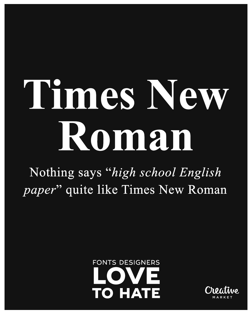
Why Designers Hatin’ Times New Roman? It has been the default font in academic and professional settings for a long time. Meaning? It’s always there to haunt you and remind you of your worst nightmares at school or work. Most designers would prefer more interesting serif font choices that don’t keep them awake at night.
Some see it as being old-fashioned and conservative. Great if you’re trying to give off that vibe. But using it is considered lazy if you’re trying to do otherwise. It is highly legible though, which is why it reminds popular among academic circles.
Famous Brands Using Times New Roman? Speaking of academics, the font has been used by Harvard for its official branding and communications. It has been used by iconic newspapers like The New York Times and The Chicago Sun-Times.
It seems to be a favorite among luxury brands like Rolex and Tiffany & Co.
Top 3 Most Hated Fonts
@xxxx[{::::::::::::::::::::::::::::::::::>
DANGER LEVEL: DRAGON – Any threat to multiple cities.
WARNING: Still here? Give up all hope, all ye who enter therein…
“There is a wide difference between true courage, and mere contempt of life…”
~ Cato the Elder
@xxxx[{::::::::::::::::::::::::::::::::::>
#3. ARIAL: Helvetica’s Horrible Font Cousin
@xxxx[{::::::::::::::::::::::::::::::::::>
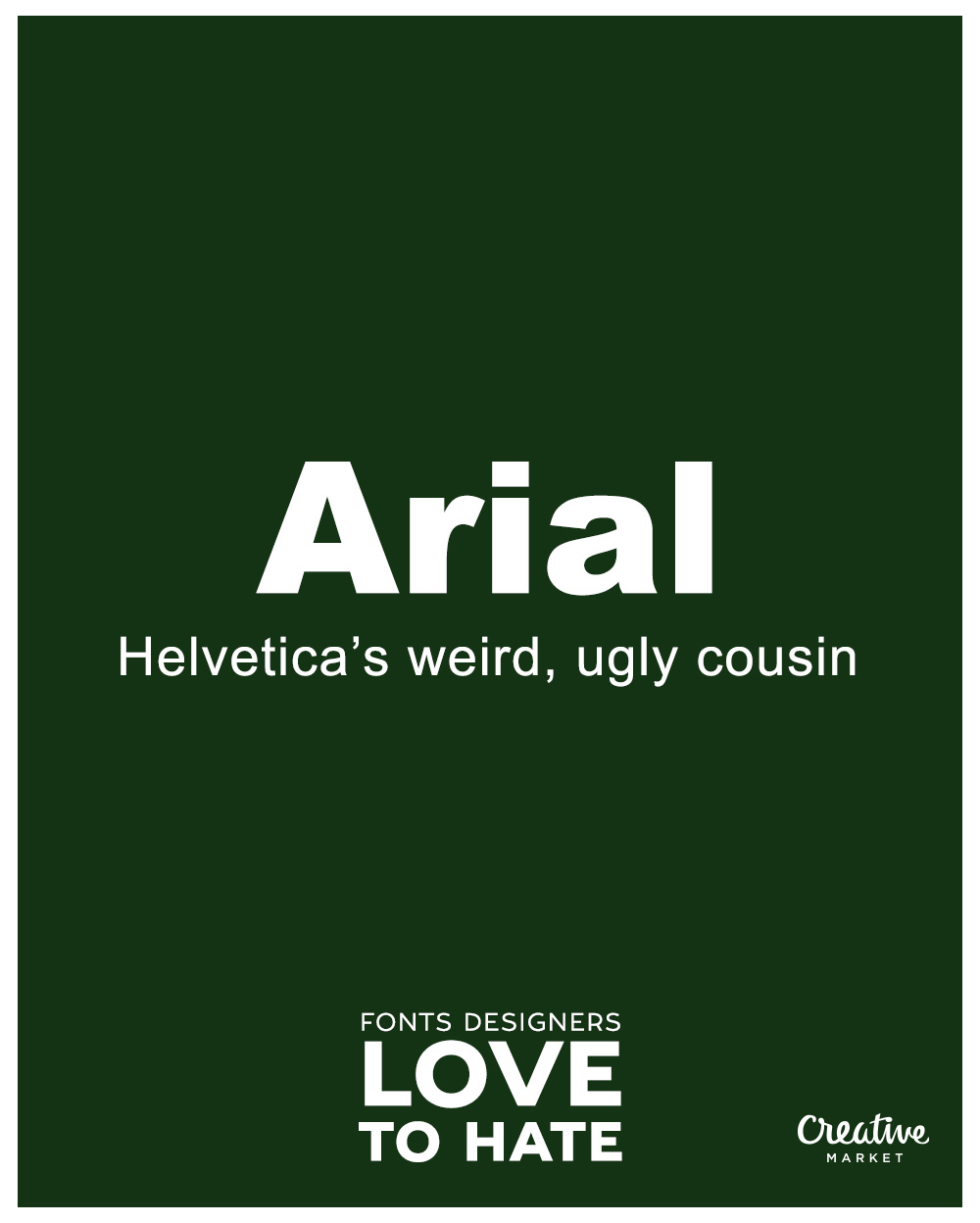
Why They Hate You, Arial? A lot of people consider the Arial font to be a poor man’s knockoff of the highly respected (and disrespected) Helvetica font. It’s just a knockoff with no personality. So designers typically seek to avoid it like the plague.
It holds status as a “system font”. Meaning? Low effort, low quality. It’s often criticized for being clunky and hard to read at smaller sizes too.
But Famous Brands Use It? Microsoft has used the font in their branding for decades. Panasonic does it too, and also in their branding. So has Jeep. And Staples. American Apparel. And Crate and Barrel.
@xxxx[{::::::::::::::::::::::::::::::::::>
#2. PAPYRUS FONT: The Faux Egyptian Font
@xxxx[{::::::::::::::::::::::::::::::::::>
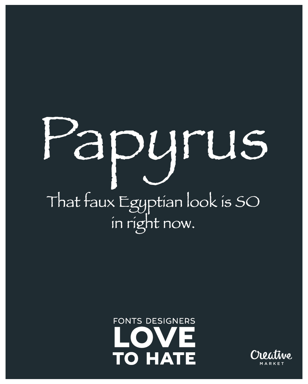
They Be Hatin’ Papyrus Now? It’s extremely overused in the health and organic products industry. Not to mention in indigenous-themed material. As weird as it sounds, the ‘ancient feel’ the font gives off makes some people feel that using it is belittles other cultures.
Some designers would argue that its problematic kerning and letter spacing make it a no-go. It’s definitely the opposite of modern sophistication.
What Big Brands Be Usin’ It? James Cameron’s movie, Avatar, has featured the font prominently. It’s also used in certain Starbucks products and locations. The hit game Undertale also uses the font extensively. The game also uses our next font…
Worst Font Ever?
@xxxx[{::::::::::::::::::::::::::::::::::>
DANGER LEVEL: GOD – A threat endangering the survival of humanity in general.
WARNING: Have you left a will? The apocalypse is here…
@xxxx[{::::::::::::::::::::::::::::::::::>
#1. COMIC SANS: The ‘Dumb Font’
@xxxx[{::::::::::::::::::::::::::::::::::>
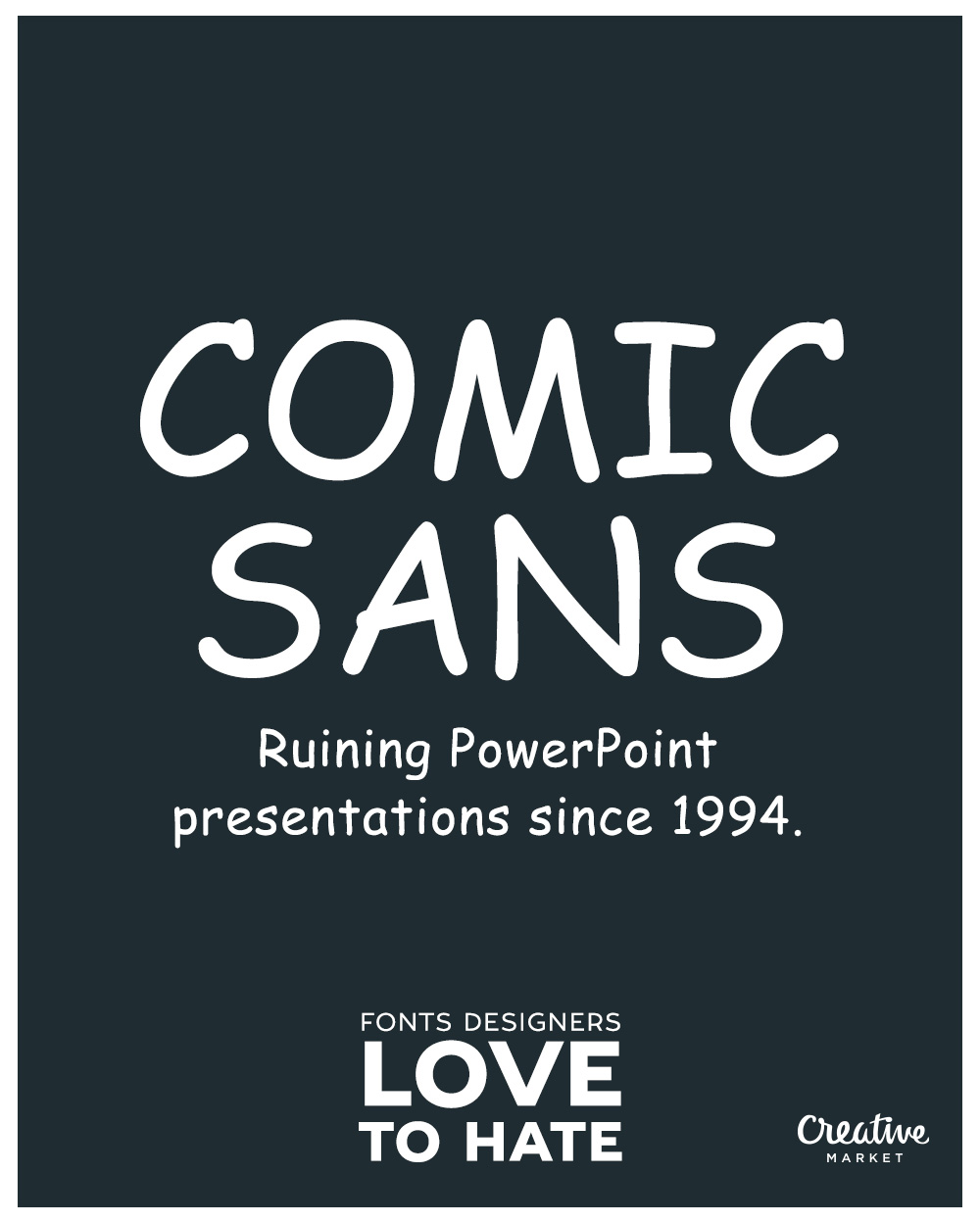
Wherefore They Hate Thee, Comic Sans? Designers consider it unprofessional, kiddish, and… extremely cliche. Its hand-drawn style isn’t exactly polished, and it has technical issues like kerning and letter spacing problems.
Despite it’s childish demeanor, the font has been used in all the worst settings. Like formal documents, business letters, and even grave markers. However, it has built a cult following among ‘anti-designers’ who want to drive designers mad. It’s also used to make a statement.
Famous Brands Still Lovin’ Comic Sans? The font was first developed for use in Microsoft products. No small wonder why they’ve struggled to catch up to Apple. It’s also used in some iconic toys and games, like the popular plush toy, Beanie Babies as well as the famous Sims video game.
Pope Benedict XVI’s resignation letter was typeset with Comic Sans in 2013. That drew a lot of criticism…
@xxxx[{::::::::::::::::::::::::::::::::::>
FAQ (Frequently Asked Questions)
@xxxx[{::::::::::::::::::::::::::::::::::>
What is the most hated font of all time, in the world, ever?
Most would consider it to be Comic Sans. Why? It was, at one time, the go-to font for amateur designers, kids books, and passive-aggressive workplace signs. Long story short, it has been severely overused and misused throughout history.
What font is overused to the point of being annoying?
Helvetica. Although beautifully crafted, the fact that it started being used anywhere and everywhere made it a target for scorn and hatred.
What are the most hated text fonts by designers?
Some of the most hated fonts by designers include Comic Sans, Trajan, Bleeding Cowboys, Papyrus, and Arial.
What are some of the most overused fonts?
Some of the most overused fonts include Time New Roman, Arial, and Helvetica.
@xxxx[{::::::::::::::::::::::::::::::::::>
Conclusion
@xxxx[{::::::::::::::::::::::::::::::::::>
Any fonts on this list that made you go ‘Arghhhhh‘? Pin, tweet, or otherwise share them out. Let others experience the pain you feel. Deep inside…
You might also want to check out this list of Best Fonts for Minimalist Design based on global sales data from the MyFonts Marketplace. So you know what the most loved fonts are, as well as the most hated…
Peace.
