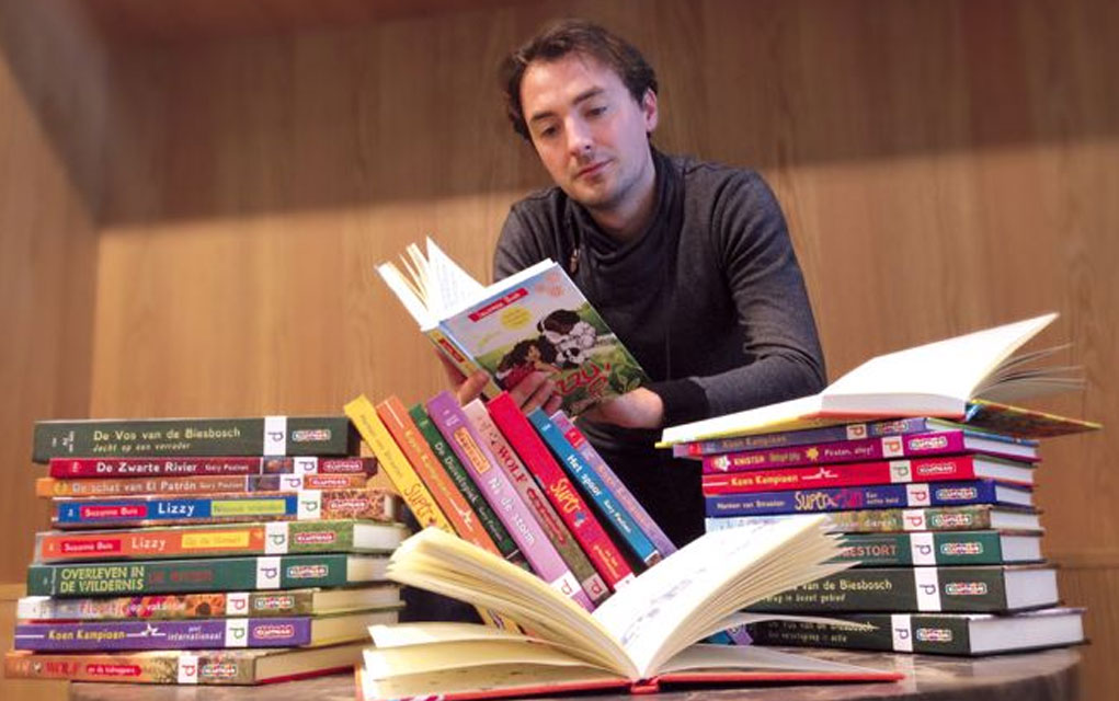
 DUTCH DESIGNER CHRISTIAN BOER (pictured above) is dyslexic. That means that, just like other people with the condition, he has difficulties connecting language with text.
A lot of the difficulty stems from traditional fonts using characters that are way too similar to each other. For aesthetic reason.
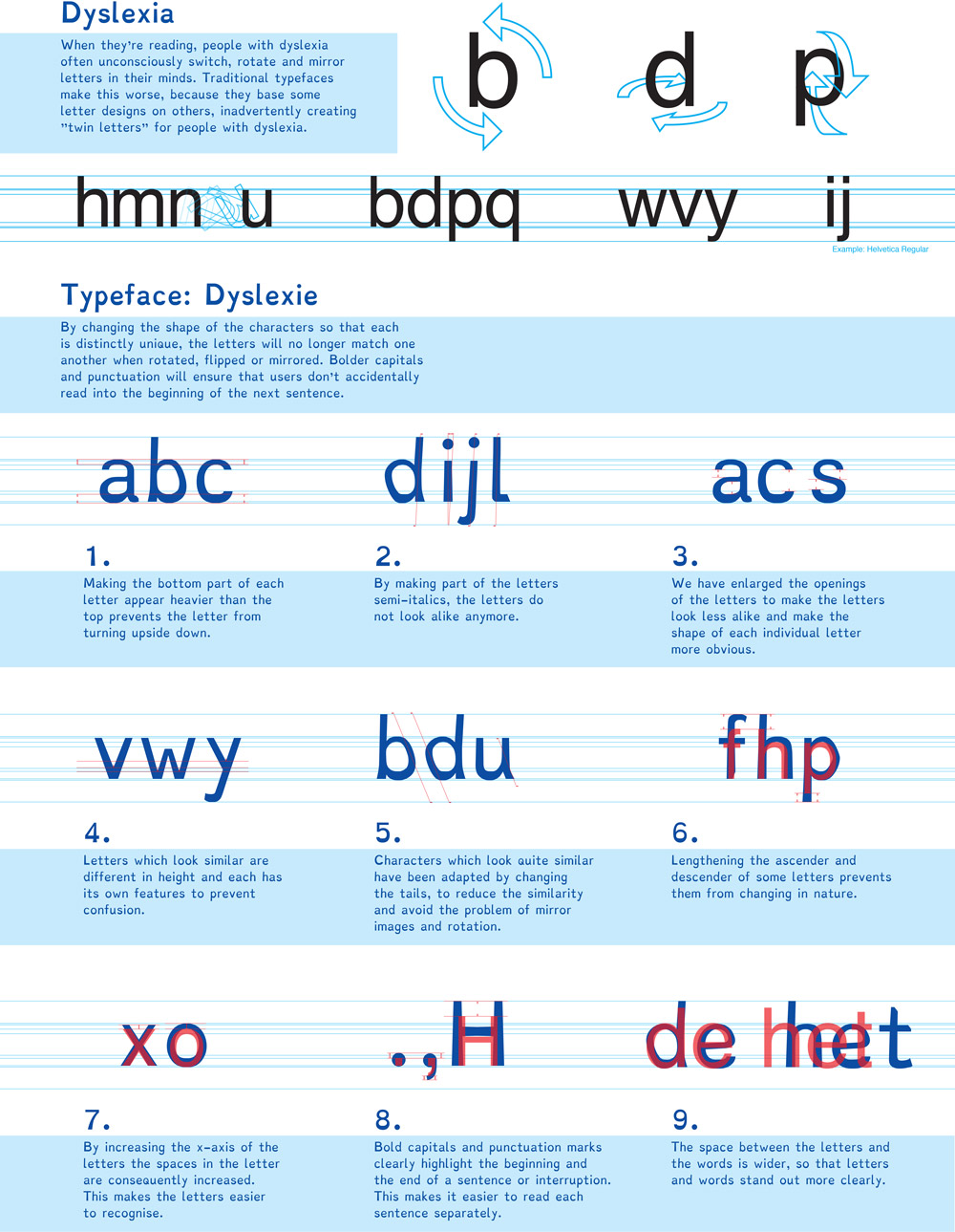
When they’re reading, people with dyslexia often unconsciously switch, rotate and mirror letters in their minds. Traditional typefaces make this worse, because they base some letter designs on others, inadvertently creating ‘twin letters’ for people with dyslexia.
If you look at typefaces like Helvetica, the letter ‘n’ is also used upside-down as a “u”. The letter “d” is merely a vertically mirrored ‘b’. You mirror the ‘b’ horizontally, you get a ‘p’. You mirror that, you get a ‘q’. It can be confusing.
Christian came up with the Dyslexie font as part of his thesis.
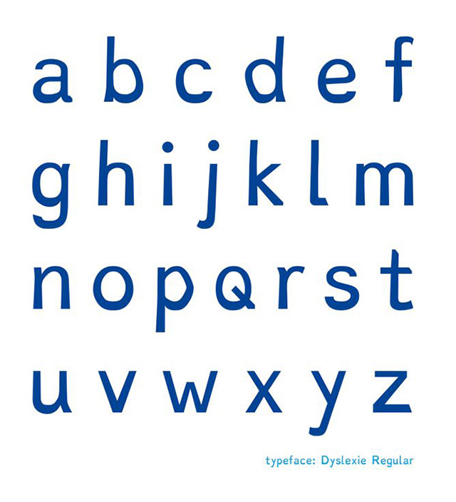
Various improvements make it much easier to read for dyslexics.

Similar letters are given distinctive slants. To make them unique.
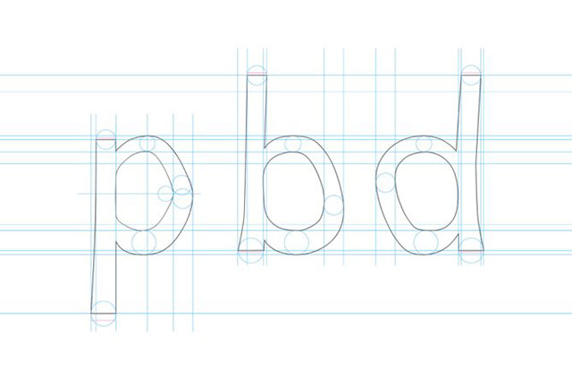
The bottoms of letters are made thicker. To prevent dyslexics from turning them upside-down.
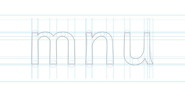
Lines are made longer and more distinct.
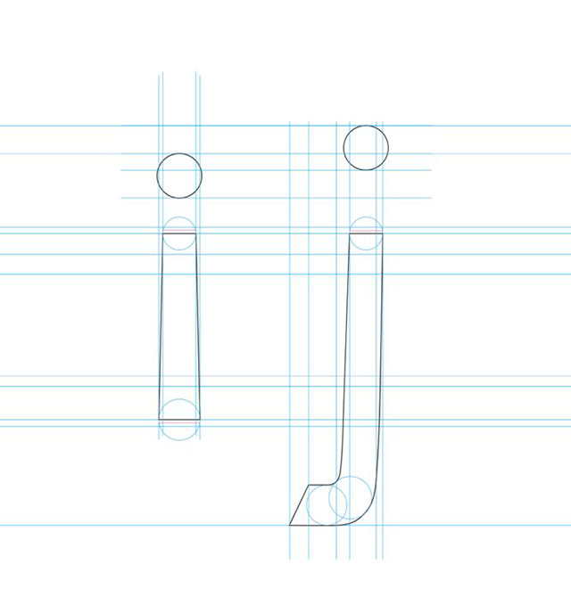
And those are just a few of the differences. Here’s more…
(You can click on the image to view a bigger size)
Watch this video for the full scoop.
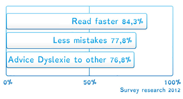
Studies have shown great reading improvements for dyslexics.
And Christian gave this TED Talk on how he came up with the idea.
The best part is…
… that the Dyslexie Font is totally free to download and use, and you can get it by clicking here. Or you can visit the font’s website for more details.
It’s a pretty cool innovation using font design that’s changing lives. Designing fonts with strong focus on readability (as opposed to merely aesthetics) is definitely a concept that should be expanded upon.
Of course, not every form of dyslexia involves problems with mirroring or rotation, but if you have those problems, this is definitely a game changer…
